1. Cosmopolitan
Bliss
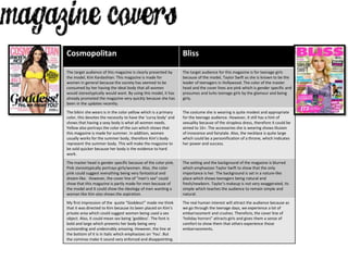
The target audience of this magazine is clearly presented by
the model, Kim Kardashian. This magazine is made for
women in general because the society has seemed to be
consumed by her having the ideal body that all women
would stereotypically would want. By using this model, it has
already promoted the magazine very quickly because she has
been in the updates recently.
The target audience for this magazine is for teenage girls
because of the model, Taylor Swift as she is known to be the
leader of teenagers in Hollywood. The color of the master
head and the cover lines are pink which is gender specific and
presumes and lurks teenage girls by the glamour and being
girly.
The bikini she wears is in the color yellow which is a primary
color, this devotes the necessity to have the ‘curvy body’ and
shows that having a sexy body is what all women needs.
Yellow also portrays the color of the sun which shows that
this magazine is made for summer. In addition, women
usually works for the summer body, therefore Kim’s body
represent the summer body. This will make the magazine to
be sold quicker because her body is the evidence to hard
work.
The costume she is wearing is quite modest and appropriate
for the teenage audience. However, it still has a hint of
sexuality because of the strapless dress, therefore it could be
aimed to 16+. The accessories she is wearing shows illusion
of innocence and fairytale. Also, the necklace is quite large
which could be a personification of a throne, which indicates
her power and success.
The master head is gender specific because of the color pink.
Pink stereotypically portrays girls/women. Also, the color
pink could suggest everything being very fantastical and
dream-like. However, the cover line of “men’s sex” could
show that this magazine is partly made for men because of
the model and it could show the ideology of men wanting a
woman like Kim also shows the aspiration.
The setting and the background of the magazine is blurred
which emphasizes Taylor Swift to show that the only
importance is her. The background is set in a nature-like
place which shows teenagers being natural and
fresh/newborn. Taylor’s makeup is not very exaggerated, its
simple which teaches the audience to remain simple and
natural.
My first impression of the quote “Goddess!” made me think
that it was directed to Kim because its been placed on Kim’s
private area which could suggest women being used a sex
object. Also, it could mean sex being ‘goddess’. The font is
bold and large which presents her body being very
outstanding and undesirably amazing. However, the line at
the bottom of it is in italic which emphasizes on ‘You’. But
the commas make it sound very enforced and disappointing.
The real human interest will attract the audience because as
we go through the teenage days, we experience a lot of
embarrassment and crushes. Therefore, the cover line of
‘holiday horrors” attracts girls and gives them a sense of
comfort to show them that others experience those
embarrassments.