1. Is it recognisable?
Little White Lies magazine covers are unique with every edition, however they all have
similar characteristics that make them recognised as Little White Lies covers. They all
include the big white circle surrounding the LWL logo and barcode centered at the top of
the cover for instance, whilst the vast majority of LWL covers center the artwork around a
portrait of a main character in the featured movie. The tagline of the cover is usually
implemented within the artwork somehow, not just set to the side, or aligned in the centre.
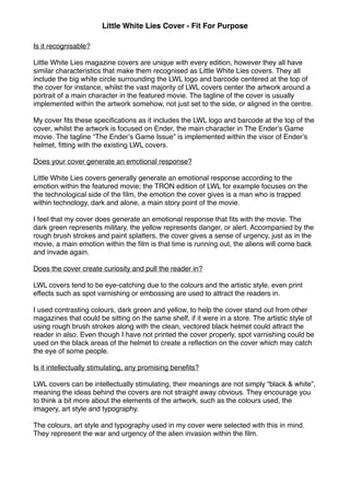
My cover fits these specifications as it includes the LWL logo and barcode at the top of the
cover, whilst the artwork is focused on Ender, the main character in The Enderʼs Game
movie. The tagline “The Enderʼs Game Issue” is implemented within the visor of Enderʼs
helmet, fitting with the existing LWL covers.
Does your cover generate an emotional response?
Little White Lies covers generally generate an emotional response according to the
emotion within the featured movie; the TRON edition of LWL for example focuses on the
the technological side of the film, the emotion the cover gives is a man who is trapped
within technology, dark and alone, a main story point of the movie.
I feel that my cover does generate an emotional response that fits with the movie. The
dark green represents military, the yellow represents danger, or alert. Accompanied by the
rough brush strokes and paint splatters, the cover gives a sense of urgency, just as in the
movie, a main emotion within the film is that time is running out, the aliens will come back
and invade again.
Does the cover create curiosity and pull the reader in?
LWL covers tend to be eye-catching due to the colours and the artistic style, even print
effects such as spot varnishing or embossing are used to attract the readers in.
I used contrasting colours, dark green and yellow, to help the cover stand out from other
magazines that could be sitting on the same shelf, if it were in a store. The artistic style of
using rough brush strokes along with the clean, vectored black helmet could attract the
reader in also. Even though I have not printed the cover properly, spot varnishing could be
used on the black areas of the helmet to create a reflection on the cover which may catch
the eye of some people.
Is it intellectually stimulating, any promising benefits?
LWL covers can be intellectually stimulating, their meanings are not simply “black & white”,
meaning the ideas behind the covers are not straight away obvious. They encourage you
to think a bit more about the elements of the artwork, such as the colours used, the
imagery, art style and typography.
The colours, art style and typography used in my cover were selected with this in mind.
They represent the war and urgency of the alien invasion within the film.
Little White Lies Cover - Fit For Purpose
2. Is it efficient and easy to scan?
Although LWL covers usually are unique and “different” from the conventional movie
magazine cover, they still require the reader to quick discover what the magazine is (if they
haven't seen LWL magazines before) and what the featured film is at a quick glance.
I believe my LWL cover is efficient and easy to scan, as the LWL logo tells the reader that it
is a magazine centered around movies (If they are unfamiliar with the LWL magazines, it
says under the logo “Truth & Movies”) and also tells the reader that The Enderʼs Game is
the featured movie due to the prominent tagline.
Is the cover logical, does it makes sense as an investment?
LWL covers need to be logical, meaning that they need to actually make sense according
to the contents of the magazine and the featured film. The cover should be clear of what
the featured film is through the use of artwork and imagery.
It is clear that my LWL cover is based around The Enderʼs Game film due to the
recognisable helmet present within the film and of course the fact that the tagline “The
Enderʼs Game Issue” is a focal point within the cover design.
Little White Lies Cover - Fit For Purpose