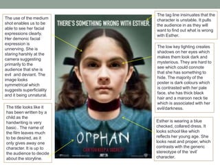
POSTER ANALYSIS
SHUTTER ISLAND & ORPHAN
The colours of the poster
are very dark and
mysterious. The island is
in sharper focus to the
rest of the images, which
makes it stand out. There
is also a white glow
around the island which
highlights it from the rest
of the poster.
The island itself is made
up of a montage or
pictures, which makes it
secretive and intriguing.
This could suggest that
the film is reflecting a
puzzle as it does not fit
together correctly.
The title font is sketchy
and looks like it has been
distorted. The bright red
stands out against the
monochrome
background. It
symbolises the danger
that the island will
inhabit.

The close up of
DiCaprio’s facial
expression creates
suspense as he looks
frightened yet concerned
at the same time. The
low-key lighting on his
face creates a shadow
which hides part of his
face which is mysterious.
It connotes that he may
be hiding something and
it is covered.
The level of the tower
brings your eye line up to
the match. This is the only
colour that the image
features. It could suggest
a link to the storyline, a fire
possibly.
The weather in the image
looks very bleak and
stormy. This adds to the
narrative as we associate
storms with negativity and
problems, so this could be
foreshadowing the
storyline.
The use of the medium
shot enables us to be
able to see her facial
expressions clearly.
Her demonic facial
expression is
unnerving. She is
staring harshly at the
camera suggesting
primarily to the
audience that she is
evil and deviant. The
image looks
symmetrical which
suggests superficiality
and it being unnatural.
The title looks like it
has been written by a
child as the
handwriting is very
basic . The name of
the film leaves much
to be desired, as it
only gives away one
character. It is up to
the audience to decide
about the storyline.

The tag line insinuates that the
character is unstable. It pulls
the audience in as they will
want to find out what is wrong
with Esther.
The low key lighting creates
shadows on her eyes which
makes them look dark and
mysterious. They are hard to
see which could connote
that she has something to
hide. The majority of the
poster is dark colours which
is contrasted with her pale
face, she has thick black
hair and a maroon neck tie
which is associated with her
evil/darkness.
Esther is wearing a blue
checked, collared dress. It
looks school like which
reflects her young age. She
looks neat and proper, which
contrasts with the generic
stereotype of the ‘evil’
character.

Poster analysis: The Inbetweeners & Project X

  • 1.
  • 2.
    The colours ofthe poster are very dark and mysterious. The island is in sharper focus to the rest of the images, which makes it stand out. There is also a white glow around the island which highlights it from the rest of the poster. The island itself is made up of a montage or pictures, which makes it secretive and intriguing. This could suggest that the film is reflecting a puzzle as it does not fit together correctly. The title font is sketchy and looks like it has been distorted. The bright red stands out against the monochrome background. It symbolises the danger that the island will inhabit. The close up of DiCaprio’s facial expression creates suspense as he looks frightened yet concerned at the same time. The low-key lighting on his face creates a shadow which hides part of his face which is mysterious. It connotes that he may be hiding something and it is covered. The level of the tower brings your eye line up to the match. This is the only colour that the image features. It could suggest a link to the storyline, a fire possibly. The weather in the image looks very bleak and stormy. This adds to the narrative as we associate storms with negativity and problems, so this could be foreshadowing the storyline.
  • 3.
    The use ofthe medium shot enables us to be able to see her facial expressions clearly. Her demonic facial expression is unnerving. She is staring harshly at the camera suggesting primarily to the audience that she is evil and deviant. The image looks symmetrical which suggests superficiality and it being unnatural. The title looks like it has been written by a child as the handwriting is very basic . The name of the film leaves much to be desired, as it only gives away one character. It is up to the audience to decide about the storyline. The tag line insinuates that the character is unstable. It pulls the audience in as they will want to find out what is wrong with Esther. The low key lighting creates shadows on her eyes which makes them look dark and mysterious. They are hard to see which could connote that she has something to hide. The majority of the poster is dark colours which is contrasted with her pale face, she has thick black hair and a maroon neck tie which is associated with her evil/darkness. Esther is wearing a blue checked, collared dress. It looks school like which reflects her young age. She looks neat and proper, which contrasts with the generic stereotype of the ‘evil’ character.