Product Type            Consumer Magazine Cover


    Product               Cover for the film magazine Little White Lies - specifically the ‘White Swan is-
   description            sue’, Issue 33 January/February 2011.


  Where did you           Little White Lies can be found on newstands and in newsagents, it is also
find it or become         stocked in the college Learning Resource Centre but this issue was used as
                          case study in comparison with Future PLC’s film magazine Total Film.
   aware of it
                          The purpose of this magazine cover is to:
 Purpose of the           Inform the reader of the content of the magazine. Attract potential consumers to
                          buy the issue with both the design style and content. Inform the readers to the
 design product           price and issue. To be used to scan when purchased (bar code)
                          Work as a stand alone design product that can be admired.

                          Little White Lies is 20cm by 24cm in format. The magazine uses heavy weighted
      Format              paper with a matte finish. The lettering for the ‘Black Swan Issue’ is embossed
                          and uses spot colour. The cover image is full bleed.


Analysis of the design
Discuss use of images, colours, shapes, typography, the composition of
the design and what draws the eye or stands out.
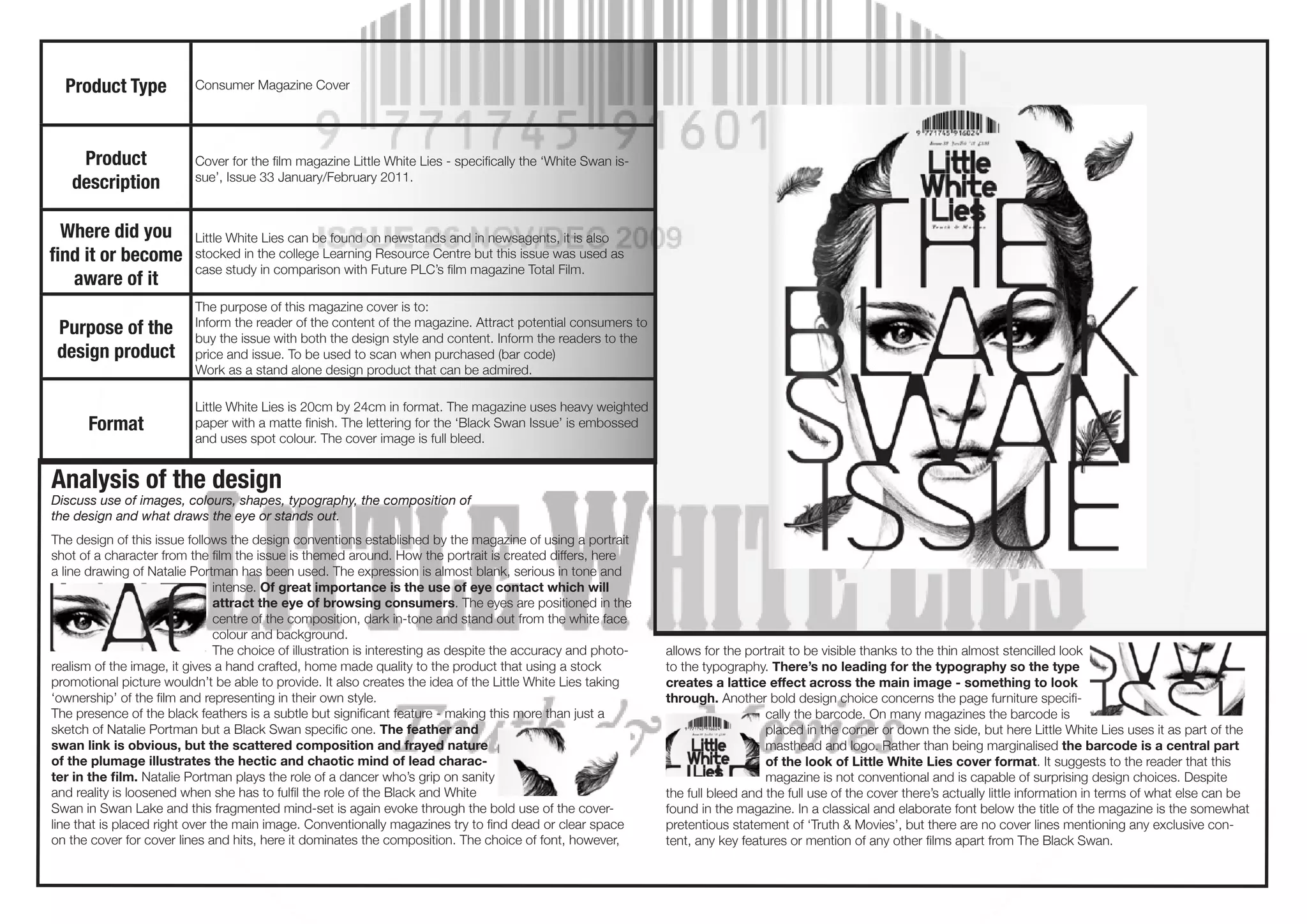
The design of this issue follows the design conventions established by the magazine of using a portrait
shot of a character from the film the issue is themed around. How the portrait is created differs, here
a line drawing of Natalie Portman has been used. The expression is almost blank, serious in tone and
                                intense. Of great importance is the use of eye contact which will
                                attract the eye of browsing consumers. The eyes are positioned in the
                                centre of the composition, dark in-tone and stand out from the white face
                                colour and background.
                                The choice of illustration is interesting as despite the accuracy and photo-   allows for the portrait to be visible thanks to the thin almost stencilled look
realism of the image, it gives a hand crafted, home made quality to the product that using a stock             to the typography. There’s no leading for the typography so the type
promotional picture wouldn’t be able to provide. It also creates the idea of the Little White Lies taking      creates a lattice effect across the main image - something to look
‘ownership’ of the film and representing in their own style.                                                   through. Another bold design choice concerns the page furniture specifi-
The presence of the black feathers is a subtle but significant feature - making this more than just a                             cally the barcode. On many magazines the barcode is
sketch of Natalie Portman but a Black Swan specific one. The feather and                                                          placed in the corner or down the side, but here Little White Lies uses it as part of the
swan link is obvious, but the scattered composition and frayed nature                                                             masthead and logo. Rather than being marginalised the barcode is a central part
of the plumage illustrates the hectic and chaotic mind of lead charac-                                                            of the look of Little White Lies cover format. It suggests to the reader that this
ter in the film. Natalie Portman plays the role of a dancer who’s grip on sanity                                                  magazine is not conventional and is capable of surprising design choices. Despite
and reality is loosened when she has to fulfil the role of the Black and White                                 the full bleed and the full use of the cover there’s actually little information in terms of what else can be
Swan in Swan Lake and this fragmented mind-set is again evoke through the bold use of the cover-               found in the magazine. In a classical and elaborate font below the title of the magazine is the somewhat
line that is placed right over the main image. Conventionally magazines try to find dead or clear space        pretentious statement of ‘Truth & Movies’, but there are no cover lines mentioning any exclusive con-
on the cover for cover lines and hits, here it dominates the composition. The choice of font, however,         tent, any key features or mention of any other films apart from The Black Swan.

9881727 black swan-example

  • 1.
    Product Type Consumer Magazine Cover Product Cover for the film magazine Little White Lies - specifically the ‘White Swan is- description sue’, Issue 33 January/February 2011. Where did you Little White Lies can be found on newstands and in newsagents, it is also find it or become stocked in the college Learning Resource Centre but this issue was used as case study in comparison with Future PLC’s film magazine Total Film. aware of it The purpose of this magazine cover is to: Purpose of the Inform the reader of the content of the magazine. Attract potential consumers to buy the issue with both the design style and content. Inform the readers to the design product price and issue. To be used to scan when purchased (bar code) Work as a stand alone design product that can be admired. Little White Lies is 20cm by 24cm in format. The magazine uses heavy weighted Format paper with a matte finish. The lettering for the ‘Black Swan Issue’ is embossed and uses spot colour. The cover image is full bleed. Analysis of the design Discuss use of images, colours, shapes, typography, the composition of the design and what draws the eye or stands out. The design of this issue follows the design conventions established by the magazine of using a portrait shot of a character from the film the issue is themed around. How the portrait is created differs, here a line drawing of Natalie Portman has been used. The expression is almost blank, serious in tone and intense. Of great importance is the use of eye contact which will attract the eye of browsing consumers. The eyes are positioned in the centre of the composition, dark in-tone and stand out from the white face colour and background. The choice of illustration is interesting as despite the accuracy and photo- allows for the portrait to be visible thanks to the thin almost stencilled look realism of the image, it gives a hand crafted, home made quality to the product that using a stock to the typography. There’s no leading for the typography so the type promotional picture wouldn’t be able to provide. It also creates the idea of the Little White Lies taking creates a lattice effect across the main image - something to look ‘ownership’ of the film and representing in their own style. through. Another bold design choice concerns the page furniture specifi- The presence of the black feathers is a subtle but significant feature - making this more than just a cally the barcode. On many magazines the barcode is sketch of Natalie Portman but a Black Swan specific one. The feather and placed in the corner or down the side, but here Little White Lies uses it as part of the swan link is obvious, but the scattered composition and frayed nature masthead and logo. Rather than being marginalised the barcode is a central part of the plumage illustrates the hectic and chaotic mind of lead charac- of the look of Little White Lies cover format. It suggests to the reader that this ter in the film. Natalie Portman plays the role of a dancer who’s grip on sanity magazine is not conventional and is capable of surprising design choices. Despite and reality is loosened when she has to fulfil the role of the Black and White the full bleed and the full use of the cover there’s actually little information in terms of what else can be Swan in Swan Lake and this fragmented mind-set is again evoke through the bold use of the cover- found in the magazine. In a classical and elaborate font below the title of the magazine is the somewhat line that is placed right over the main image. Conventionally magazines try to find dead or clear space pretentious statement of ‘Truth & Movies’, but there are no cover lines mentioning any exclusive con- on the cover for cover lines and hits, here it dominates the composition. The choice of font, however, tent, any key features or mention of any other films apart from The Black Swan.