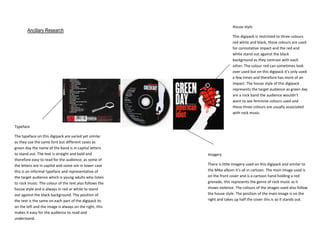
1. House style
Ancillary Research
This digipack is restricted to three colours
red white and black, these colours are used
for connotative impact and the red and
white stand out against the black
background as they contrast with each
other. The colour red can sometimes look
over used but on this digipack it’s only used
a few times and therefore has more of an
impact. The house style of this digipack
represents the target audience as green day
are a rock band the audience wouldn’t
want to see feminine colours used and
these three colours are usually associated
with rock music.
Typeface
The typeface on this digipack are varied yet similar
as they use the same font but different cases as
green day the name of the band is in capital letters
to stand out. The text is straight and bold and
therefore easy to read for the audience, as some of
the letters are in capital and some are in lower case
this is an informal typeface and representative of
the target audience which is young adults who listen
to rock music. The colour of the text also follows the
house style and is always in red or white to stand
out against the black background. The position of
the text is the same on each part of the digipack its
on the left and the image is always on the right, this
makes it easy for the audience to read and
understand.
Imagery
There is little imagery used on this digipack and similar to
the Mika album it’s all in cartoon. The main image used is
on the front cover and is a cartoon hand holding a red
grenade, this represents the genre of rock music as it
shows violence. The colours of the images used also follow
the house style. The position of the main image is on the
right and takes up half the cover this is so it stands out.