1. GENERAL OVERVIEW:
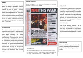
HEADER:
Overall the magazine is very conventionally coloured and laid out as
The header conveys NME’s logo, so many
according to previous issues of NME. THE LAYOUT:
readers will be able to realise who produced
the magazine, it also adds consistency to the The layout of the magazine is very conventional
magazine. It gives the reader a constant to many other NME contents pages. The layout
reminder of the name of the magazine so if is very clear because everything is sectioned off
they are new to the magazine they could easily allowing the reader to know what story/caption
research into it. Moreover it is a very clever goes with what header/title. The content page
way of making the contents page young and only has one main story which is clearly
current, as the header reads ‘NME THIS WEEK’ sectioned and expressed this is shown through
and not just reading ‘CONTENTS’, this form of the use of no other images apart from the ones
header gives something new to the magazine, chosen for the main story.
giving it a new edge.
MAIN FEATURES:
One of the persistent features I see to
COLOUR PALETTE: consistently occur on NME content pages is the
band index, the band index is a useful feature
The colour palette again follows the because if a reader saw bands they liked it may
conventional house colours of NME red, black, influence them to buy the magazine to look up
white and yellow/gold, the conventional use of on it.
colour keeps consistency and follows
throughout the magazine. The colour palette is
used effectively to contrast certain words in
this case, it enforces ‘NME This Week’ to stand
out. It also ensures that the main story stands
out and captures the readers eye by using the SOCIAL GROUPS:
colour black and ensuring that the headline is
in bold. The use of bold and vibrant colour is It is obvious that this magazine is not aimed at
associated with the type of life-style the urban or the pop genre, this is clearly shown
readers are assumed to have, as readers are WRITING STYLE: though the colour scheme, layout and the
assumed to be flamboyant and out-going images.
people. The writing style is colloquial to the social group, written in slang
and easy terms so that the target audience would understand. You
can clearly see that this magazine is not for high brow readers.