
Recommended
More Related Content
What's hot
What's hot (20)
Viewers also liked
Viewers also liked (17)
Similar to Question 3 feedback
Similar to Question 3 feedback (20)
Recently uploaded
Recently uploaded (20)
Question 3 feedback
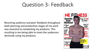
- 1. Question 3- Feedback Receiving audience and peer feedback throughout both planning and production stages of my work was essential to completing my products. This resulting in me being able to meet the audiences demands using my products.
- 2. Peer Feedback Receiving peer feedback during my research and planning was very important, this peer feedback helped shape my original plans, the peer feedback was both positive comments on what I was doing well, but also some constructive criticism on what I could improve on to make my magazine look a lot more professional and appealing to my target audience. Some of the positive feedback I received included good use of image styles to link with genre, also saying I have a strong theme. Some criticism that I ended up using was having a stronger link with target audience and to further develop who I wanted my target audience to be, I used this too develop a full reader profile explaining my target audience and there likes/dislikes and some general information such as age/gender.
- 3. Audience feedback The audience feedback was probably the most important thing I received when It came to how my final product looks now. I received audience feedback multiple times at different stages or research and planning and production. They almost shaped my magazine design, as I went of there like and dislikes and there general feedback and changed things accordingly, of course I still ensured I was happy with the design myself but the feedback was greatly appreciated. I started off with a more darker colour scheme of black, white and blue. This I thought at first looked very appealing, however the feedback from my audience told me that the colour scheme was possibly too dark with a black background and black backgrounds generally aren’t used very often, they said ‘keep it light and cheerful to attract a larger audience’ multiple people from my target audience said similar therefore I changed the colour scheme to white, red and black, using black for the text and white for the background ended up working massively in my favour and I am very happy with the final products of both my magazine, billboard and my website.