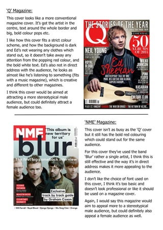
1. ‘Q’ Magazine:
This cover looks like a more conventional
magazine cover. It’s got the artist in the
centre, text around the whole border and
big, bold colour pops etc.
I like how this cover fits a strict colour
scheme, and how the background is dark
and Ed’s not wearing any clothes which
stand out, so it doesn’t take away any
attention from the popping red colour, and
the bold white text. Ed’s also not in direct
address with the audience, he looks as
almost like he’s listening to something (fits
with a music magazine), which is creative
and different to other magazines.
I think this cover would be aimed at
attracting a more stereotypical male
audience, but could definitely attract a
female audience too.
I think a cover like this is effective because
it gives the reader an insight onto what the
magazine is going to include, but I also
think it’s quite busy.
‘NME’ Magazine:
This cover isn’t as busy as the ‘Q’ cover
but it still has the bold red colouring
which could stand out for the same
audience.
For this cover they’ve used the band
‘Blur’ rather a single artist, I think this is
still effective and the way it’s in direct
address makes it more appealing to the
audience.
I don’t like the choice of font used on
this cover, I think it’s too basic and
doesn’t look professional or like it should
be used on a magazine cover.
Again, I would say this magazine would
aim to appeal more to a stereotypical
male audience, but could definitely also
appeal a female audience as well.
2. ‘V’ Magazine:
I like how the cover of this magazine is
different to other conventional music
magazine covers such as ‘NME’ or ‘Q’. It’s
got a plain grey background and white text,
but with the light up neon V in the centre,
and photo of Selena Gomez makes it look
professional but simple at the same time.
SG stands out in the cover because she
covers the page vertically from top to
bottom, making her the centre of our
attention and what were likely to see first.
I think a cover like this is effective,
especially in attracting a more female
audience, but also men. The page isn’t
crammed with information like other
magazine covers, but I don’t think that
effects it much.
‘Clash’ Magazine:
Again, this cover is slightly different to
the conventional music magazines, it
doesn’t have the bold red and black
colours and isn’t crammed with
information like others.
I like how the whole cover follows a
colour scheme of pink, white and black. It
looks very natural, and even with Rita
Ora being the model with simple make-up
and hair, makes it all match together
I think this cover would push towards
wanting to attract a female audience,
especially with the female artist on the
front and pink colour.
I think this cover is effective, even if it’s
quite simple. It looks nice and would
definitely attract people to look at it if
they saw it on a shelf in a shop.