
Recommended
More Related Content
What's hot
What's hot (17)
Similar to Media magazine covers
Similar to Media magazine covers (20)
Recently uploaded
Recently uploaded (20)
Media magazine covers
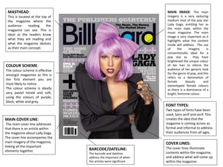
- 1. MASTHEAD: This is located at the top of the magazine where the audience reading the magazine can see. This is ideal as the readers know what they are reading and what the magazine idolises as their main concept. COVER LINES: The cover lines illuminate contents within the magazine, and address what will come up within the magazine. FONT TYPES: Two types of fonts have been used, Sans serif and serif. This creates the idea that the magazine is coming across as formal and informal to address their audiences from all ages. COLOUR SCHEME: The colour scheme is effective amongst magazines as this is the first element you are most likely to notice. The colour scheme is ideally very pastel toned and soft, using the colours of purple, black, white and grey. MAIN COVER LINE: The main cover line addresses that there is an article within the magazine about Lady Gaga. The cover line accompanies the main imagery of the magazine, linking all the important elements together. MAIN IMAGE: The main imagery is a very seducing medium shot of the pop star Lady Gaga, entitling her as the main topic within the music magazine. The main image is very important as it highlights what the content inside will address. The use of the imagery is conventionally ideal for a pop star as they have brightened the unique colour of her hair to inform the audience of her generic look for the genre of pop, and this refers to a domination of female beauty and stereotyped female colours as there is a dominance of a bright, feminine colour. BARCODE/DATELINE: The barcode and dateline address the important of when the articles were significant
- 2. MASTHEAD: This is located at the top of the magazine where the audience reading the magazine can see. This is ideal as the readers know what they are reading. COVER LINES: Mainly cover lines address issues within the magazine highlighting what content will be available to read for the audience. FONT TYPES: The font type supresses what time of magazine it will be, either formal or informal. In this case it comes across very formally as they are using fonts with serif. COLOUR SCHEME: The colour scheme normally highlights what type of magazine it will be, for example pink addresses feminism and black and white addresses modernism. Within this magazine it is specifically dark, cool blues expressing masculinity. MAIN COVER LINE: The main cover line illuminates the main topic for the audience so they can focus on what article will first be written. This cover line is quite comical and ironic, as it was around the time he left one direction. Therefore they use the pun of “Zayn Malik's Own Direction.” MAIN IMAGE: The main image addresses the content within the magazine, the example of this imagery is of Zayn Malik an artist and ex member of One Direction. The use of this image exemplifies that within the magazine, there is a main article about him. The main image is edited to come across very dark with little highlight except upon his face and tattoos, almost suggesting a back story on a new tattoo or a happening within his life since the leaving of One Direction.
- 3. MASTHEAD: The masthead is always located on the left side of the paper as the audience will begin reading from this side. COVER LINES: Cover lines are used to address ideal topics within the magazine, this helps the audience see what content is inside and whether or not it is ideal for their interests. COLOUR SCHEME: The colour scheme is based around very autumn colours for example red, orange and the blue around her eyes. The use of the blue is very intense which combines with the blue lines and bullet points next to the cover lines. MAIN COVER LINE: The main cover line is at the top of the magazine, this hints at the topic of the article about the celebrity. “Florence, Woman on edge.” this could be fallac language for the idea that her music is quite edgy and punk rock, this attracts young audiences. MAIN IMAGE: The main image takes up the whole page and they use her fiery, seductive red hair to use as a background to place everything against. This makes the magazine seem more edgy and rocky.