
Recommended
More Related Content
What's hot
What's hot (19)
Viewers also liked
Similar to Evaluation of front cover
Similar to Evaluation of front cover (20)
More from rhiannarobinson
More from rhiannarobinson (15)
Recently uploaded
Recently uploaded (20)
Evaluation of front cover
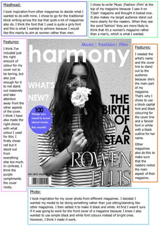
- 1. Masthead: I took inspiration from other magazines to decide what I wanted to do with mine. I chose to go for the traditional block writing across the top that quite a lot of magazines also do. I think the font that I used is quite a girly font and this is what I wanted to achieve because I would like this mainly to aim at women rather than men. I chose to write ‘Music |Fashion |Film’ at the top of my magazine because I saw it on ‘Clash’ magazine and thought it looked nice. It also makes my target audience stand out more clearly for the readers. When they see the word ‘fashion’ they are more likely to think that it’s a woman’s magazine rather than a man’s, which is what I wanted. Photo: I took inspiration for my cover photo from different magazines. I decided I wanted my model to be doing something rather than just sitting/standing like other magazines. I then edited it to make it black and white. At first I wasn’t sure if it was going to work for the front cover of a magazine because I knew I also wanted to use simple black and white font colours instead of bright ones. However, I think I made it work. Features: I think I’ve included just the right amount of colour for my cover not to be boring, but also just enough for it to not stand out massively and take attention away from the other aspects of the cover. I think I have also made the right choice with what colour I used for this. I firstly chose red but it stood out from everything else too much. In contrast, I think the purple compliments the cover nicely. Features: I needed the artist’s name and the cover line to stand out to the audience because she’s the main part of my magazine. That’s why I chose to use a block capital font and black colouring for the cover line and a fancier font in white with a black outline for her name. Other magazines also do this to make sure that the readers notice the main aspect of their magazine.