1. The Script – Science and Faith album analysis
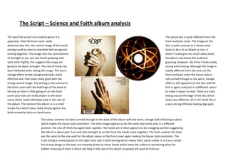
The band the script is of a hybrid genre it is The actual disc is quite different from the
pop/rock, I feel the front cover really front and back cover. The image on the
demonstrates this, the central image of the hands disc is quite unusual as it shows what
joining could be seen to resemble the two genres looks to be a lit up flower or star, it
coming together. The image also has connotations doesn’t really give too much away about
of strength as you see two hands gripping onto the album and leaves the audience
each other tightly, this suggests the songs are guessing, however I do think it looks really
going to be about strength. The rule of thirds has strong and enticing. Although the image is
been followed when taking the image. The worn, totally different from the ones on the
vintage effect on the background looks really front and back cover the house style is
effective and I feel looks really good with the still carried through as the worn, vintage
strong central image. The writing is also central to effect is still apparent on the disc and the
the front cover with the bold logo of the band at font is again used just in a different colour
the top as there is little going on on the front to make it easier to read. There is a track
cover your eyes are really drawn to the band listing around the edge of the disc which
name which could ultimately help in the sale of looks very effective. All in all I think this is
the album. The name of the album is in a small a very strong effective looking digi-pack.
simple font which looks really strong against the
bold somewhat obscure band name.
The colour scheme has been carried through to the back of the album with the worn, vintage look still being in place
which makes the house style consistent. The main image appears to be the same two hands only in a different
position, the rule of thirds has again been applied. The hands are in what appears to be a begging position suggesting
the album is about pain, hurt and also strength as on the front the hands come together. The fonts used on the back
are the same to the one used for the album name on the front cover again making the house style consistent. The
track listing is neatly placed on the right hand side in bold writing which makes them easily visible. It is a very simple
but strong design as the eyes are instantly drawn to these hands which leave the audience wondering what the
hidden meaning of them is which will help in the sale of the album as people will want to find out.