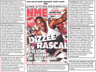
1. The header and footer show us lots of ANALYSIS OF MUSIC MAGAZINE FRONT COVER The Masthead ‘NME’ clearly stands
others artists, showing us that the type of ‘NME’ out bright from the page because of
music that this target audience likes; which
is mainly popular, iconic bands and artists. its blood red colour, making the
This shows us that this magazine is masthead the first thing the audience
usually a magazine for mainstream artists see. The font is bold and has a
and is aimed at a young readership. Also it bevelled effect to look like it is literally
comes across that it is for a younger
audience because of the slang used in ‘&
coming off the page, this is to
more’. Also ‘& more’ temps the reader to emphasise the name and show that
know all the other artists inside the this magazine is important to the
magazine. It gives the impression that it is reader. Also the colour red comes
jam packed with all there favourite artist, across as this magazine is superior
page to page. This will make them want to
buy it to get all the information. to all the other magazines as the red
portrays the fact that it is a seductive,
The main selling line anchors the exclusive and first class colour.
main image, so anyone can see who
the name relates too. Also the sans The Main Image is a mid-shot of
font goes with the theme of the article Dizzee Rascal crouching. He has a
and ironically with his name ‘DIZZEE’. happy, bouncy expression and hand
The drop shadow is wobbled so gives gesture, it is fun and eye-catching
the effect of it moving or bouncing, and appeals to the target audience of
giving the impression of him being
NME. The background also goes with
exciting. Also it goes with the fun,
vibrant theme of the magazine, with the theme of the magazine cover, as
Dizzee Rascals expression and it has black and white tiled floor with
background. Furthermore the selling splashes of red in the room. Even
line ‘I’m Spreading Joy Around The Dizzee Rascal is in theme with the
World, Man!’ also anchors the theme magazine colour scheme, like his
of fun, happiness and ‘Joy’. Overall red, black and white shoes and plain
the cover is portraying excitement and white vest top. The walls in the
fun, giving the impression that this background have graffiti and this
magazine will be too, making people portrays the target audience across
want to buy it.
too, as it shows young and
rebelliousness.
The layout used for this magazine is
the magic C, even the image, as
Dizzee is leaning his face into the
magic C lines. The cover is very fun The bar code, date/issue and price
and excitement comes across straight is out of the way of the main image
away. This suggests that the and is there because all magazines
Also the NME have used shapes to make it more appealing to there
readership is of a young age and also target audience. Again this goes with the colour theme throughout the need to have this if they want to sell
that the magazine is filled with cover. Also the slang ‘wowee zowee it’s on!’ in the shape also again copies.
interesting and exciting content. shows us that is a young audience.
2. Same theme running throughout the Title is on the top of the page to
contents as well, to keep the clearly state what the page is, also
magazine consistent, and not to lose its mimicking the masthead font,
there readers interest and excitement
makes it more consistent.
once they open the magazine. Also
the magazine has a consistent
themed font; the block letters all Date clearly on top of the contents
mimicking the masthead. This comes page, to show the reader the issue
across as a future font, with its stern number and when all this
square letters, NME may be information was from.
suggesting that they are up-to-date
with all new ‘future’ music and are at
Sub-headings to divide the pages
the forefront of all other magazines.
into certain sections. This is done to
Also NME have used as little words
as possible to read, only giving them put each page in categories, so that
a little teaser, to get the reader the reader can find things easily and
tempted to read it. also to give each sub-heading a
banner and name to catch the
The layout of the magazine again readers eye, instead of just a list of
goes with the target audience. The pages. It appeals more to the target
use of the big picture and very little audiences eyes.
text. Also the eyes are drawn to the
picture and then the paragraph, the Using the word ‘PLUS’ in a eye
use of the billboard in the centre catching red colour, also again
gives the effect of it being the most emphasises how much is in the
important part on the contents, and magazine to the reader, giving
making it a bit funky to look at. This is allusion there is more than usual.
where mainly all the main information
is, to know what's going on in this The subscription font and text
magazine.
colour is not in theme with the
magazine to distinguish from the
Different image for a different article
sub-headings, title and captions. It is
on contents to emphasise how much
done this way to get people to
is in the magazine, will get the reader
thinking the magazine is jam packed notice, and maybe subscribe up for
with lots of artist info. The readers there monthly issue. Doing this on
see other pictures and information the contents, is because the readers
and will get them interested and have already been interested about
excited on other things in the the magazine, and may just
magazine. subscribe it then.
Band Index is to make it easier for there readership to find there favourite bands and artists. Also this list of artists
again makes it looks to the target audience that it is full, page to page of artists information and gossip.