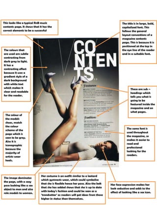
1. This looks like a typical RnB music The title is in large, bold,
contents page. It shows that it has the capitalized font. This
correct elements to be a successful follows the general
contents page. layout conventions of a
magazine contents
page. This is because it is
positioned at the top in
The colours that the eye line of the reader
are used are subtle and in a suitable font.
contrasting from
dark grey to light.
It has a
contrasting effect
because it uses a
gradient style of a
dark background
with white text
which makes it These are sub –
clear and readable headings which
for the reader. tells you what is
going to be
featured inside the
magazine and on
what pages.
The colour of
the models
shoes, match
the colour
The same font is
scheme of the
used throughout
page which is
the magazine, so
seen to be grey.
makes it easier to
Also it is
read and
iconographic
professional
because the
looking for the
majority of
readers.
artists wear
heels.
Her costume is an outfit similar to a leotard
The image dominates
which gymnasts wear, which could symbolise
the page, with a sexy
that she is flexible hence her pose. Also the belt Her face expression makes her
pose looking like a sex
that she has added shows that she is up to date look seductive and adds to the
object to men and also
with today’s fashion and could be seen as a effect of looking like a sex icon.
role models to women.
‘trendsetter’ as readers will get ideas from those
higher in status than themselves.