
Recommended
More Related Content
What's hot
What's hot (18)
Viewers also liked
Viewers also liked (17)
Similar to School Magazines
Similar to School Magazines (20)
More from passy123
Recently uploaded
Recently uploaded (20)
School Magazines
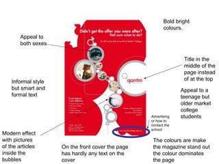
- 1. Modern effect with pictures of the articles inside the bubbles Bold bright colours. Appeal to a teenage but older market college students Appeal to both sexes Informal style but smart and formal text Title in the middle of the page instead of at the top The colours are make the magazine stand out the colour dominates the page On the front cover the page has hardly any text on the cover Advertising or how to contact the school
- 2. Big bold bright colours. To stand out Big picture showing the main article inside or showing her doing an activity to show what they offer at the school( events etc) Almost poster like Would appeal to teenagers younger teenagers Dark background to make the colours and picture stand out more The picture of the girl dominates the page Bright bold and is very eye catching Contact details directed at the students
- 3. Dark background to make the main writing and glow to stand out. Main article ( 25) is big and dominants the whole front page Masthead- the title of the magazine Target audience would be teenagers but appeal more to males than females but can attract both
- 4. Formal style appeal more to parents than the children Formal structure Simple colours and more writing than the others more informative to parents than children Simple and uncomplicated clip art with no effects Articles everywhere but still in a formal pattern The school slogan underneath the name of the school
- 5. Formal style- the font ( serif style) is formal and smart giving a smart appearance To be read by the parents more than the teenagers but can also appeal to the teenagers The people are posed neatly and smart to give an appearance of the college A big bold blue title to stand out from the background image- the masthead Old fashioned style but with a modern twist The background and the title go together very well Pictures of the activities and articles inside and real students and teachers used
- 6. Modern style-informal appeal more to the teenagers/ college students showing the magazine is for the teenagers The text is tilted to the right and then some to left. Dark background with bright images and fonts so you are able to see the subtitles etc makes them stand out more with a dark background The main contents title in a more teenager and modern style which appeals to them Pictures relate to magazine with activities and events
- 7. Very formal appeal to the parents more than the students The logo is the most dominant item on the page meaning the school is important Pictures of the activities and events with posed and not posed pictures of actual students and teachers to show what's happening The font is a formal( serif style) and would appeal to an older audience Its smart and sophisticated Colours big and bold and link with the school logo/emblem
- 8. Very formal again Emblem and school name in the middle of the page The pictures at the top of the magazine are of Princess Ann showing they are well known school as royalty has been there Colours link with the school emblem This magazine is meant for the parents to read and not the students Formal style of font serif style Pictures of students at work not posed photos but real people in them
- 9. The contents page is simple and easy to read In a formal style is meant for the teenagers or the parents to read as its about the school events It uses pictures of actual students showing it involves them in the school events Serif style font formal style and layout Not very brightly coloured just black and white The college- is the boldest item on the page and the text dominants the page more than the pictures
- 10. Basic contents page- intended to be read by the parents Formal style and layout shows the school is respectable school Serif style fonts Simple colours grey, black and white background No images of the students or school all text The text is the most dominant item on the contents page Page numbers -formal