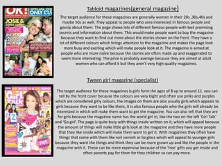
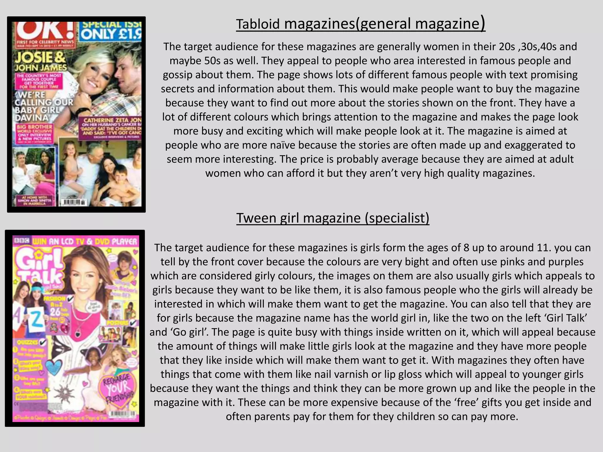
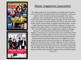
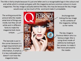
Tabloid magazines(general magazine)
The target audience for these magazines are generally women in their 20s ,30s,40s and
maybe 50s as well. They appeal to people who area interested in famous people and
gossip about them. The page shows lots of different famous people with text promising
secrets and information about them. This would make people want to buy the magazine
because they want to find out more about the stories shown on the front. They have a
lot of different colours which brings attention to the magazine and makes the page look
more busy and exciting which will make people look at it. The magazine is aimed at
people who are more naïve because the stories are often made up and exaggerated to
seem more interesting. The price is probably average because they are aimed at adult
women who can afford it but they aren’t very high quality magazines.
The target audience for these magazines is girls form the ages of 8 up to around 11. you can
tell by the front cover because the colours are very bight and often use pinks and purples
which are considered girly colours, the images on them are also usually girls which appeals to
girls because they want to be like them, it is also famous people who the girls will already be
interested in which will make them want to get the magazine. You can also tell that they are
for girls because the magazine name has the world girl in, like the two on the left ‘Girl Talk’
and ‘Go girl’. The page is quite busy with things inside written on it, which will appeal because
the amount of things will make little girls look at the magazine and they have more people
that they like inside which will make them want to get it. With magazines they often have
things that come with them like nail varnish or lip gloss which will appeal to younger girls
because they want the things and think they can be more grown up and like the people in the
magazine with it. These can be more expensive because of the ‘free’ gifts you get inside and
often parents pay for them for they children so can pay more.
Tween girl magazine (specialist)
Music magazines (specialist)
The target audience for these magazines are people from the age of
around 13/14 when teenagers become more interested in music up to
adults in there thirties but mainly young people. Most music
magazines have a specific genre of music, the two on the left are
mainly indie rock and therefore appeal to people who like that kind of
music. The gender isn’t specific because the colours used aren’t really
gender specific and the bands are popular with both genders. The key
image is bands because that’s what the magazine is all about and
appeals to the target audience. The colours are relatively bright on the
first one and the page is quite crowded which appeals to teenagers
because it is eye catching and will make them interested in the
magazine. The second on is more dull colours and is minimalistic which
would appeal to an older audience who are more mature. It also only
shows the one main band featured which will mean people who like
that band will be interested, however the first magazine has more
bands included written around the outside so it will appeal to more
people who like those bands. On both magazines the band names are
made bold and stand out because that is the main reason why people
buy the magazine and they want them to be noticeable so people who
like the bands will buy the magazine. The price isn't overly expensive
because its often teens buying the magazine who cant afford to spend
much on it.
The magazines on the mood board are all music magazines which is the type
of magazine I am choosing to make. I also chose magazine covers featuring
artists which are similar to artists I want to feature in my magazine
(indie/alternative). My favourite magazine cover is the DIY one because it is
quite minimalistic compared to the others which I think makes it look more
expensive and high end. I also like the covers of NME and The Clash because
they have slightly more information on what’s inside the magazine than DIY
but they don’t look too crowded and busy. I think my magazine will be in
between the style of DIY and NME. I have also noticed the colour red is quite
common in music magazines and the title font is normally thick bold capital
letters and sans serif rather than tall, thin serif fonts used in fashion
magazines. They would mainly appeal to teenagers between the ages of 13
and 19 and both genders because the artists featured and the magazine style
isn’t gender specific. They would be priced from around £2 to £5 so they are
still affordable since the age group wouldn’t be earning a high amount of
money.
Genre conventions.
Colour palettes
The magazine uses a pale blue background in a
block colour. You can tell it has been designed to
coordinate with the key image as the blue looks
good with the red hair. The text is just white which
means there aren’t too many bright colours. It
slightly breaks the conventions of music
magazines as blue isn’t usually used and NME
often features more red colours but they changed
it to suit the key image.
The colours on the magazine are quite girly which
goes with the female key image. The text is white
which keeps the cover looking simple and
minimalistic. The pink background goes with the
pink hair of the girl in the key image.
The colours on this magazine make it easy to
recognise as a music magazine because red, white
and black are very common colours used by music
magazines like NME, Q and Rolling Stone. The
background is quite bold as it is all bright red so
the writing is just black and white to make it look
more simple. The colours go with what the people
in the key image are wearing and the colours red
white and black are often related to the band on
the cover.
The colours on this magazine are very common
colours for music magazines. The background
has a lot of writing on it in different red and
black which could make it look quite busy but
the simple pale colours featured in the key
image balance it out.
These colours are aesthetically pleasing and are
considered girly colours. The use of girly
colours co-ordinates with the female key
image. The colours are pastel which is
something people associate with the artist on
the cover. The text is plain white to keep the
magazine looking minimalistic.
The colours in this magazine all go with the
theme of the American flag which is red white
and blue. The text is in a light blue or white
which compliments the colours of the flag. I
think although a lot of colours are used it
doesn’t look to busy and they work well
together.
Audience profile
My target audience will be males between the age of 14 and 20 who enjoy indie /
alternative music. since most will be unemployed students or have a job but not
earning a lot of money I’ve decided my magazine will only be £2.00. The magazine
will be published every two weeks and will be about 55 pages long. I think I will
use bright colours on a white background so it stands out but isn’t too over the
top. It will include articles about music festivals and new albums.
Name: Ollie Jackson
Age: 16
Favourite bands/artists: Drenge, FIDLAR, Slaves, Mac Demarco
Occupation: unemployed student
Clothing style: vans, band tops, tartan shirts, light denim jeans turned up
Name: Eloise Smith
Age: 18
Favourite bands/artists: Swim Deep, Peace, Palma violets, Foals
Occupation: works weekends at Starbucks
Clothing style: vintage dresses, oversized jumpers, doc martens, denim
Although the magazine is targeted at males, people mainly buy it for the bands
featured so females similar to this may also buy the magazine.
I can use these audience profiles to design my magazine based on
the bands and style like as well as base the price of the amount of
money they make.
UK tribes
From looking at the UK tribes website I have
decided that my magazine will be targeted at
‘Indie Scenesters’ from the leading edge
category. I chose that specific group because
they are interested in finding new alternative
music which is what I want to be featured in my
magazine. I have decided to feature artists like
Rat Boy and Palma Violets as they are relatively
new bands that have recently started gaining
popularity.
Survey results
Link to my survey: https://www.surveymonkey.com/r/XSTFPCW
There was a relatively equal
amount of responses from
girls and boys, however there
where more two more boys
than girls. This is good
because my magazine is
mainly going to be targeted at
males however there will be
some aspects that appeal to
females as well.
The ages shown here are
between 15 and 18 which is
good because my target
audience is people between
the ages of 14 and 20.
almost all of the results
where in this range a part
from a few which where just
one or two years
older/younger.
As the chart above shows
nobody chose less than a
pound. £3 was chosen the
most and £4 was the second
most chosen. I’ve decided to
make my magazine £3 so it’s
affordable for my target
audience who might not be
earning money and can’t afford
an expensive magazine.
Most people said they find bright
colours the most appealing. The
second most popular choice was
dark colours so I’ve decided to
choose a blue theme for my
magazine as I can use both bright
shades of blue and dark shades.
65% of people chose indie/
alternative as their favourite genre
of music which works well as that is
the genre I was planning to base my
magazine on. This means quite a lot
of people will be interested in the
bands in my magazine and therefore
want to buy it.
This Is useful because most of these artists fit the genre of my magazine and I
can use this research to help choose band names to put on the cover so that
my target audience want to buy the magazine.
This shows most people want either gig
reviews and picture or new artists in a
music magazine. This will be helpful when
I’m deciding what to put on my contents
and double page spread.
This shows the majority of people would
prefer both genders or males on the
cover which supports that my target
audience is mainly males but still
appealing to both genders.
More people prefer minimalistic
covers which will be helpful when
designing the cover. I can use
magazines like DIY for inspiration as
it is also minimalistic.
First draft of the magazine cover Final magazine cover
First draft of the contents page Final contents page
First draft of the double page spread
Final double page spread

Magazine research

  • 1.
    Tabloid magazines(general magazine) Thetarget audience for these magazines are generally women in their 20s ,30s,40s and maybe 50s as well. They appeal to people who area interested in famous people and gossip about them. The page shows lots of different famous people with text promising secrets and information about them. This would make people want to buy the magazine because they want to find out more about the stories shown on the front. They have a lot of different colours which brings attention to the magazine and makes the page look more busy and exciting which will make people look at it. The magazine is aimed at people who are more naïve because the stories are often made up and exaggerated to seem more interesting. The price is probably average because they are aimed at adult women who can afford it but they aren’t very high quality magazines. The target audience for these magazines is girls form the ages of 8 up to around 11. you can tell by the front cover because the colours are very bight and often use pinks and purples which are considered girly colours, the images on them are also usually girls which appeals to girls because they want to be like them, it is also famous people who the girls will already be interested in which will make them want to get the magazine. You can also tell that they are for girls because the magazine name has the world girl in, like the two on the left ‘Girl Talk’ and ‘Go girl’. The page is quite busy with things inside written on it, which will appeal because the amount of things will make little girls look at the magazine and they have more people that they like inside which will make them want to get it. With magazines they often have things that come with them like nail varnish or lip gloss which will appeal to younger girls because they want the things and think they can be more grown up and like the people in the magazine with it. These can be more expensive because of the ‘free’ gifts you get inside and often parents pay for them for they children so can pay more. Tween girl magazine (specialist)
  • 2.
    Music magazines (specialist) Thetarget audience for these magazines are people from the age of around 13/14 when teenagers become more interested in music up to adults in there thirties but mainly young people. Most music magazines have a specific genre of music, the two on the left are mainly indie rock and therefore appeal to people who like that kind of music. The gender isn’t specific because the colours used aren’t really gender specific and the bands are popular with both genders. The key image is bands because that’s what the magazine is all about and appeals to the target audience. The colours are relatively bright on the first one and the page is quite crowded which appeals to teenagers because it is eye catching and will make them interested in the magazine. The second on is more dull colours and is minimalistic which would appeal to an older audience who are more mature. It also only shows the one main band featured which will mean people who like that band will be interested, however the first magazine has more bands included written around the outside so it will appeal to more people who like those bands. On both magazines the band names are made bold and stand out because that is the main reason why people buy the magazine and they want them to be noticeable so people who like the bands will buy the magazine. The price isn't overly expensive because its often teens buying the magazine who cant afford to spend much on it.
  • 6.
    The magazines onthe mood board are all music magazines which is the type of magazine I am choosing to make. I also chose magazine covers featuring artists which are similar to artists I want to feature in my magazine (indie/alternative). My favourite magazine cover is the DIY one because it is quite minimalistic compared to the others which I think makes it look more expensive and high end. I also like the covers of NME and The Clash because they have slightly more information on what’s inside the magazine than DIY but they don’t look too crowded and busy. I think my magazine will be in between the style of DIY and NME. I have also noticed the colour red is quite common in music magazines and the title font is normally thick bold capital letters and sans serif rather than tall, thin serif fonts used in fashion magazines. They would mainly appeal to teenagers between the ages of 13 and 19 and both genders because the artists featured and the magazine style isn’t gender specific. They would be priced from around £2 to £5 so they are still affordable since the age group wouldn’t be earning a high amount of money. Genre conventions.
  • 10.
    Colour palettes The magazineuses a pale blue background in a block colour. You can tell it has been designed to coordinate with the key image as the blue looks good with the red hair. The text is just white which means there aren’t too many bright colours. It slightly breaks the conventions of music magazines as blue isn’t usually used and NME often features more red colours but they changed it to suit the key image. The colours on the magazine are quite girly which goes with the female key image. The text is white which keeps the cover looking simple and minimalistic. The pink background goes with the pink hair of the girl in the key image. The colours on this magazine make it easy to recognise as a music magazine because red, white and black are very common colours used by music magazines like NME, Q and Rolling Stone. The background is quite bold as it is all bright red so the writing is just black and white to make it look more simple. The colours go with what the people in the key image are wearing and the colours red white and black are often related to the band on the cover.
  • 11.
    The colours onthis magazine are very common colours for music magazines. The background has a lot of writing on it in different red and black which could make it look quite busy but the simple pale colours featured in the key image balance it out. These colours are aesthetically pleasing and are considered girly colours. The use of girly colours co-ordinates with the female key image. The colours are pastel which is something people associate with the artist on the cover. The text is plain white to keep the magazine looking minimalistic. The colours in this magazine all go with the theme of the American flag which is red white and blue. The text is in a light blue or white which compliments the colours of the flag. I think although a lot of colours are used it doesn’t look to busy and they work well together.
  • 13.
    Audience profile My targetaudience will be males between the age of 14 and 20 who enjoy indie / alternative music. since most will be unemployed students or have a job but not earning a lot of money I’ve decided my magazine will only be £2.00. The magazine will be published every two weeks and will be about 55 pages long. I think I will use bright colours on a white background so it stands out but isn’t too over the top. It will include articles about music festivals and new albums. Name: Ollie Jackson Age: 16 Favourite bands/artists: Drenge, FIDLAR, Slaves, Mac Demarco Occupation: unemployed student Clothing style: vans, band tops, tartan shirts, light denim jeans turned up Name: Eloise Smith Age: 18 Favourite bands/artists: Swim Deep, Peace, Palma violets, Foals Occupation: works weekends at Starbucks Clothing style: vintage dresses, oversized jumpers, doc martens, denim Although the magazine is targeted at males, people mainly buy it for the bands featured so females similar to this may also buy the magazine. I can use these audience profiles to design my magazine based on the bands and style like as well as base the price of the amount of money they make.
  • 14.
    UK tribes From lookingat the UK tribes website I have decided that my magazine will be targeted at ‘Indie Scenesters’ from the leading edge category. I chose that specific group because they are interested in finding new alternative music which is what I want to be featured in my magazine. I have decided to feature artists like Rat Boy and Palma Violets as they are relatively new bands that have recently started gaining popularity.
  • 15.
    Survey results Link tomy survey: https://www.surveymonkey.com/r/XSTFPCW There was a relatively equal amount of responses from girls and boys, however there where more two more boys than girls. This is good because my magazine is mainly going to be targeted at males however there will be some aspects that appeal to females as well. The ages shown here are between 15 and 18 which is good because my target audience is people between the ages of 14 and 20. almost all of the results where in this range a part from a few which where just one or two years older/younger. As the chart above shows nobody chose less than a pound. £3 was chosen the most and £4 was the second most chosen. I’ve decided to make my magazine £3 so it’s affordable for my target audience who might not be earning money and can’t afford an expensive magazine.
  • 16.
    Most people saidthey find bright colours the most appealing. The second most popular choice was dark colours so I’ve decided to choose a blue theme for my magazine as I can use both bright shades of blue and dark shades. 65% of people chose indie/ alternative as their favourite genre of music which works well as that is the genre I was planning to base my magazine on. This means quite a lot of people will be interested in the bands in my magazine and therefore want to buy it.
  • 17.
    This Is usefulbecause most of these artists fit the genre of my magazine and I can use this research to help choose band names to put on the cover so that my target audience want to buy the magazine.
  • 18.
    This shows mostpeople want either gig reviews and picture or new artists in a music magazine. This will be helpful when I’m deciding what to put on my contents and double page spread. This shows the majority of people would prefer both genders or males on the cover which supports that my target audience is mainly males but still appealing to both genders. More people prefer minimalistic covers which will be helpful when designing the cover. I can use magazines like DIY for inspiration as it is also minimalistic.
  • 19.
    First draft ofthe magazine cover Final magazine cover
  • 20.
    First draft ofthe contents page Final contents page
  • 21.
    First draft ofthe double page spread
  • 22.