Media Magazine Cover Analysis
•Download as PPTX, PDF•
1 like•330 views

My Media Magazine Cover Analysis for my preliminary task in Media A-Level

Recommended
More Related Content
Viewers also liked
Viewers also liked (16)
Similar to Media Magazine Cover Analysis
Similar to Media Magazine Cover Analysis (20)
Recently uploaded
Recently uploaded (20)
Media Magazine Cover Analysis
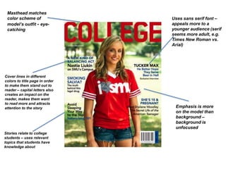
- 1. Masthead matches color scheme of model’s outfit - eye- catching Cover lines in different colors to title page in order to make them stand out to reader – capital letters also creates an impact on the reader, makes them want to read more and attracts attention to the story Emphasis is more on the model than background – background is unfocused Stories relate to college students – uses relevant topics that students have knowledge about Uses sans serif font – appeals more to a younger audience (serif seems more adult, e.g. Times New Roman vs. Arial)
- 2. House theme consistent with text (masthead and brand identity synonymous with “Seventeen” magazine) Use of bright colours and bold text, as well as different shape textbox – stands out and makes reader want to read more to find out how to win the prize Title matches house style with smaller writing in what seems to be another aspect of house style Colour scheme matches student (pink on nails and lipstick, yellow bag) – as well as this colours are more feminine (pink and pastel yellows), meaning it appeals more to a female audience than to a male audience Uses serif and sans serif font – appeals to a wider audience (13-19 year old female) Model is smiling and in a laid-back pose – shows approachability and is appropriate for audience as she looks friendly – however, wearing lots of makeup so could give younger audiences false hope/impressions of how to look
- 3. Use of graphics to show audience what other articles can be found in magazine – slightly translucent, meaning that background can still be seen behind graphic. As well as this, use of a secondary color shows that it is a school magazine aimed at both teens and parents. Model positioned more to the side on cover, although background is not in focus – could suggest that although she is potentially an important person in the magazine, the background gives the audience an idea of a school environment. Use of sans serif font appeals to teenagers and younger students, as it looks slightly cartoonish and down-to-earth, appealing to this niche audience. Use of serif font here appeals more to parents, and story detail seems as though it is more suitable for parents hoping to send their child to the school. As well as this, the way it is presented suggests that it could be an exclusive in the magazine, as the Mayor of Cheltenham is an important person in the eyes of the community. Magazine contents are varied, appealing to both students (Turner piece suggests how a student will potentially celebrate results, and the teenage stress section ) and parents (the “New to School” section and the GCSE results section). As well as this, the healthy cooking guide can be used by parents and students alike.
- 4. Plain gradient background gives more attention to model – shows that model is the main focus point on the page Use of different shapes makes article title below stand out to audience, as well as matching color scheme used for text Banner clearly marks out publication intentions, as well as keeping with the house style – consistency, showing that it is for the use of this school Model not looking at camera with arms folded – possibly trying to appeal to audience by looking “cool” Small photos of new SF center – appeals to audience by giving them an idea of what they are going to be seeing, and a small example of the feature in the magazine, meaning they will want to read more for that reason Font looks like handwriting – matches purpose as a school magazine and links to audience as well for this reason