Model Call Girl in Bikash Puri Delhi reach out to us at 🔝9953056974🔝
Contents page analysis
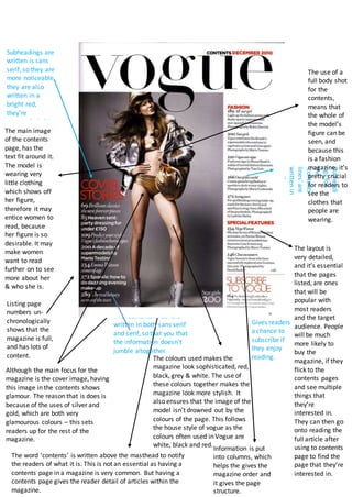
1. Subheadi
ngsfor
the
‘contents
lines’are
writtenin
serifas
wellas
italicsto
givea
more
sophistica
tedlook.
The ‘contents lines’ are
written in both sans serif
and serif, so that you that
the information doesn’t
jumble altogether.
The colours used makes the
magazine look sophisticated, red,
black, grey & white. The use of
these colours together makes the
magazine look more stylish. It
also ensures that the image of the
model isn’t drowned out by the
colours of the page. This follows
the house style of vogue as the
colours often used in Vogue are
white, black and red.
Gives readers
a chance to
subscribe if
they enjoy
reading.
The use of a
full body shot
for the
contents,
means that
the whole of
the model’s
figure can be
seen, and
because this
is a fashion
magazine, it’s
pretty crucial
for readers to
see the
clothes that
people are
wearing.
Although the main focus for the
magazine is the cover image, having
this image in the contents shows
glamour. The reason that is does is
because of the uses of silver and
gold, which are both very
glamourous colours – this sets
readers up for the rest of the
magazine.
The layout is
very detailed,
and it’s essential
that the pages
listed, are ones
that will be
popular with
most readers
and the target
audience. People
will be much
more likely to
buy the
magazine, if they
flick to the
contents pages
and see multiple
things that
they’re
interested in.
They can then go
onto reading the
full article after
using to contents
page to find the
page that they’re
interested in.
Listing page
numbers un-
chronologically
shows that the
magazine is full,
and has lots of
content.
The main image
of the contents
page, has the
text fit around it.
The model is
wearing very
little clothing
which shows off
her figure,
therefore it may
entice women to
read, because
her figure is so
desirable. It may
make women
want to read
further on to see
more about her
& who she is.
Information is put
into columns, which
helps the gives the
magazine order and
it gives the page
structure.
The word ‘contents’ is written above the masthead to notify
the readers of what it is. This is not an essential as having a
contents page in a magazine is very common. But having a
contents page gives the reader detail of articles within the
magazine.
Subheadings are
written is sans
serif, so they are
more noticeable,
they are also
written in a
bright red,
they’re
extremely bold.