
Recommended
More Related Content
What's hot
What's hot (20)
Viewers also liked
Viewers also liked (13)
Similar to SPIN Magazine Contents Page Appeals with Young Model and Music Focus
Similar to SPIN Magazine Contents Page Appeals with Young Model and Music Focus (20)
Recently uploaded
Recently uploaded (20)
SPIN Magazine Contents Page Appeals with Young Model and Music Focus
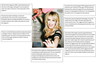
- 1. Unusually,thiscontentspage forSPIN magazine doesnot state the word ‘contents’onthe page.The fact that they have done thismakesthe magazine more individualand unique asit’sgoingagainstconvention.Thismayappeal to the audience asit isa change fromthe ordinary. The quote on the top righthand of the page isfrom the model usedinthe image.The quote talksaboutthe artist’slove formusic.Thissuggeststhatthe magazine is music-orientated,andinvitespeople whoalsolove,music to keepreading. The model inthe image isquite youngandattractive, whichwouldappeal tomenbecause theyare interestedin attractive women.Also,the factthatshe is quite young alsowouldbe appealingtogirlsbecause she presentsa goodrole-model image.She isstoodinaplayful pose asif she isabout to hitthe readerwithher pinkguitar, howevernotaggressively.She isalsogivingdirectaddress to the readerwhichmakesthe readerfeel asif she is actuallyaddressing/beingplayful withthem.The model’s hair isquite messybutstylish,whichsuggeststhatshe maybe has a bitof a ‘devil maycare’attitude butisstill in style.Hersmile isalsoinvitingasitlightensupthe direct address. The prop the model isholdingisasmall pink guitar/ukulele.The colourpinkisassociatedwith friendship,affectionandapproachability.Thiscreatesa friendlyinvitationtothe readersandaudience toread the magazine. The model inthe image has a shadowbehindherdue to the lightingduringthe photoshoot.Thishascreatedthe effectof makingthe model lookasif she isin the foreground,bringingmore attentiontoher.Also,the backgroundisplainwhichbringsmore attentiontoboth the model andthe writing. The title of the magazine ‘SPIN’ispositionedatthe top leftcornerof the page.Althoughitisnotverybig,the colourred makesitstandout, informingreadersof the magazine. There isa listof the featureswhichinclude artistnames and page numbers,makingiteasyforreadersto find whattheywant. The style ismore boldandformal than the rest of the page,possiblysoitdoesn’tlooktoo informal altogether.
- 2. Theyhave usedreference tothe celebrityJustinBieberin thisquote fromthe model,JacobyShadd.The reference to thisothercelebritywillattractfansof JustinBieberand entice themtobuyand read the magazine. The magazine title ‘RockSound’iseditedtocome outof the marginof the box on the leftto make the contents page lookslightlyless organized,goingalongwiththe theme of messy‘rockn roll’. Basedon the namesof the artistson the ‘MainFeatures’ section,itiseasyto tell thatthismagazine isfocusedon the rock genre of music.This isbecause bigartistssuchas Papa Roach andSlipknotare featured.Also,byputtingthe page numbersof each of the featuredartistsup,thislets fansof the artistknowwhere inthe magazine theywill findthe relatedarticle.Thisattractsfansof those artiststo buythe magazine. The model usedportraysa ‘rock-y’image.The visible tattooson hischestreveal tothe readerthathe has a rebellious‘badboy’side,whichappealstofemalesasthey mightbe attracted to thiskindof image. Histop isalso dirtyand stainedwhichsuggestshe islivingawildand care-free lifestyle,muchlike howthe stereotypical rock star does.He also hastattoos onhis face whichare un- conventional andattractattentionfrombothwomenwho are attractedto that and alsofansof tattoos.He hasa confused/questioningexpressiononhisface,whichlinks to the quotedcaptionbelow,whichstartswith‘Hmmm…’, whichissupposedtobe the model thinking.The model is alsogivingdirectaddresstothe readers. The colour scheme usedisa lightblue andwhite.Light blue isassociatedwithfeelingsof melancholyandcalm, and so althoughthisisa rock magazine,the colourscheme ispresentingittoappearlessedgythansomeone might expectarock magazine to look.
- 3. s There isa woman’shandcomingoverhisshoulder, grabbingKanye’sheartwhichishighlightedinredwithher hand.The connotationof thisisthat womenwanthim makinghimseemlike adesirable andattractive man. The colourred onthe heartisalso associatedwithlove and romance,whichsuggeststhatthe star may getpersonal in hisfeature,whichenticesreadersasitoffersanexclusive. The title ‘CONTENTS’isinthe top thirdof the page, attractingthe reader’sattentionandinformingthemthat thisisthe contentspage. Itis alsowritteninthe boldest and largestfontonthe page,furtherattractingthe reader’seye toit. There isa clearlylabelledsectionforthe ‘Features’list on the right whichissmall buteasyenoughtosee.The font changesinsize and style,connotingthatthismagazine is maybe more unique thanothers. There isalso a labelledsectionforthe ‘Fashion’articleson the bottomright of the page.This will appeal tomembers of the audience whoare lessinterestedinmusicandmore infashion. The model isKanye West,a rap artist,howeverthe colour scheme usedisblackand white andhe isdressedin smart-casual clotheswhichisdifferenttohisusual style. The connotationthisgivesisthat hisfeature inthis magazine will be more seriousandformal insteadof informal like hisusual stuff. Also,the factthatthe backgroundisveryplaindrawsmore attentiontothe model andwritingonthe page. The placementof the ‘V’(Vogue) logointhe background givesthe contentspage anabstract look,as well asmaking people notice itonthe page.Thisenticesreaderstothe magazine brandand notjustthe stories/pictures. The size and style of the font inthe featuressectionis verysmall andquite feminine.Bydoingthis,more attentionisdrawnto the image andthe masthead.