Web Form Automation for Bonterra Impact Management (fka Social Solutions Apri...
Irn bru research
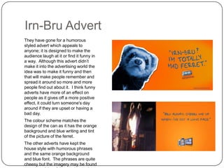
1. Irn-Bru Advert
They have gone for a humorous
styled advert which appeals to
anyone; it is designed to make the
audience laugh at it or find it funny in
a way. Although this advert didn‟t
make it into the advertising world the
idea was to make it funny and then
that will make people remember and
spread it around so more and more
people find out about it. I think funny
adverts have more of an effect on
people as it gives off a more positive
effect, it could turn someone's day
around if they are upset or having a
bad day.
The colour scheme matches the
design of the can as it has the orange
background and blue writing and tint
of the picture of the ferret.
The other adverts have kept the
house style with humorous phrases
and the same orange background
and blue font. The phrases are quite
cheesy but the imagery may be found
2. Irn-Bru Advert
The top advert is using the colour scheme
again with the balloons but the text on them
is not as bold and formal as the original font
on the product itself. The balloons are the
main focus of the image as they stand out
the most and it also includes the slogan on
“irn-bru gets you through” which is quite
catchy as it rhymes. It is the sort of small
catchy phrase you can get stuck in your
head which is a good advertising technique
to get people to remember the brand. The
text doesn‟t explain what it is implying it will
“get you through” but it could be aimed at
getting you through the day which could
also imply to buy one everyday.
The text it the bottom advert is very informal
but it is using Scottish language in a way to
stay with the fact that it was made in
Scotland. The colour scheme has changed
to go with the flavour of the drink which
according to the advert hot and fiery. The
orange has got darker and the blue has
changed to black. The red represents the
3. Irn-Bru Design
The colour scheme is blue and
orange with a silver outline of a man.
The text is bold and all in higher case
letters to stand out. It is also outlined
with a black line. The two colours put
together are almost completely
recognizable which is good for the
brand. The orange comes from to
colour of the drink which is orange so
it matches. The same design is kept
throughout every sized can and bottle
to make sure the audience
recognises the brand. The sugar free
version of the drink doesn‟t have the
orange on the can but the rest of the
can detail is the same as the regular
can. The irn-bru 32 can colours are
turned around as it has a blue
background with some orange and
silver text. It also says “New” on it to
grab peoples attention and might
make people want to try it.
4. Red Bull Advert
This advert is very different to Irn-Bru
adverts as it is showing something a bit
more extreme. It shows a skateboarder in
the air almost reaching the top of the big
height measurer which is supposed to link
in with the quote at the bottom of the page.
It say “make it to the top” and it shows the
man in the air practically making it to the
top. It is implying that if you drink Red Bull
you will make it to the top and be able to
push your own limit. The plane in the air is
there to show how high he is going, planes
obviously fly high in the sky and it is
showing the skateboarder near the plane in
the air which makes the people think he is
really high in the air. Red Bull‟s slogan “It
gives you wings” is not used in this advert
but a lot of people are aware of Red Bull
adverts and know the slogan and can apply
it to this advert as the man is in the air with
a plane; it is like he is flying with the plane
in the air.
The colour scheme is basic as it only has
the red text and the Red Bull logo. There is
also some light grey writing under the quote
which says the name of the athlete and
“2007 X Games Gold Medallist” which is
good as it uses a professional athlete to
represent the brand which could imply if you
5. Monster Advert
This advert is presenting the drink more
unlike the Red Bull advert. It is quite basic
in a way but the colours and fonts used
make it look quite exciting and crazy. The
font links up well with the brand name
Monster and so does the colours scheme,
bright green and black. The three stripes
look like a monster has clawed the can
which links with the name of the brand
again. It says “Unleash the Beast” which
could imply when you drink it you become a
monster. It doesn‟t imply that you are going
to become evil it comes off in a good way
as it could mean you are releasing a side of
yourself you have never seen before as it is
an energy drink so you become energetic
and it gives you that boost. The posters
also includes some ingredients to make it
look good, they are also being honest which
could attract an customers because if they
are putting their ingredients on the adverts
then they have nothing to hide.
The can is lit up by the green glow in the
background to bring peoples attention to it
so it catches their eyes.
6. Lucozade Advert
This is probably an advert to do with the
World Cup as it is saying “Giving England
an Edge” and it is a man playing football.
This is a very stylised advert and very
edited with the lions in the clouds and the
Lucozade bottle looking like a flame coming
from the football. It makes it look like he
has kicked the ball with some power and it
is going so fast it is on fire and having it in
the shape of the Lucozade bottle implies
that he drank Lucozade to do this, the drink
has given him energy to do this. The three
lion in the sky are the lions on the England
football shirts and it has made them look
aggressive so if the opposition saw this
advert they would be afraid to face England
in a football match. The lions link up with
the text “Giving England an Edge” which
could attract an audience of big football
fans. The fact that there is a storm could
give off an effect of England are bringing a
storm to the football world.
The colour scheme is very dark but the man
in white really stand out to make him look
like the important one. The text is also white
and bold to stand out against the black
background. The Lucozade bottle on the
ball really stands out as it is the brightest
thing in the advert which is important as it
7. Powerade Advert
This is another World Cup advert but
Powerade are the brand promoting it. It
shows the man becoming more athletic as
the drink is sprayed around him which is
implying that if you drink Powerade you will
become more energetic and athletic. Also it
says “to hydrate 2010 FIFA world cup”
which links to the change in the ground as it
goes from dirt to grass as the drink is
sprayed out of the bottle because it is also
hydrating the ground making the grass
grow.
The sky goes darker in the right corner
because then the man and the drink around
him stand out more. The text still stands
out against the light background even
though it is a white font. Most of the font is
white but stand out against the black/dark
green background. “Chosen by FIFA” is it
bold writing to promote FIFA more and also
to show it off because FIFA chose it
themselves as the drink for the world cup.
8. Red Bull Product
There are four different types of Red Bull
energy drink and they all have different
designs and the normal Red Bull cans are
known to be smaller than other energy
drinks. The original design is very
recognisable nowadays with the blue silver
and red colour scheme. The font is mainly
red on every can design especially on the
actual “Red Bull” font. The can with the
most red on it is the Red Bull Cola but all
the others are mainly blue and silver. The
Sugar free version has a lighter blue to
maybe imply the drink is actually lighter as it
doesn‟t have any sugar in. The cola design
is the only different one to the rest but that
may be because it is a different flavour.
The smaller can is the energy shot but it
has the same design as the original can but
smaller.
The Red Bull logo is always on the can,
normally in the middle where all the colours
meet apart from Red Bull cola with the
completely different can design.
9. Monster Products
Monster cans all have the logo on the can
in the same place so in that way the design
is the same. The colours of the logo
change depending on what flavour it is.
Some of the backgrounds change from the
normal black to the messy colours with the
black logos, it is like they have swapped the
logo and background colours around, the
ones on the bottom image are these types
of cans and are flat with different
flavours, sort of like a special edition. They
change the can designs to let people know
what flavours they are for example people
will always know which one is the original
because that one was the flavour they first
released which is the regular energy drink
flavour and has the green logo.
10. Lucozade Products
Again they changed the design of the
product depending on what flavour it is.
They also change the type of bottle, the
images at the top are flat drinks and
labelled „Sport‟ whereas the bottom image
are fizzy drinks labelled „Energy‟ so they
change the type of bottle to what type of
drink it is. The designs on the bottles
change as well as the font size changes
and there is more imagery on the bottom
image. The bottle tops are also different as
the ones at the top stay blue even if the
flavour is different but the bottle tops of the
bottom image change to what flavour it is so
the tops match the design on the bottle.
11. Powerade Products
The bottle of the normal one is quite basic
with white font and black background but
the zero sugar version is just the same but
the colours have reversed and the bottle top
is white not black like on the normal ones.
These drinks are quite recognisable
because of the fact they don‟t have a lot of
a design on it. Most of the bottle you can
see the drink and they are brightly coloured
so they catch peoples eyes more than the
packaging. The text is bold and clear for
people to read.
12. Comparing
They are all different from each other but have many similarities in designs on how it changes if the flavour is
different or it is a sugar free version. All the products designs are different and have different layouts on the
can. Monster energy drink is the most abstract and eye catching as it is the most colourful, all the others are
quite plain but still have the ability to attract customers.
Irn-Bru adverts are a lot more humorous than all the other brands. All the other brands adverts are serious
and not so humorous. They focus on representing sports because they based their sponsorship around
professional athletes so they try to make their adverst sporty and athletic.