
Recommended
More Related Content
Similar to Parlour Process Book
Similar to Parlour Process Book (20)
Recently uploaded
Recently uploaded (20)
Parlour Process Book
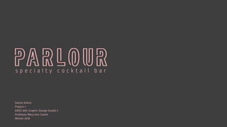
- 1. Danny Askins Project 1 GRDS 400: Graphic Design Studio 2 Professor Mary Ann Casem Winter 2018
- 2. CONTENTS Creative Brief Logo Development Packaging Development Website Development Menu Development Final Deliverables
- 3. ICE CREAM'S MORE FUN AFTER DARK Many people grew up with a sweet tooth for ice cream. We all have our favorite flavors, toppings and memories associated with this beloved desert. As adults, many of those childhood qualities start to fade and we sometimes forget how to have fun and indulge a little bit. Don’t you think its time we change that up a bit ?
- 4. SITUATIONAL OVERVIEW For this project, students were instructed to create a project of their own that consisted of multiple components that worked together as a complete system. My idea was to create a fictional cocktail lounge that specialized in alcoholic ice creams and other deserts. I chose to use Chicago as its home city because of it rich culture and diverse residence. I wanted to create a sophisticated space where adults can once again indulge as they did as kids, in a more fun and upscale way.
- 6. PROPOSAL OUTLINE For this project, I wanted to create a brand that would stand out from the crowd and offer a new bar experience that would be able to elevate itself from the busy marketplace. Bars come in all shapes and sizes and offer many different experiences from one to the other. I would like to create a space in which people remember and come back for more. I am looking to create a bar that specializes in alcoholic ice creams, sorbets, and snow cones along with traditional cocktails. I would like the space to be sophisticated with a few quirks here and there bringing feelings of comfort, community, and fun. I would like to create a brand identity that is playful yet sophisticated as to not create a child- like environment for alcoholic deserts. I want to provide a relaxed comfortable space for adults to unwind and enjoy the sweet things in life. PROJECT RESEARCH I will start my research by first looking for spaces that I feel embody a sense of modern sophistication and comfort with nice materials and polished interior design that reflect the mood I am going for. I will research the competitor marketplace to see what is already being done and how to improve upon that. I will also pay close attention to my target audience which will have a great impact on how the brand is developed. I will also research interesting ways in which to create a well-rounded experience for the visitor. PROJECT GOALS My goal is to create a new bar experience that differentiates itself from the crowded marketplace with a strong brand identity and sense of place. I would like to improve my web design skills as well as my skills in identity design. DELIVERABLES Logo Website Menu System Products (glasses, cocktail tools, etc.) ADs SCHEDULE Class 3 ¬– Complete research, Brand Overview, List of specific products, Ideas / sketches on Identity system, collect images/products, develop menu items Class 4 ¬– Work on identity system, Wire frames for website Class 5 ¬– Finish Identity, Rough website layout, Work on Menu, Work on Ad development, Product Development Class 6 – Work on Menu, Website, Ads Class 7 – Finished Menu, Finished Ads, Work on Website, Work on Products Class 8 – Work on Website, Products, Tweaks on other deliverables Class 9 – Materials Printed, Finish production on Products, Website Class 10 – Project due PROJECT BRIEF
- 7. GOALS & OBJECTIVES I want this brand to feel sophisticated yet approachable, high quality, and comfortable. This cocktail bar is not a place where you drink beer and watch the football game. It is a place where friends, couples and many generations of people can come to relax, laugh, and create new memories with one another, all while enjoying an incredible cocktail or desert.
- 8. WORD LIST SOPHISTICATED HIGH-END QUALITY EXCITING CONTEMPORARY APPROACHABLE COMFORTABLE MEMORABLE
- 9. MISSION STATEMENT “At Parlour, our goal has always been to provide a modern and sophisticated space for people to relive their childhood favorites. In 2014, life-long friends Amy Walker and Jackson Hill brought together their passion for handcrafted cocktails and their childhood love of ice cream. Together they opened Parlour, specializing in alcoholic deserts as well as delicious cocktails. We welcome you to surround yourself with good people and good desserts. Stay awhile, and welcome to Parlour.”
- 10. COMPETITOR RESEARCH Chicago is a huge city filled with a plethora of options to choose from when deciding to enjoy a night out. If you are in the mood for something sweet, George’s Ice Cream is a beloved favorite but does not offer any alcoholic options and the space is busy, loud and often filled with many kids. Other options include the Boiler Room and Scofflaw which are higher end cocktail bars but don’t have any specialty items that set them apart from the competition. With Parlour, we hope to bridge the two.
- 11. COMPETITOR LOGOS
- 12. LOCATION Carl Sandburg’s 1916 poem put it, “Hog Butcher, Tool Maker, Stacker of Wheat, Player with Railroads and Freight Handler to the Nation.” Chicago is the largest city in the Midwest and a central trade route to this day. For this reasons it holds a vast array of people and cultures from around the world making it one of the most diverse cities in the United States. We want our brand to complement the cities rich history in its sophistication but also in the comfort and approachability it holds.
- 13. TARGET AUDIENCE Everyone is welcome at Parlour ( as long as your at least 21 ) At Parlour we want to reflect Chicago’s diverse residence and be apart of its rich community. We want to harbor a place where the young and old can come together to enjoy a great cocktail or desert. We want people to find a second home at Parlour, one that is comfortable and relaxing yet sophisticated. We encourage people to come in and get to know the person next to you.
- 15. MOOD BOARD A mood board tells you about the aesthetics a brand holds. We love the contrast of dark warm colors, mixed with soft pastels. This gives a fun yet sophisticated feel to the brand. Neon adds a nostalgic taste and a way to say “don’t take us so seriously”. Pulling inspiration and textures from high end materials adds a classy feel and also alludes back to our specialty in alcoholic ice creams.
- 16. TYPE STUDY For the logo we chose to pull elements from neon signs to bring that nostalgic feeling of old ice cream parlours into the feeling of the brand and give it a more humanistic touch. For the secondary type we chose to use a rounded sans-serif typeface that complemented the curves of the logo well while providing a minimalistic, sophisticated feeling.
- 17. COLOR PALETTE Our color palette comes from a combination of dark natural elements like fine marbles, slate, and concrete used in our bar as well as pops of soft pink and peach pastels to bring some life and excitement into the space. Our main logo uses a soft blush but changes on our packaging to match the different products we offer.
- 18. INTERIOR The interior of Parlour is meant to evoke a sense of comfort and approachability. Its dark setting allows for a feeling of relaxation complemented with high quality materials to bring forward a sophisticated sense. High quality furniture that is comfortable and inviting is used throughout the space usually consisting of fine leathers and upholstery.
- 19. EXTERIOR The exterior of Parlour is a dark wood store front that reflects old English style architecture. This dark store front complements the soft pastel pink of the signage and allows for the warm glow of the interior space to illuminate out. This creates a welcoming feeling to passersby to stop in and stay awhile.
- 20. DELIVERABLES Brand Identity / Logo System ( B/W, Color, Large and Small Versions) Product Packaging ( Three Ice Cream Containers and Three Popsicle Packaging) Website ( Homepage, Product Page, About, Digital Menu) Menu System
- 21. LOGO DEVELOPMENT
- 22. LOGO SKETCHES I started my ideation with thinking of different names for the brand. The first idea was “The Ice Box” but after more thought I moved towards the idea of “The Parlour” which was again revised to be simply, “Parlour”. I tried various ways of logo exploration with contemporary takes on what ice cream can look like and eventually ended up with a neon word mark that I believe portrayed the brand well.
- 25. DIGITAL DRAFTS
- 26. LOGO DETAILSI decided to use a peachy, pink color that expressed the fun sensibility of the cocktail bar but in a slightly more contemporary and serious way than a bubblegum pink would. I wanted the pink to be paired with a dark grey that wasn’t 100% black, instead using a 90% black that had more warmth to it. I used the typeface Ropa Soft Pro Light as the secondary typography under the wordmark and used throughout the brand. C - 0 M - 34 Y - 17 K - 0 C - 0 M - 0 Y - 0 K - 90 R - 249 G - 187 B - 184 R - 65 G - 64 B - 66 HEX #f8b7b7 HEX #404041 ROPA SOFT PRO LIGHT A B C D E F G H I J K L M N O P Q R S T U V W X Y Z 1 2 3 4 5 6 7 8 9 0
- 27. LOGO SIZINGThe logo can be sized down to .5 in, any further and the secondary type will be hard to read 1.5 in 2 in 1 in .75 in .5 in
- 28. FINAL LOGOThe final logo is used predominantly in the pink and dark grey combination but can also be used easily in black and white. The only exception to this is in the brands packaging where the logo takes on the color scheme of the package as a whole. The color is determined by the flavor used.
- 30. PACKAGING SKETCHESWhen sketching ideas for the packaging I wanted to play with various styles that fit the key aesthetic behind the brand. I played with the idea of melting ice cream and old school labels to mix the idea of the old fashioned ice cream parlour with a contemporary twist.
- 32. DIGITAL DRAFTS
- 33. BLACKBERRY ROSÈ alcoholic ice cream ORANGE SANGRIA alcoholic ice cream SPARKLING LIMEADE alcoholic ice cream
- 35. FINAL ICE CREAM PACKAGINGAfter many attempts I finally came to the idea of using abstracted paint strokes to visualize the idea of ice cream in a new way. I used a duo-tone effect that represented the flavor inside. I decided to keep the rest of the packaging black to make the color pop off the packaging and draw the eye in. The packaging also has a very contemporary feel that matches the brand identity well.
- 36. FINAL POPSICLE PACKAGINGI applied the same approach I took with the Ice Cream and used it for the popsicle packaging. I used the flavor of the pop as the connection to the color usage for each and made each slightly different with the paint stroke to give each its own personality
- 37. MENU DEVELOPMENT
- 38. MENU SKETCHESI played around with many different layouts for the menu while keeping in mind how the customer would interact with it. I first started with a vertical layout but thought that was a little cheap feeling so I moved to two page folded layout. I applied the same elements used in the packaging to keep within the brand identity.
- 40. DIGITAL DRAFTS
- 42. FINAL MENUMy final menu keeps within the brand aesthetic used in the packaging but toned down slightly. I wanted the menu to reflect the elegant qualities I was going for so I used a light grey in the background with a touch of the pink to wrap it all together.
- 44. WEBSITE SKETCHESAs with the other deliverables, the website needed to fit within the qualities of the brand. I played with various layouts and color blocking elements to make it visually interesting while still minimal and sophisticated especially when it came to the product pages.
- 46. DIGITAL DRAFTS
- 48. FINAL WEBSITEUsing a mix of both full bleed photography that captured the brand as a whole and flat color usage I was able to keep the sophisticated feeling of the brand without it becoming too boring or visually uninteresting. For the product pages I used dynamic product shots to push this feeling even further.
- 50. 4 in 4 in 4 in 4in
- 51. 4 in 4 in 4 in 4.25in
- 52. WINTER 2018 101 W. Marshall St. Chicago, IL 60007 | 773.674.8864 | www.parlour.co
- 54. WELCOME MENU THE BAR PRODUCTS welcome to At Parlour, our goal has always been to provide a modern and sophisticated space for people to relive their childhood favorites. In 2014, life-long friends Amy Walker and Jackson Hill brought together their passion for handcrafted cocktails and their childhood love of ice cream. Together they opened Parlour, specializing in alcoholic desserts as well as delicious cocktails. We welcome you to surround yourself with good people, good desserts and stay awhile. Welcome to Parlour.
- 55. THANK YOU