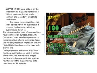
1. Cover lines: were laid out on the
left side of my magazine front cover, I
did this to ensure that my readers
(primary and secondary) are able to
reads them.
In essence theses cover lines had
to be able to attract my audience as it
is one of the first things which my
audience are drawn to.
The colours used on most of my cover lines
have been used on purpose, that is, the
“important” ones have been presented in
the same colour scheme as my mast head.
this basically creates an impression that we
(State’O Mind) are honoured to have such
a cover line.
During my research on music magazines, I
found out such tactics are used in honour
of the cover line. For instance, images
maybe merged onto a masthead to show
how honoured the magazine may be to
have an artist; for example.