Webinar - How to set pay ranges in the context of pay transparency legislation
Draft music mag
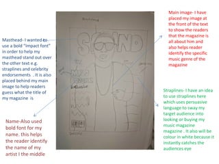
1. Straplines- I have an idea
to use straplines here
which uses persuasive
language to sway my
target audience into
looking or buying my
music magazine
magazine . It also will be
colour in white because it
instantly catches the
audiences eye
Masthead- I wanted to
use a bold “Impact font”
in order to help my
masthead stand out over
the other text e.g.
straplines and celebrity
endorsements . It is also
placed behind my main
image to help readers
guess what the title of
my magazine is
Name-Also used
bold font for my
name. this helps
the reader identify
the name of my
artist I the middle
Main image- I have
placed my image at
the front of the text
to show the readers
that the magazine is
all about him and
also helps reader
identify the specific
music genre of the
magazine