CALL ON ➥8923113531 🔝Call Girls Gomti Nagar Lucknow best Night Fun service
Untitled presentation
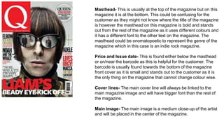
1. Masthead- This is usually at the top of the magazine but on this
magazine it is at the bottom. This could be confusing for the
customer as they might not know where the title of the magazine
is however the masthead on this magazine is bold and stands
out from the rest of the magazine as it uses different colours and
it has a different font to the other text on the magazine. The
masthead could be onomatopoetic to represent the genre of the
magazine which in this case is an indie rock magazine.
Price and Issue date- This is found either below the masthead
or on/near the barcode as this is helpful for the customer. The
barcode is usually found towards the bottom of the magazine
front cover as it is small and stands out to the customer as it is
the only thing on the magazine that cannot change colour wise.
Cover lines- The main cover line will always be linked to the
main magazine image and will have bigger font than the rest of
the magazine.
Main image- The main image is a medium close-up of the artist
and will be placed in the center of the magazine.
2. The magazine title will always be at the top of
the magazine and reads from left to right in this
case it is ‘Billboard’, this has a unique font to
the rest of the text and uses different colours
which helps the masthead stand out.
The main image is a medium close-up and has
had a filter added to make the photo black and
white which makes the image stand out on the
white background. The name of the artist is
written across the body to show who the artist is
for customers who may not recognise who it is
in this magazine it is ‘Beyonce’.
The cover lines are to the left off the artist
and don’t cross over the face off the artist.
They have the same font and colours which
makes it easier for customers to get an
insight to what the magazine will include.