SlideShare a Scribd company logo
1 of 5
COVER PAGE
ANALYSIS
ALTERNATIVE PRESS – PAGE ONE
Q – PAGE TWO
KERRANG! – PAGE THREE
XXL - PAGE FOUR
NIKITA JADE GROUVEL
The masthead/ AP Logo is always present in the same place,
ad typeface for every issue of the magazine. Although it
changed colour depending on the main image and the theme
of the issue. The font is bold and memorable, which
represents the magazine as timeless and long lasting.
Furthermore the muted red colour fits in with the rest of the
cover due to some cover lines and inviting words being placed
in this colour. The red font contrasts massively with the
background of the image as the foreground and background
image, with the cover lines are all light colours or white. Such
contrast indicates how whilst the magazine aims to presents a
passionate platform for artists and bands in the music
industry, it is only a platform and will change with each issue
yet the content and passion will stay consistent for the love of
music.The background of the cover is a plain off white/grey
backdrop. This is commonly used for DVD cases and movie
posters, and is usually made in reference to comedy. The use
of a white background on AP, suggest the content within may
be written in a comedic manor. Although usually Alternative
magazines will have dark backgrounds or brightly coloured
backgrounds, and not white. This way the white background
also draws attention to the foreground image and the cover
stories. Furthermore the white theme throughout the cover
keeps your attention on all of the content as it doesn’t make
one part more aesthetic than another, which also prevents a
visual distraction.
Outside of the colouring, the rest of the design of the cover is
quite conventional of AP. The different fonts are used in
almost every issue to show the difference between the inside
content. This gives the magazine a certain degree of
familiarity and makes it recognisable to its audience once they
look past the image and colours. Not only this, it is also very
common the AP to have the artist or band covering the
masthead, as it is so easily recognisable it suggests that the
AP audience will know it is AP even if it is covered. This is
effective as it still encourages people to pick up the magazine
even if they are not familiar with the artists on the cover. As
Pierce the Veil are not loved by everyone, keeping the same
underlying house style would attract readers who are turned
off by the main feature and thus guarantee minimal loss of
interest for this particular issue.
There is only one subject on the cover and that is the AP
Music Awards, which is a part of the AP brand. This
promotes their brand, as well as include other bands which
will connect to a wider audience. This shows they know
how to use cross media convergence to promote other
The main image of Vic Fuentes and Tony Perry is the most eye
catching of the whole magazine. The way Tony is looking towards
the camera suggests he wants to connect with the audience more.
Whereas Vic is looking into the distance. Vic’s pose is not
uncommon for an alternative magazine, much like Tony’s is also
not uncommon. The glance away from the camera gives a
mystery to the audience so they want to read the issue to find out
more. Not only this, the use of a mid-two shot for this image
echoes the importance of both the collective and the individual in
the band. In the image Vic is positioned in front of Tony, with
Tony’s arm rested on Vic’s shoulder, this shows the closeness of
the relationship between the front man and the lead guitarist of the
band, which adds to the comedic value of the issue.
The colour scheme used on this cover of AP employs contrasting
colours (grey scale, red and yellow) to give a more classic,
traditional feel. Furthermore, the red used for one of the cover
lines and the mast head are slightly different shades of red. The
cover line shade is less muted but darker than the masthead
which can be seen as more aggressive and negative rather than
approachable, but the fonts used make it look less aggressive.
Meanwhile the colours black and white link directly to the main
image. This draws the entire content of the cover together,
creating a specific house style. Additionally, the pale yellow used
in the cover lines breaks up the page so the aforementioned
house style does not become repetitive. Furthermore the yellow
separates the headline content from the other features. Therefore,
upon recognition of Vic and Tony, they are drawn to the text
written in yellow rather than white, so it allows them to access
their desired content faster and locate other content later.
The skyline relates to the content of the magazine, and the cover
lines at the bottom of the page. The colour and typeface of the
skyline fits in with the colour scheme, main image, and the cover
lines at the bottom of the page as well. It is the one of the only two
bits of text on the whole cover that is completely black. This grabs
the attention of the reader, whilst splitting up the colours on the
page to make it look less repetitive. The use of a hashtag suggest
that AP also has a twitter account, which can be used to connect
to the audience, this is also another way to suggest the use of
cross media convergence. As the different elements do not merge
together, it makes each piece of text draw the reader in itself and
therefore the full spread of content can be observed individually
The number 30 above the masthead but below the skyline is not
uncommon for AP to have. Usually AP will have a shape or text
there to give an insight to what is inside the issue. The number
’30’ commemorates 30 years of Alternative Press and coincides
with the colour scheme, and the skyline, giving an overall clean
and professional look.
The masthead/Q Logo is present in the same place
and color for every issue of the magazine. It is in a
more elegant serif font represents the magazine as
timeless, long lasting and somewhat traditional.
Furthermore, the red backing for the logo stands out
and contrasts massively to the white background of
the page and the white masthead(even though it is
one letter), which follows through to the rest of the
cover. Such a contrast indicates how whilst the
magazine aims to provide a respectful and
passionate platform for the music industry and bands
in the music industry, is is only a platform and will
remain the same and true to itself and viewers
regardless of what/who is on the cover. Whereas
such a claim cannot be said for the music industry as
it is ever changing, therefore the magazine gives a
secure platform for those who want it.The background of the cover is white. This sort of
aesthetic is commonly used in association with
comedy (more likely to be seen for movie posters).
The use of white for is common for Q which suggests
there is a comedic element to the content of the
magazine, or in the manner of how the content is
written. On the other hand a plain white background
means that the foreground stands out more, and in
this case the main image. As the band in the main
image (U2) are all dressed in dark clothing, the white
background is a big contrast. As there is a lot of dark
features on the page, the white background gives a
clean slate for it all to be placed making it look
organized and professional, as well as it connecting
the different aspects of darkness together.
Additionally having a neutral background means there
is less of a visual distraction from the actual content
on the page, which also somewhat hides the barcode
in the right third at the bottom of the page, making it
Other than the colors on the page, the rest of the page
design is conventional of Q. The stretched and narrowed
sans serif typeface is found on every cover of Q. This
gives the magazine its own certain degree of familiarity,
therefore making it more recognizable to its audience
once you look past the images and colors. This is an
effective choice as it still encourages people to pick up
the magazine even if they aren’t interested in the band
on the front cover. As Coldplay don’t commonly divide
opinion, there are some people who are not interested,
so keeping the same underlying house style would attract
readers who are turned off by the main image, which
guarantees minimal loss of leadership from this issue.
The layout has been chosen to emphasize the presence
of Coldplay. As there is only one piece of text that has not
been made to fit around the main image of them, as that
piece of text is about them. Any non Coldplay related
content is smaller and in either black or red, which does
not stand out as much as the yellow font used for
‘COLDPLAY’. Suggesting that the band has a large
influence on modern music. The headline is placed
largely over the main image of Coldplay, which suggests
that not many people will recognize the band by the
image, but will recognize the name.
The main image of Coldplay is most likely to be unseen,
original content, although it is typical for Coldplay to
position themselves like this for many photos. This
makes them seem more familiar to the audience if they
know Coldplay which will make Coldplay fans want to
pick up the magazine even if they are not interested in
other content within the magazine.There are very few cover lines on this issue of Q.
This is again, to emphasize the presence of
Coldplay. Although hardly any cover lines, the editors
have used images in the left side third and far right
third to grab some attention towards those articles,
without taking much away from the main image.
The skyline and footer correspond to one another, in the
fact they both resemble banners, with a red background
and white text. The text font is the same (besides capitals
and non-capitals), which ties everything in between the
two look to be a part as one, it seems to frame the page
to make it look proffessional and well put together.
As the background is full-coloured, the background stands out
and is a prominent feature of the cover. This suggest how the
target audience are teenagers and young adults who are
money conscious.
The main image is a close up of Panic! At the Disco’s only
member, Brendon Urie. This use of a close up like this is quite
unusual for music magazines of this type. Such an alternative
choice reflects the contents and genre of the magazine, as
well as echoing the mission statement of KERRANG!, which is
to report on the most extreme end of the alternative music
genre. The dark and bold image choice makes the magazine
stand out as much as possible, the size of the image will
attract the target audience as Panic! At the Disco are very
popular with the target audience. As it dominates the page, it
leaves very little space for other content. Therefore people are
more likely to pick up the magazine because they recognise
Urie, and not for the content inside. This immediately filters out
any readers that are unlikely to be interested in the main
content and thus making it clear who the target demographic
are.The cover used many different typefaces, the majority are
capitalised and sans serif which represents the bold and brutal
nature of the alternative rock genre and the content
KERRANG! Provides. Other than the generic typefaces, a
handwritten-style font and Guns N’ Roses own elongated serif
font are used. This not only breaks up the page to not look
repetitive, but also attracts specific fans of not only Urie but
also fans of Guns N’ Roses, who will recognise the typeface
immediately and thus be encouraged to pick up the magazine
despite the fact they are not the main feature.
The handwritten aspect to the anchorage text makes the cover
feel more personalised which will attract Panic! At the Disco’s
audience more, as they will feel as if it is more personal to the
front man Brendon Urie. As well as this the typeface used for
the main cover line is classic sans-serif style, but it has been
personalised with the red font colour and the paint splatter
effect. This paint splatter effect is situated over the whole
cover, as a background for the cover lines on the first left side
third and the last right side third. This ties the cover together,
and separates the foreground from the background by using
contrasting colours. The red colour to the paint splatter is
made to look like blood, which connotes the violent
stereotypes of the alternative rock genre, which could also
foreshadow the content inside. This will also attract those who
are more attracted to the heavier side of alternative rock, and
those who lean more towards the metal core genre , as the
The colour yellow is used as an accent for the content on the
cover of the magazine. It is used to grab attention to certain
cover lines such as ‘2016 POSTER SPECIAL’ and ‘PLUS’
which may attract a different target kind of audience. For
example the posters will attract the audience at the younger
end of the target audience, whereas other cover lines such as
‘THE NIGHT LEMMY DIED’ and ‘BIFFY CLYRO’ will attract
more of the older end of the target audience. This way they
target more than one age demographic, and cater to a verity of
different age groups at the same time, by using simple
content.
The masthead is covered by the image of Urie suggesting that
it is more important that he is recognized rather than the name
of the magazine. As KERRANG! Is very popular and well
known through the alternative community, it is likely the house
style of KERRANG! Will make consumers identify it over
others, and therefore meaning the masthead can be covered
and it will not affect the revenue of the magazine.
The colour scheme used for this issue of KERRANG! Consists of
mainly, black, white, red and yellow. White and black are used in
to emphasise the darkness of the main image of Urie, which also
connotes the darkness of the feature content, as well as the
darkness of his music. This has been done to suggest the dark
connotations behind Urie and his music without suggesting that
he is actually ‘evil’. Furthermore the two colours are classically
used within the alternative rock genre as they are bold which
connotes the music and content within as bold and loud. Not only
this, the white and black stand out against the red and yellow on
the page. Furthermore suggesting the editors of KERRANG! Use
colour in order to make the magazine as easy to read as
possible.
In comparison, the red and yellow are employed to make the
magazine stand out on the shelf against other magazines, whilst
echoing the violence of the alternative rock music genre and
KERRANG!’s content. The shade of red that has been chosen is
very bold and dark, and is often associated with negative
connotations due to blood and violence etc. An association of
this sort is used in advantage of Panic! At the Disco as their
history is thought to be quite traumatic ( Urie is the last member
present). Whereas the colour yellow commonly has happy
connotations, but can also connote decaying. Suggesting Panic!
As a cover line screams ‘STAR WARS’ this shows the editors efforts
to attract a wider audience through film. This suggests that whilst the
magazine has a loyal, niche audience, it can still be expanded by
popular culture.
The masthead is similar to other alternative magazines that I
have analyzed, as it has a stand out red block background,
with white text overlapping. As well as this like the other one,
it also is situated in the top left-side third, which seems to be
very popular, as it can be seen on a shop shelf peeking from
behind other magazines. The typeface used it very bold, the
white font colour is a different shade of white to any other
white on the cover, which stands out and makes the reader’s
eye focus on it more.
The layout used has been chosen as it emphasizes Jay Z,
as his face covers most of the page. Not only this, the
positioning of the artist covers the right two thirds of the
page, and part of the masthead. This suggests that it is
more important that the audience see Jay Z first, than the
name of the magazine. This could be to attract Jay Z’s
audience as a primary target, and then those who know
XXL will pick up the issue whether they are fans of Jay Z or
not. As the masthead is covered, it suggests that loyal
readers of XXL, do not need to see the whole masthead to
know what magazine it is, due to its particular house style.
As the masthead is situated in the same place, and same
colours for every issue, it makes it recognizable and familiar
to a loyal consumer.
The headline is the only other piece of red text, other than
the masthead, on the cover. After seeing the picture of Jay Z
and the masthead, this will be the content reader’s eyes will
divert to. The optimum positioning in the bottom left third of
the page is chosen to make sure that readers will see it, as
the text is much larger than other cover lines on the cover.
The anchorage text consists of only one word ‘untouchable’
which is uncommon for anchorage text, which also makes
the audience more intrigued to find out the story behind it.
The headline and most of the cover lines are the
same font, although the cover lines are just
slightly smaller. This connects the headline to the
cover lines to give a polished look. Not only this,
both the cover lines and the headlines are all
names of artists. This is common for magazines of
this genre as they usually show case artists on the
cover, rather than articles like other magazines.
This suggests that the audience is more interested
in who is featured in the issue, than what is in the
issue. This suggests that the fans of the artists
featured are loyal, and will want to know as much
as they can about them, no matter what it is.
The main cover line ‘the BIG BU$INE$$ issue’
attracts an audience through the use of dollar
signs. This connotes wealth and suggests that the
rap/hip-hop industry has a lot of money building it
up, and those in the industry are admired for their
wealth and status. It also suggests that the issue
is worth the money they will pay for it, and that
there will be a lot of content, which will attract
viewers that want to get as much as they can for
their money.
The bold black type font does not take any
attention away from, Jay Z, the masthead, or
headline, but does get attention as it is the boldest
black text on the page.
The design and layout used for XXL is very similar
and shares similar features, as alternative
magazines, despite obvious differences in the genre
of music. The significant differences range from
font, text size, imagery, and cover content. On
alternative covers like KERRANG! There is usually a
lot of cover content, whereas XXL has a lot less.
The fonts differ due to alternative magazines usually
have custom fonts for each issue, whereas the bold
san serif font used for XXL is easily replicable. Not
only this the font size is a lot bigger and in your face
on XXL, which links with the thought of money and
the idea of ‘Go big or go home’.
Jay Z supports the idea of wealth and money, due to the mise en
scene used. The diamond earrings, and silver chain around his
neck suggests he is of a wealthy background, which is common
for those in this industry, and links with the dollar signs used in a
cover line. Not only this the grey hooded top, links with the idea of
intimidation and gangster, as it makes him look to be rougher and
less wealthy than he is, which contrasts the accessories he is
The image of Jay Z is a close up, which breaks the fourth wall
between him and the audience. As he is looking directly into the lens
of the camera, it shows him as being intimidating. This is common for
the rap genre, as most of them are seen to be ‘gangster’ and from a

More Related Content

What's hot

Detailed analysis 2
Detailed analysis 2Detailed analysis 2
Detailed analysis 2DavidKelly_
 
Textual analysis
Textual analysisTextual analysis
Textual analysisJwbread
 
Magazine Textual Analysis
Magazine Textual AnalysisMagazine Textual Analysis
Magazine Textual AnalysisJwbread
 
Media coursework content page analysis
Media coursework content page analysisMedia coursework content page analysis
Media coursework content page analysismattmosey1
 
Analysis of music magazines
Analysis of music magazinesAnalysis of music magazines
Analysis of music magazinesLauraASMagazine
 
Magazine Analysis
Magazine AnalysisMagazine Analysis
Magazine Analysisasmediae13
 
Task 2- magazine cover, contents & double page spread
Task 2- magazine cover, contents & double page spreadTask 2- magazine cover, contents & double page spread
Task 2- magazine cover, contents & double page spreadasmediab15
 
How my magazine appeals to my audience
How my magazine appeals to my audienceHow my magazine appeals to my audience
How my magazine appeals to my audienceLuke Reynolds
 
Analysis of Music Magazines
Analysis of Music MagazinesAnalysis of Music Magazines
Analysis of Music MagazinesBeniboy39
 
Detailed analysis of a music magazine
Detailed analysis of a music magazineDetailed analysis of a music magazine
Detailed analysis of a music magazineayreslou
 
NME Cover Analysis
NME Cover AnalysisNME Cover Analysis
NME Cover AnalysisLukaMedia
 

What's hot (20)

Detailed analysis 2
Detailed analysis 2Detailed analysis 2
Detailed analysis 2
 
Conventions
ConventionsConventions
Conventions
 
Textual analysis
Textual analysisTextual analysis
Textual analysis
 
Magazine Textual Analysis
Magazine Textual AnalysisMagazine Textual Analysis
Magazine Textual Analysis
 
Media coursework content page analysis
Media coursework content page analysisMedia coursework content page analysis
Media coursework content page analysis
 
Magazine analysis
Magazine analysisMagazine analysis
Magazine analysis
 
Analysis of music magazines
Analysis of music magazinesAnalysis of music magazines
Analysis of music magazines
 
Magazine Analysis
Magazine AnalysisMagazine Analysis
Magazine Analysis
 
Task 2- magazine cover, contents & double page spread
Task 2- magazine cover, contents & double page spreadTask 2- magazine cover, contents & double page spread
Task 2- magazine cover, contents & double page spread
 
How my magazine appeals to my audience
How my magazine appeals to my audienceHow my magazine appeals to my audience
How my magazine appeals to my audience
 
Analysis of Music Magazines
Analysis of Music MagazinesAnalysis of Music Magazines
Analysis of Music Magazines
 
Task 2a1
Task 2a1Task 2a1
Task 2a1
 
Detailed analysis of a music magazine
Detailed analysis of a music magazineDetailed analysis of a music magazine
Detailed analysis of a music magazine
 
Textual analysis
Textual analysisTextual analysis
Textual analysis
 
Evaluation media
Evaluation mediaEvaluation media
Evaluation media
 
Task2
Task2Task2
Task2
 
NME Cover Analysis
NME Cover AnalysisNME Cover Analysis
NME Cover Analysis
 
Magazine cover
Magazine coverMagazine cover
Magazine cover
 
Kuku hjghjhjh
Kuku hjghjhjhKuku hjghjhjh
Kuku hjghjhjh
 
Magazine analysis
Magazine analysisMagazine analysis
Magazine analysis
 

Similar to Analysis of Magazine Covers

Magazine covers
Magazine coversMagazine covers
Magazine coversrj5453
 
Market research
Market researchMarket research
Market researchKaris Hays
 
Mojo magazine analysis
Mojo magazine analysisMojo magazine analysis
Mojo magazine analysisLittlePainter
 
Nme Music Magazine Analysis 2
Nme Music Magazine Analysis 2Nme Music Magazine Analysis 2
Nme Music Magazine Analysis 2ritapro98
 
Mojo magazine analysis
Mojo magazine analysis Mojo magazine analysis
Mojo magazine analysis Najat Hachem
 
Front cover analysis, kerrang!, mojo, q
Front cover analysis, kerrang!, mojo, qFront cover analysis, kerrang!, mojo, q
Front cover analysis, kerrang!, mojo, qAnthonyTeazdale
 
Analysis of magazine pages.
Analysis of magazine pages.Analysis of magazine pages.
Analysis of magazine pages.Pineapple_Monkey
 
Market research on the pop and rock music genre
Market research on the pop and rock music genreMarket research on the pop and rock music genre
Market research on the pop and rock music genreivelinaemilova
 
Magazine analysis
Magazine analysisMagazine analysis
Magazine analysislsuttie9
 
Task 2 - Detailed Analysis of Music Magazines
Task 2 - Detailed Analysis of Music MagazinesTask 2 - Detailed Analysis of Music Magazines
Task 2 - Detailed Analysis of Music Magazinesayreslou
 
Further research final
Further research finalFurther research final
Further research finalEmilyPlenty
 
Textual Analysis
Textual AnalysisTextual Analysis
Textual Analysispinogo
 
Florence q magazine finished,
Florence q magazine finished,Florence q magazine finished,
Florence q magazine finished,emilylouisej
 

Similar to Analysis of Magazine Covers (20)

Magazine covers
Magazine coversMagazine covers
Magazine covers
 
Market research
Market researchMarket research
Market research
 
Mojo magazine analysis
Mojo magazine analysisMojo magazine analysis
Mojo magazine analysis
 
Nme Music Magazine Analysis 2
Nme Music Magazine Analysis 2Nme Music Magazine Analysis 2
Nme Music Magazine Analysis 2
 
Mojo magazine analysis
Mojo magazine analysis Mojo magazine analysis
Mojo magazine analysis
 
Front cover analysis, kerrang!, mojo, q
Front cover analysis, kerrang!, mojo, qFront cover analysis, kerrang!, mojo, q
Front cover analysis, kerrang!, mojo, q
 
Analysis of magazine pages.
Analysis of magazine pages.Analysis of magazine pages.
Analysis of magazine pages.
 
Media magaine analysis
Media magaine analysisMedia magaine analysis
Media magaine analysis
 
Task2
Task2Task2
Task2
 
Textanalysis
TextanalysisTextanalysis
Textanalysis
 
Market research
Market researchMarket research
Market research
 
Market research on the pop and rock music genre
Market research on the pop and rock music genreMarket research on the pop and rock music genre
Market research on the pop and rock music genre
 
Magazine analysis
Magazine analysisMagazine analysis
Magazine analysis
 
ANALYSIS OF FRONT COVERS
ANALYSIS OF FRONT COVERSANALYSIS OF FRONT COVERS
ANALYSIS OF FRONT COVERS
 
Task 2 - Detailed Analysis of Music Magazines
Task 2 - Detailed Analysis of Music MagazinesTask 2 - Detailed Analysis of Music Magazines
Task 2 - Detailed Analysis of Music Magazines
 
Further research final
Further research finalFurther research final
Further research final
 
Music double page
Music double pageMusic double page
Music double page
 
Textual Analysis
Textual AnalysisTextual Analysis
Textual Analysis
 
Florence q magazine finished,
Florence q magazine finished,Florence q magazine finished,
Florence q magazine finished,
 
Mojo
MojoMojo
Mojo
 

Recently uploaded

Islamabad Escorts # 03080115551 # Escorts in Islamabad || Call Girls in Islam...
Islamabad Escorts # 03080115551 # Escorts in Islamabad || Call Girls in Islam...Islamabad Escorts # 03080115551 # Escorts in Islamabad || Call Girls in Islam...
Islamabad Escorts # 03080115551 # Escorts in Islamabad || Call Girls in Islam...wdefrd
 
Vip Hisar Call Girls #9907093804 Contact Number Escorts Service Hisar
Vip Hisar Call Girls #9907093804 Contact Number Escorts Service HisarVip Hisar Call Girls #9907093804 Contact Number Escorts Service Hisar
Vip Hisar Call Girls #9907093804 Contact Number Escorts Service Hisarsrsj9000
 
Call Girl Service In Dubai #$# O56521286O #$# Dubai Call Girls
Call Girl Service In Dubai #$# O56521286O #$# Dubai Call GirlsCall Girl Service In Dubai #$# O56521286O #$# Dubai Call Girls
Call Girl Service In Dubai #$# O56521286O #$# Dubai Call Girlsparisharma5056
 
The First Date by Daniel Johnson (Inspired By True Events)
The First Date by Daniel Johnson (Inspired By True Events)The First Date by Daniel Johnson (Inspired By True Events)
The First Date by Daniel Johnson (Inspired By True Events)thephillipta
 
Lucknow 💋 Escorts Service Lucknow Phone No 8923113531 Elite Escort Service Av...
Lucknow 💋 Escorts Service Lucknow Phone No 8923113531 Elite Escort Service Av...Lucknow 💋 Escorts Service Lucknow Phone No 8923113531 Elite Escort Service Av...
Lucknow 💋 Escorts Service Lucknow Phone No 8923113531 Elite Escort Service Av...anilsa9823
 
FULL ENJOY - 9953040155 Call Girls in Noida | Delhi
FULL ENJOY - 9953040155 Call Girls in Noida | DelhiFULL ENJOY - 9953040155 Call Girls in Noida | Delhi
FULL ENJOY - 9953040155 Call Girls in Noida | DelhiMalviyaNagarCallGirl
 
Lucknow 💋 Virgin Call Girls Lucknow | Book 8923113531 Extreme Naughty Call Gi...
Lucknow 💋 Virgin Call Girls Lucknow | Book 8923113531 Extreme Naughty Call Gi...Lucknow 💋 Virgin Call Girls Lucknow | Book 8923113531 Extreme Naughty Call Gi...
Lucknow 💋 Virgin Call Girls Lucknow | Book 8923113531 Extreme Naughty Call Gi...anilsa9823
 
Charbagh / best call girls in Lucknow - Book 🥤 8923113531 🪗 Call Girls Availa...
Charbagh / best call girls in Lucknow - Book 🥤 8923113531 🪗 Call Girls Availa...Charbagh / best call girls in Lucknow - Book 🥤 8923113531 🪗 Call Girls Availa...
Charbagh / best call girls in Lucknow - Book 🥤 8923113531 🪗 Call Girls Availa...gurkirankumar98700
 
Patrakarpuram ) Cheap Call Girls In Lucknow (Adult Only) 🧈 8923113531 𓀓 Esco...
Patrakarpuram ) Cheap Call Girls In Lucknow  (Adult Only) 🧈 8923113531 𓀓 Esco...Patrakarpuram ) Cheap Call Girls In Lucknow  (Adult Only) 🧈 8923113531 𓀓 Esco...
Patrakarpuram ) Cheap Call Girls In Lucknow (Adult Only) 🧈 8923113531 𓀓 Esco...akbard9823
 
Young⚡Call Girls in Lajpat Nagar Delhi >༒9667401043 Escort Service
Young⚡Call Girls in Lajpat Nagar Delhi >༒9667401043 Escort ServiceYoung⚡Call Girls in Lajpat Nagar Delhi >༒9667401043 Escort Service
Young⚡Call Girls in Lajpat Nagar Delhi >༒9667401043 Escort Servicesonnydelhi1992
 
SHIVNA SAHITYIKI APRIL JUNE 2024 Magazine
SHIVNA SAHITYIKI APRIL JUNE 2024 MagazineSHIVNA SAHITYIKI APRIL JUNE 2024 Magazine
SHIVNA SAHITYIKI APRIL JUNE 2024 MagazineShivna Prakashan
 
Gomti Nagar & High Profile Call Girls in Lucknow (Adult Only) 8923113531 Esc...
Gomti Nagar & High Profile Call Girls in Lucknow  (Adult Only) 8923113531 Esc...Gomti Nagar & High Profile Call Girls in Lucknow  (Adult Only) 8923113531 Esc...
Gomti Nagar & High Profile Call Girls in Lucknow (Adult Only) 8923113531 Esc...gurkirankumar98700
 
Hazratganj / Call Girl in Lucknow - Phone 🫗 8923113531 ☛ Escorts Service at 6...
Hazratganj / Call Girl in Lucknow - Phone 🫗 8923113531 ☛ Escorts Service at 6...Hazratganj / Call Girl in Lucknow - Phone 🫗 8923113531 ☛ Escorts Service at 6...
Hazratganj / Call Girl in Lucknow - Phone 🫗 8923113531 ☛ Escorts Service at 6...akbard9823
 
(NEHA) Call Girls Ahmedabad Booking Open 8617697112 Ahmedabad Escorts
(NEHA) Call Girls Ahmedabad Booking Open 8617697112 Ahmedabad Escorts(NEHA) Call Girls Ahmedabad Booking Open 8617697112 Ahmedabad Escorts
(NEHA) Call Girls Ahmedabad Booking Open 8617697112 Ahmedabad EscortsCall girls in Ahmedabad High profile
 
Islamabad Call Girls # 03091665556 # Call Girls in Islamabad | Islamabad Escorts
Islamabad Call Girls # 03091665556 # Call Girls in Islamabad | Islamabad EscortsIslamabad Call Girls # 03091665556 # Call Girls in Islamabad | Islamabad Escorts
Islamabad Call Girls # 03091665556 # Call Girls in Islamabad | Islamabad Escortswdefrd
 
Lucknow 💋 Cheap Call Girls In Lucknow Finest Escorts Service 8923113531 Avail...
Lucknow 💋 Cheap Call Girls In Lucknow Finest Escorts Service 8923113531 Avail...Lucknow 💋 Cheap Call Girls In Lucknow Finest Escorts Service 8923113531 Avail...
Lucknow 💋 Cheap Call Girls In Lucknow Finest Escorts Service 8923113531 Avail...anilsa9823
 
Hazratganj ] (Call Girls) in Lucknow - 450+ Call Girl Cash Payment 🧄 89231135...
Hazratganj ] (Call Girls) in Lucknow - 450+ Call Girl Cash Payment 🧄 89231135...Hazratganj ] (Call Girls) in Lucknow - 450+ Call Girl Cash Payment 🧄 89231135...
Hazratganj ] (Call Girls) in Lucknow - 450+ Call Girl Cash Payment 🧄 89231135...akbard9823
 
RAK Call Girls Service # 971559085003 # Call Girl Service In RAK
RAK Call Girls Service # 971559085003 # Call Girl Service In RAKRAK Call Girls Service # 971559085003 # Call Girl Service In RAK
RAK Call Girls Service # 971559085003 # Call Girl Service In RAKedwardsara83
 

Recently uploaded (20)

Islamabad Escorts # 03080115551 # Escorts in Islamabad || Call Girls in Islam...
Islamabad Escorts # 03080115551 # Escorts in Islamabad || Call Girls in Islam...Islamabad Escorts # 03080115551 # Escorts in Islamabad || Call Girls in Islam...
Islamabad Escorts # 03080115551 # Escorts in Islamabad || Call Girls in Islam...
 
Vip Hisar Call Girls #9907093804 Contact Number Escorts Service Hisar
Vip Hisar Call Girls #9907093804 Contact Number Escorts Service HisarVip Hisar Call Girls #9907093804 Contact Number Escorts Service Hisar
Vip Hisar Call Girls #9907093804 Contact Number Escorts Service Hisar
 
Call Girl Service In Dubai #$# O56521286O #$# Dubai Call Girls
Call Girl Service In Dubai #$# O56521286O #$# Dubai Call GirlsCall Girl Service In Dubai #$# O56521286O #$# Dubai Call Girls
Call Girl Service In Dubai #$# O56521286O #$# Dubai Call Girls
 
The First Date by Daniel Johnson (Inspired By True Events)
The First Date by Daniel Johnson (Inspired By True Events)The First Date by Daniel Johnson (Inspired By True Events)
The First Date by Daniel Johnson (Inspired By True Events)
 
Lucknow 💋 Escorts Service Lucknow Phone No 8923113531 Elite Escort Service Av...
Lucknow 💋 Escorts Service Lucknow Phone No 8923113531 Elite Escort Service Av...Lucknow 💋 Escorts Service Lucknow Phone No 8923113531 Elite Escort Service Av...
Lucknow 💋 Escorts Service Lucknow Phone No 8923113531 Elite Escort Service Av...
 
FULL ENJOY - 9953040155 Call Girls in Noida | Delhi
FULL ENJOY - 9953040155 Call Girls in Noida | DelhiFULL ENJOY - 9953040155 Call Girls in Noida | Delhi
FULL ENJOY - 9953040155 Call Girls in Noida | Delhi
 
Lucknow 💋 Virgin Call Girls Lucknow | Book 8923113531 Extreme Naughty Call Gi...
Lucknow 💋 Virgin Call Girls Lucknow | Book 8923113531 Extreme Naughty Call Gi...Lucknow 💋 Virgin Call Girls Lucknow | Book 8923113531 Extreme Naughty Call Gi...
Lucknow 💋 Virgin Call Girls Lucknow | Book 8923113531 Extreme Naughty Call Gi...
 
Charbagh / best call girls in Lucknow - Book 🥤 8923113531 🪗 Call Girls Availa...
Charbagh / best call girls in Lucknow - Book 🥤 8923113531 🪗 Call Girls Availa...Charbagh / best call girls in Lucknow - Book 🥤 8923113531 🪗 Call Girls Availa...
Charbagh / best call girls in Lucknow - Book 🥤 8923113531 🪗 Call Girls Availa...
 
Patrakarpuram ) Cheap Call Girls In Lucknow (Adult Only) 🧈 8923113531 𓀓 Esco...
Patrakarpuram ) Cheap Call Girls In Lucknow  (Adult Only) 🧈 8923113531 𓀓 Esco...Patrakarpuram ) Cheap Call Girls In Lucknow  (Adult Only) 🧈 8923113531 𓀓 Esco...
Patrakarpuram ) Cheap Call Girls In Lucknow (Adult Only) 🧈 8923113531 𓀓 Esco...
 
Young⚡Call Girls in Lajpat Nagar Delhi >༒9667401043 Escort Service
Young⚡Call Girls in Lajpat Nagar Delhi >༒9667401043 Escort ServiceYoung⚡Call Girls in Lajpat Nagar Delhi >༒9667401043 Escort Service
Young⚡Call Girls in Lajpat Nagar Delhi >༒9667401043 Escort Service
 
SHIVNA SAHITYIKI APRIL JUNE 2024 Magazine
SHIVNA SAHITYIKI APRIL JUNE 2024 MagazineSHIVNA SAHITYIKI APRIL JUNE 2024 Magazine
SHIVNA SAHITYIKI APRIL JUNE 2024 Magazine
 
Gomti Nagar & High Profile Call Girls in Lucknow (Adult Only) 8923113531 Esc...
Gomti Nagar & High Profile Call Girls in Lucknow  (Adult Only) 8923113531 Esc...Gomti Nagar & High Profile Call Girls in Lucknow  (Adult Only) 8923113531 Esc...
Gomti Nagar & High Profile Call Girls in Lucknow (Adult Only) 8923113531 Esc...
 
Hazratganj / Call Girl in Lucknow - Phone 🫗 8923113531 ☛ Escorts Service at 6...
Hazratganj / Call Girl in Lucknow - Phone 🫗 8923113531 ☛ Escorts Service at 6...Hazratganj / Call Girl in Lucknow - Phone 🫗 8923113531 ☛ Escorts Service at 6...
Hazratganj / Call Girl in Lucknow - Phone 🫗 8923113531 ☛ Escorts Service at 6...
 
(NEHA) Call Girls Ahmedabad Booking Open 8617697112 Ahmedabad Escorts
(NEHA) Call Girls Ahmedabad Booking Open 8617697112 Ahmedabad Escorts(NEHA) Call Girls Ahmedabad Booking Open 8617697112 Ahmedabad Escorts
(NEHA) Call Girls Ahmedabad Booking Open 8617697112 Ahmedabad Escorts
 
Dxb Call Girls # +971529501107 # Call Girls In Dxb Dubai || (UAE)
Dxb Call Girls # +971529501107 # Call Girls In Dxb Dubai || (UAE)Dxb Call Girls # +971529501107 # Call Girls In Dxb Dubai || (UAE)
Dxb Call Girls # +971529501107 # Call Girls In Dxb Dubai || (UAE)
 
Islamabad Call Girls # 03091665556 # Call Girls in Islamabad | Islamabad Escorts
Islamabad Call Girls # 03091665556 # Call Girls in Islamabad | Islamabad EscortsIslamabad Call Girls # 03091665556 # Call Girls in Islamabad | Islamabad Escorts
Islamabad Call Girls # 03091665556 # Call Girls in Islamabad | Islamabad Escorts
 
Lucknow 💋 Cheap Call Girls In Lucknow Finest Escorts Service 8923113531 Avail...
Lucknow 💋 Cheap Call Girls In Lucknow Finest Escorts Service 8923113531 Avail...Lucknow 💋 Cheap Call Girls In Lucknow Finest Escorts Service 8923113531 Avail...
Lucknow 💋 Cheap Call Girls In Lucknow Finest Escorts Service 8923113531 Avail...
 
Hazratganj ] (Call Girls) in Lucknow - 450+ Call Girl Cash Payment 🧄 89231135...
Hazratganj ] (Call Girls) in Lucknow - 450+ Call Girl Cash Payment 🧄 89231135...Hazratganj ] (Call Girls) in Lucknow - 450+ Call Girl Cash Payment 🧄 89231135...
Hazratganj ] (Call Girls) in Lucknow - 450+ Call Girl Cash Payment 🧄 89231135...
 
RAK Call Girls Service # 971559085003 # Call Girl Service In RAK
RAK Call Girls Service # 971559085003 # Call Girl Service In RAKRAK Call Girls Service # 971559085003 # Call Girl Service In RAK
RAK Call Girls Service # 971559085003 # Call Girl Service In RAK
 
Bur Dubai Call Girls # 971504361175 # Call Girls In Bur Dubai || (UAE)
Bur Dubai Call Girls # 971504361175 # Call Girls In Bur Dubai || (UAE)Bur Dubai Call Girls # 971504361175 # Call Girls In Bur Dubai || (UAE)
Bur Dubai Call Girls # 971504361175 # Call Girls In Bur Dubai || (UAE)
 

Analysis of Magazine Covers

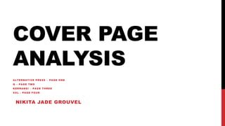
  • 1. COVER PAGE ANALYSIS ALTERNATIVE PRESS – PAGE ONE Q – PAGE TWO KERRANG! – PAGE THREE XXL - PAGE FOUR NIKITA JADE GROUVEL
  • 2. The masthead/ AP Logo is always present in the same place, ad typeface for every issue of the magazine. Although it changed colour depending on the main image and the theme of the issue. The font is bold and memorable, which represents the magazine as timeless and long lasting. Furthermore the muted red colour fits in with the rest of the cover due to some cover lines and inviting words being placed in this colour. The red font contrasts massively with the background of the image as the foreground and background image, with the cover lines are all light colours or white. Such contrast indicates how whilst the magazine aims to presents a passionate platform for artists and bands in the music industry, it is only a platform and will change with each issue yet the content and passion will stay consistent for the love of music.The background of the cover is a plain off white/grey backdrop. This is commonly used for DVD cases and movie posters, and is usually made in reference to comedy. The use of a white background on AP, suggest the content within may be written in a comedic manor. Although usually Alternative magazines will have dark backgrounds or brightly coloured backgrounds, and not white. This way the white background also draws attention to the foreground image and the cover stories. Furthermore the white theme throughout the cover keeps your attention on all of the content as it doesn’t make one part more aesthetic than another, which also prevents a visual distraction. Outside of the colouring, the rest of the design of the cover is quite conventional of AP. The different fonts are used in almost every issue to show the difference between the inside content. This gives the magazine a certain degree of familiarity and makes it recognisable to its audience once they look past the image and colours. Not only this, it is also very common the AP to have the artist or band covering the masthead, as it is so easily recognisable it suggests that the AP audience will know it is AP even if it is covered. This is effective as it still encourages people to pick up the magazine even if they are not familiar with the artists on the cover. As Pierce the Veil are not loved by everyone, keeping the same underlying house style would attract readers who are turned off by the main feature and thus guarantee minimal loss of interest for this particular issue. There is only one subject on the cover and that is the AP Music Awards, which is a part of the AP brand. This promotes their brand, as well as include other bands which will connect to a wider audience. This shows they know how to use cross media convergence to promote other The main image of Vic Fuentes and Tony Perry is the most eye catching of the whole magazine. The way Tony is looking towards the camera suggests he wants to connect with the audience more. Whereas Vic is looking into the distance. Vic’s pose is not uncommon for an alternative magazine, much like Tony’s is also not uncommon. The glance away from the camera gives a mystery to the audience so they want to read the issue to find out more. Not only this, the use of a mid-two shot for this image echoes the importance of both the collective and the individual in the band. In the image Vic is positioned in front of Tony, with Tony’s arm rested on Vic’s shoulder, this shows the closeness of the relationship between the front man and the lead guitarist of the band, which adds to the comedic value of the issue. The colour scheme used on this cover of AP employs contrasting colours (grey scale, red and yellow) to give a more classic, traditional feel. Furthermore, the red used for one of the cover lines and the mast head are slightly different shades of red. The cover line shade is less muted but darker than the masthead which can be seen as more aggressive and negative rather than approachable, but the fonts used make it look less aggressive. Meanwhile the colours black and white link directly to the main image. This draws the entire content of the cover together, creating a specific house style. Additionally, the pale yellow used in the cover lines breaks up the page so the aforementioned house style does not become repetitive. Furthermore the yellow separates the headline content from the other features. Therefore, upon recognition of Vic and Tony, they are drawn to the text written in yellow rather than white, so it allows them to access their desired content faster and locate other content later. The skyline relates to the content of the magazine, and the cover lines at the bottom of the page. The colour and typeface of the skyline fits in with the colour scheme, main image, and the cover lines at the bottom of the page as well. It is the one of the only two bits of text on the whole cover that is completely black. This grabs the attention of the reader, whilst splitting up the colours on the page to make it look less repetitive. The use of a hashtag suggest that AP also has a twitter account, which can be used to connect to the audience, this is also another way to suggest the use of cross media convergence. As the different elements do not merge together, it makes each piece of text draw the reader in itself and therefore the full spread of content can be observed individually The number 30 above the masthead but below the skyline is not uncommon for AP to have. Usually AP will have a shape or text there to give an insight to what is inside the issue. The number ’30’ commemorates 30 years of Alternative Press and coincides with the colour scheme, and the skyline, giving an overall clean and professional look.
  • 3. The masthead/Q Logo is present in the same place and color for every issue of the magazine. It is in a more elegant serif font represents the magazine as timeless, long lasting and somewhat traditional. Furthermore, the red backing for the logo stands out and contrasts massively to the white background of the page and the white masthead(even though it is one letter), which follows through to the rest of the cover. Such a contrast indicates how whilst the magazine aims to provide a respectful and passionate platform for the music industry and bands in the music industry, is is only a platform and will remain the same and true to itself and viewers regardless of what/who is on the cover. Whereas such a claim cannot be said for the music industry as it is ever changing, therefore the magazine gives a secure platform for those who want it.The background of the cover is white. This sort of aesthetic is commonly used in association with comedy (more likely to be seen for movie posters). The use of white for is common for Q which suggests there is a comedic element to the content of the magazine, or in the manner of how the content is written. On the other hand a plain white background means that the foreground stands out more, and in this case the main image. As the band in the main image (U2) are all dressed in dark clothing, the white background is a big contrast. As there is a lot of dark features on the page, the white background gives a clean slate for it all to be placed making it look organized and professional, as well as it connecting the different aspects of darkness together. Additionally having a neutral background means there is less of a visual distraction from the actual content on the page, which also somewhat hides the barcode in the right third at the bottom of the page, making it Other than the colors on the page, the rest of the page design is conventional of Q. The stretched and narrowed sans serif typeface is found on every cover of Q. This gives the magazine its own certain degree of familiarity, therefore making it more recognizable to its audience once you look past the images and colors. This is an effective choice as it still encourages people to pick up the magazine even if they aren’t interested in the band on the front cover. As Coldplay don’t commonly divide opinion, there are some people who are not interested, so keeping the same underlying house style would attract readers who are turned off by the main image, which guarantees minimal loss of leadership from this issue. The layout has been chosen to emphasize the presence of Coldplay. As there is only one piece of text that has not been made to fit around the main image of them, as that piece of text is about them. Any non Coldplay related content is smaller and in either black or red, which does not stand out as much as the yellow font used for ‘COLDPLAY’. Suggesting that the band has a large influence on modern music. The headline is placed largely over the main image of Coldplay, which suggests that not many people will recognize the band by the image, but will recognize the name. The main image of Coldplay is most likely to be unseen, original content, although it is typical for Coldplay to position themselves like this for many photos. This makes them seem more familiar to the audience if they know Coldplay which will make Coldplay fans want to pick up the magazine even if they are not interested in other content within the magazine.There are very few cover lines on this issue of Q. This is again, to emphasize the presence of Coldplay. Although hardly any cover lines, the editors have used images in the left side third and far right third to grab some attention towards those articles, without taking much away from the main image. The skyline and footer correspond to one another, in the fact they both resemble banners, with a red background and white text. The text font is the same (besides capitals and non-capitals), which ties everything in between the two look to be a part as one, it seems to frame the page to make it look proffessional and well put together.
  • 4. As the background is full-coloured, the background stands out and is a prominent feature of the cover. This suggest how the target audience are teenagers and young adults who are money conscious. The main image is a close up of Panic! At the Disco’s only member, Brendon Urie. This use of a close up like this is quite unusual for music magazines of this type. Such an alternative choice reflects the contents and genre of the magazine, as well as echoing the mission statement of KERRANG!, which is to report on the most extreme end of the alternative music genre. The dark and bold image choice makes the magazine stand out as much as possible, the size of the image will attract the target audience as Panic! At the Disco are very popular with the target audience. As it dominates the page, it leaves very little space for other content. Therefore people are more likely to pick up the magazine because they recognise Urie, and not for the content inside. This immediately filters out any readers that are unlikely to be interested in the main content and thus making it clear who the target demographic are.The cover used many different typefaces, the majority are capitalised and sans serif which represents the bold and brutal nature of the alternative rock genre and the content KERRANG! Provides. Other than the generic typefaces, a handwritten-style font and Guns N’ Roses own elongated serif font are used. This not only breaks up the page to not look repetitive, but also attracts specific fans of not only Urie but also fans of Guns N’ Roses, who will recognise the typeface immediately and thus be encouraged to pick up the magazine despite the fact they are not the main feature. The handwritten aspect to the anchorage text makes the cover feel more personalised which will attract Panic! At the Disco’s audience more, as they will feel as if it is more personal to the front man Brendon Urie. As well as this the typeface used for the main cover line is classic sans-serif style, but it has been personalised with the red font colour and the paint splatter effect. This paint splatter effect is situated over the whole cover, as a background for the cover lines on the first left side third and the last right side third. This ties the cover together, and separates the foreground from the background by using contrasting colours. The red colour to the paint splatter is made to look like blood, which connotes the violent stereotypes of the alternative rock genre, which could also foreshadow the content inside. This will also attract those who are more attracted to the heavier side of alternative rock, and those who lean more towards the metal core genre , as the The colour yellow is used as an accent for the content on the cover of the magazine. It is used to grab attention to certain cover lines such as ‘2016 POSTER SPECIAL’ and ‘PLUS’ which may attract a different target kind of audience. For example the posters will attract the audience at the younger end of the target audience, whereas other cover lines such as ‘THE NIGHT LEMMY DIED’ and ‘BIFFY CLYRO’ will attract more of the older end of the target audience. This way they target more than one age demographic, and cater to a verity of different age groups at the same time, by using simple content. The masthead is covered by the image of Urie suggesting that it is more important that he is recognized rather than the name of the magazine. As KERRANG! Is very popular and well known through the alternative community, it is likely the house style of KERRANG! Will make consumers identify it over others, and therefore meaning the masthead can be covered and it will not affect the revenue of the magazine. The colour scheme used for this issue of KERRANG! Consists of mainly, black, white, red and yellow. White and black are used in to emphasise the darkness of the main image of Urie, which also connotes the darkness of the feature content, as well as the darkness of his music. This has been done to suggest the dark connotations behind Urie and his music without suggesting that he is actually ‘evil’. Furthermore the two colours are classically used within the alternative rock genre as they are bold which connotes the music and content within as bold and loud. Not only this, the white and black stand out against the red and yellow on the page. Furthermore suggesting the editors of KERRANG! Use colour in order to make the magazine as easy to read as possible. In comparison, the red and yellow are employed to make the magazine stand out on the shelf against other magazines, whilst echoing the violence of the alternative rock music genre and KERRANG!’s content. The shade of red that has been chosen is very bold and dark, and is often associated with negative connotations due to blood and violence etc. An association of this sort is used in advantage of Panic! At the Disco as their history is thought to be quite traumatic ( Urie is the last member present). Whereas the colour yellow commonly has happy connotations, but can also connote decaying. Suggesting Panic! As a cover line screams ‘STAR WARS’ this shows the editors efforts to attract a wider audience through film. This suggests that whilst the magazine has a loyal, niche audience, it can still be expanded by popular culture.
  • 5. The masthead is similar to other alternative magazines that I have analyzed, as it has a stand out red block background, with white text overlapping. As well as this like the other one, it also is situated in the top left-side third, which seems to be very popular, as it can be seen on a shop shelf peeking from behind other magazines. The typeface used it very bold, the white font colour is a different shade of white to any other white on the cover, which stands out and makes the reader’s eye focus on it more. The layout used has been chosen as it emphasizes Jay Z, as his face covers most of the page. Not only this, the positioning of the artist covers the right two thirds of the page, and part of the masthead. This suggests that it is more important that the audience see Jay Z first, than the name of the magazine. This could be to attract Jay Z’s audience as a primary target, and then those who know XXL will pick up the issue whether they are fans of Jay Z or not. As the masthead is covered, it suggests that loyal readers of XXL, do not need to see the whole masthead to know what magazine it is, due to its particular house style. As the masthead is situated in the same place, and same colours for every issue, it makes it recognizable and familiar to a loyal consumer. The headline is the only other piece of red text, other than the masthead, on the cover. After seeing the picture of Jay Z and the masthead, this will be the content reader’s eyes will divert to. The optimum positioning in the bottom left third of the page is chosen to make sure that readers will see it, as the text is much larger than other cover lines on the cover. The anchorage text consists of only one word ‘untouchable’ which is uncommon for anchorage text, which also makes the audience more intrigued to find out the story behind it. The headline and most of the cover lines are the same font, although the cover lines are just slightly smaller. This connects the headline to the cover lines to give a polished look. Not only this, both the cover lines and the headlines are all names of artists. This is common for magazines of this genre as they usually show case artists on the cover, rather than articles like other magazines. This suggests that the audience is more interested in who is featured in the issue, than what is in the issue. This suggests that the fans of the artists featured are loyal, and will want to know as much as they can about them, no matter what it is. The main cover line ‘the BIG BU$INE$$ issue’ attracts an audience through the use of dollar signs. This connotes wealth and suggests that the rap/hip-hop industry has a lot of money building it up, and those in the industry are admired for their wealth and status. It also suggests that the issue is worth the money they will pay for it, and that there will be a lot of content, which will attract viewers that want to get as much as they can for their money. The bold black type font does not take any attention away from, Jay Z, the masthead, or headline, but does get attention as it is the boldest black text on the page. The design and layout used for XXL is very similar and shares similar features, as alternative magazines, despite obvious differences in the genre of music. The significant differences range from font, text size, imagery, and cover content. On alternative covers like KERRANG! There is usually a lot of cover content, whereas XXL has a lot less. The fonts differ due to alternative magazines usually have custom fonts for each issue, whereas the bold san serif font used for XXL is easily replicable. Not only this the font size is a lot bigger and in your face on XXL, which links with the thought of money and the idea of ‘Go big or go home’. Jay Z supports the idea of wealth and money, due to the mise en scene used. The diamond earrings, and silver chain around his neck suggests he is of a wealthy background, which is common for those in this industry, and links with the dollar signs used in a cover line. Not only this the grey hooded top, links with the idea of intimidation and gangster, as it makes him look to be rougher and less wealthy than he is, which contrasts the accessories he is The image of Jay Z is a close up, which breaks the fourth wall between him and the audience. As he is looking directly into the lens of the camera, it shows him as being intimidating. This is common for the rap genre, as most of them are seen to be ‘gangster’ and from a