
Recommended
More Related Content
What's hot
What's hot (15)
Similar to Double Page Analysis - Hammer Magazine
Similar to Double Page Analysis - Hammer Magazine (20)
Recently uploaded
Recently uploaded (20)
Double Page Analysis - Hammer Magazine
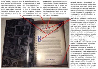
- 1. Formal or Informal? – I would say that this piece of text is quite informal, because words such as ‘snotty, bratty middle fingered lyrics’ are used in the piece. Also, the magazine is targeted at fans of MCR and Rock Music, and they say that people are influenced by the music they listen to, and the Rock Genre is quite informal on a whole. Drop Cap – Not every word is in drop cap on this page. The handwriting ‘in the beginning’ is in capital letters and stands out at the top of the page. The starting letter of the article is a huge capital letter; this could be to show the reader that this is the beginning of the My Chemical Romance story. And the description below the handwriting is in capitals and it is talking about how the music scene needed a revolution. Drop cap is used to highlight certain parts of texts to the reader and draw them in to reading that part. Page Layout – This page has been to made to look like a notebook (a pen is also included which makes it look more real). In handwriting style at the top of the page, it says ‘in the beginning...’ and the article talks about how the music scene needed reviving in the early 2000’s, and it basically talks about how MCR did not know how much of an impact they would have on this scene. This is a more interesting layout than just normal pages, so people could be attracted to the different look as throughout it is like a scrap book. The scattered photos on the left page also make the page look like a scrap book. Brief Summary – Before the article begins, a brief summary is there to give the reader a slight insight as to what the piece of text is going to be talking about. This provides the reader with a little bit more information and may attract more people to buy the magazine if they know exactly what it is that they are reading about. My Chemical Romance Logo – The logo used at the top of the page is from the band’s first album. I think this ties in well with the theme of ‘In the Beginning’ because this was the first album. I think it is quite good for the fans who would know that as well. Doodle Patterns – Not only do these act as separators, but they also link in with the scrapbook style that the pages have. They follow the colour scheme as well; they tie in with the capital B, the handwriting at the top of the page, and the pen in the top right corner.