O9654467111 Call Girls In Dwarka Women Seeking Men
Mixmag Textual Analysis
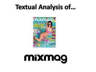
1.
2. This is the front cover of Mixmag. Mixmag is a British electronic dance and clubbing
magazine appealing to the younger audience ranging from 18-29.
Mixmag stick to conventions by using the average sans-serif type, this portrays a
modern look which gives the audience a better idea of what the magazine is about. The
masthead is aligned left at the top of the page. The white boldly stands out from the
blue background and is very noticeable. White is often overlaid on a blue background
for sharpened clarity. White reflects goodness and innocence something not ordinarily
linked with ‘clubbing’ and ‘raving’. In addition, white means safety, this provides a
sense of security for the audience reading this magazine. Blue is the colour of the sky
and sea. In this splash image the model is surrounded by water. The colour helps up
identify a clear link between the two.
Blue is often associated with depth and stability. Blue symbolizes trust, and loyalty. In
addition with wisdom, confidence, intelligence, faith, truth, and heaven. Blue is also
thought to be beneficial to the mind and the body, something closely related to dance.
You can use blue to promote products as this often stands out a great deal.
Moreover, when used with warm colours like yellow or pink, blue can create high
impact; vibrant designs due to use of complimentary colour pallets.
The use of colour around the splash image is also vital. The use of yellow reflects
sunshine and warmth, an idealistic partying atmosphere. In addition, yellow arouses
cheerfulness and encourages stimulating mental activity. It also seen to be an attention
getter.
The mix of pink and yellow creates a vibrant aesthetic to the entire front cover and just
by looking at it you feel stimulated and motivated.
3. The main image is seen as the most important because of its size and it securely anchors
the selling line ‘Cut Price Ibiza’. The strap lines ‘Dance for free’ and ‘Drink cheap’ back up
the extravagant selling line. The fact the strap lines fluctuate between white, pink and
yellow promotes the vibrant non-stop partying lifestyle due to their intellectual and
energetic connotations. The colour is dominant on this page and fits within the house
style, which is consistent. Due to the context of reception Mixmag will need to capture the
attention of potential consumers amongst many other magazines, the vibrant image and
cover lines aid this copiously.
The long shot of the model reveals her entire body except her feet. In this image there is
emphasis on the mise-en-scene; props and costume. Her outfit consists of a minimalist
swimwear that openly reveals her feministic physical attributes including her
chest, waist, hips and legs.
The main focus of the front cover is the cinematography of the shot. The photo is used in a
way that portrays seasonality and reflects summer solstice.
The use of the colour pink is vital. Pink is a mixture of red and white, the energy of pink is
often determined by how much red is present and how vibrant the overall colour is. Pink
has feminine connotations and is often a straight link to females. For example, baby clothes
are often offered in either blue or pink, blue for males and pink for girls.
There is a strong correlation between the image and the surrounding text. Each colour
used for the text is taken from the main image giving a more organised feel to the cover.
The overall colour scheme is used for young audiences and fits in with the summer theme.
Furthermore, her posture and body language show she is in a partying atmosphere. This is
the dominant code and the intended meaning.
4. The Male Gaze Theory
The male gaze is a concept which deals with how an audience perceive the person
presented. This feminist theory mainly deals with how the male sex view women.
As many people would agree there has been huge leaps in how the media portray
women in television, film and on magazines. In the last few decades there has been
a growth in the presence and influence of women in the media behind the scene.
Female stereotypes thrive in the media that we ourselves consume everyday. The
gaze theory looks at the interest behind the objectification and eroticization of
females by the media today.
In this image the model is portrayed wearing minimal clothes, modelling in a pose
which accentuates her physical attributes. Her chest area is pushed out towards
the reader inviting them to view her. Her legs are crossed over and her hips pulled
around to the front showing off not only the front of her body but angling in a way
which is revealing the other half of her too.
The swimsuit the model wears covers barely her upper chest and lower genital
area. Revealing every other area of her body, by covering up these parts this adds
mystery which influences interest of the intrigued audience.
5. Mixmag Contents Page Analysis
This is mixmag’s contents page. The consistent house style of the magazine
continues on over the pages as the minimalistic theme continues. They have
used very few colours in the terms of text. This may be because they want a
more simplistic approach or perhaps because they want a bolder impact. The
use of colours on this page purposely reflect the life-style surrounding this
magazine. This is because the white on black theme is bold and rather audacious
as this could be seen as too dull of an approach.
As well as this the layout is very clear and concise as the page is split into three
main sections. In turn the page looks neat in comparison to busy magazines
which can often look overcrowded. There is a clear title of ‘contents’ which is
bolder to the rest of the text, allowing it to stand out to readers which in turn
enables readers to pinpoint the page they are looking for. In addition, the
magazine date displayed slightly to the right of the main header also allows the
reader to identify the issue of magazine if in case they ever need to come back
for reference. Furthermore, this is similar in all of their magazines which shows
continuity.
The main and only image on this page shows a female model in
tight, shiny, skimpy clothing dancing in a night life scene. The image fills the
majority of the page, similar to the front cover, which is very common and
conventional for a contents page. This is because the main image usually
references to the main article. In this case the image relates to ‘110 Club
Listings’.
The main image stands out greatly from the bold black background because of
the vibrant clothing she is wearing. This creates an eye catching focus point for
the audience and immediately draws them in.
The model is looking away from the camera and down towards the floor, this
gives the impression that she feels relaxed as though no body is watching her.
This creates an indirect mode of address. In addition to this her overall outfit
creates the impression that she has a care-free lifestyle of glamour, glitz and
ostentation. By including the crowd behind her but focusing the main image on
her this shows that she stands out from the crowd and isn't afraid to have a
good time. This will appeal to the target audience. There isn't much surrounding
text relating to the image which is why the use of vibrant colours is ample.
6. The image used here is significantly interesting due to the models pose and indirect gaze
which adds a sense of mystery. In addition her outfit is also vital in adding to the overall
theme/ house-style of the magazine. She is wearing a purple playsuit with gold
embroidery and silver embellished accessories. Purple is associated with royalty. It
symbolizes power, nobility and luxury. Purple is associated with creativity, mystery, and
magic. Something the target audience may be able to relate to. It can also be seen as a
feminine colour which compliments the model well. To further this, the gold symbolizes
wealth and wisdom alongside good health and optimism. Silver is also a vital colour in
her outfit, this is because when combined with purple, silver has a very feminine
energy. Silver signals a time of reflection and a change of direction as it illuminates the
way forward. Which may be an aspiration for the target audience.
To further this she is wearing minimalistic clothing which links closely to the male gaze
theory as mentioned before. She is showing herself as a seductive erotic object for men
and other women to view.
The subheading on this page of ‘Your free CD’ may be a marketing strategy and attempt
to draw in consumers. The CD they offer is called ‘Boys Noize’ and is a CD closely related
to the music they base their magazine around. In broad terms anything that is free is
good and is often never refused. This links to the concept of reception, as when
displayed amongst many other magazines Mixmag thrives to stand out, by offering free
merchandise they are giving their selves a unique selling point.
The cover lines and VIP features are all well spaced as they layout of the page uses very
little dead space. This keeps in with the consistent house style.
The font used is also keeping in with the house-style and includes references to music
itself including a ‘play’ button incorporated in the typography on the ‘E’.
There is a consistent theme used on the page numbers written on the left hand side of
the page and the use of font editing such as ‘italics’ is used for the inside stories makes
them stand out and making it easier for the reader to follow.
7. Double page spread analysis
On the double page spread the ‘partying’ vibe comes across in a particularly strong manor. This is good because it shows the magazine is sticking
to the ideology of the genre. The page shows the top three upcoming parties and their venues. This is informative and is used to draw in readers
to the magazine.
The double page spread consists of one main image and other smaller images. The main image on the page is used to draw readers to a specific
sections on the page instantly. The small caption aligned bottom left of the picture is in place to give the readers a small insight into the following
text. The use of white on black gives clarity, shows importance and allows the text to stand out.
The models in the image are posing as if they are on a ‘night out’. A direct link to partying. Not only does the image promote the lifestyle but it
also gives a vision to the subsequent text.
The layout on the two pages shows organisation, this is due to the boxed off sections. This is done to represent ‘the big three’. Each sector
contains an image (or two) and writes very little in comparison to other magazines. The main aim of this magazine is to provide interest and
stimulate mental activity, hence the use of images and bright colours. The use of colours on the intersections aids the generic theme of mixmag.
The pink signifies compassion and warmth, and the yellow symbolizes happiness, and vibrancy. Vibrant pinks and yellows are conventional
colours for most partying venues and the many outfits often correlate with such. In addition the colours used anchor the usual conventions of the
magazine.
The black font one a white background is also important. Black is an extremely bold colour and signifies formality and mystery. It also has the
ability to stand out from any colour background and because of such is used widely in many magazines.
The body of the text all incorporates the same house-style and is used throughout the entire magazine and they are all visually connected
together. This adds a more personal feel to the magazine.
The graphical furniture on these pages all relates to the comprehensive genre and the mise-on-scene and lighting in each signifies a happy, carefree partying life style.
The magazines register is presented in a very informal tone as it takes the reader through the latest and best partying venues. The magazine page
has a mysterious quality to it due to the small text and large subheadings, the bold and exciting headers encourage the audience and readers to
perhaps buy this magazine and read on.