
Recommended
More Related Content
What's hot
What's hot (19)
Similar to music magazines
Similar to music magazines (20)
More from gozdetezcan
Recently uploaded
Recently uploaded (20)
music magazines
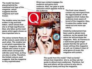
- 1. Direct eye contact engages the audience and gains more audience. Also, her gaze is quite seductive which appeals more to the audience. The model has been placed behind the masthead and logo of the magazine which suggests that the magazine isn't well known. The models name has been written in big and bold letters which shows that she is of high significance. Also, she takes up the most space which again shows us how important she is. The front cover doesn’t contain any red expect from the logo/masthead of the magazine which makes the audience more aware of brand of the magazine. Also, it makes the master head stand out and more eye catchy. Celebrity endorsement has been used to attract more audience, as the people that adore her will purchase the magazine. Also, as Florence is a well known good singer people that like her genre of music will buy this magazine as well, as it makes it clear of what genre of music the magazine will contain. The colour scheme flows, as all the colours used relate to each other. The models hair is red which resembles the logo of magazine. Also, the models skin colour is pure white which corresponds with the cover lines, as they are also in white. Therefore, the limited colours used suggests that the magazine is very sophisticated. The quote from the model “I feel so lonely” shows how imperative she is, as they use her quote to attract more audiences. Therefore, her fans and others will be curious to why she is feeling so lonely and buy the magazine.
- 2. The model used is covering the whole page which hyperbolises her significance. Also, as always she is sexually objectified, as she is wearing minimum clothing and is topless. Moreover, this suggests that the magazine is also for men as it will attract male attention as well. The models hair is very messy which suggests she is very daring and carefree. Therefore, that suggests that the magazine is a thrilling and interesting magazine. The models name is covered which connotes that she is very popular. Therefore, her name doesn’t need to be written for her to be recognised as everyone already knows her. Celebrity endorsement has been used to attract more audience, as her fans will want to buy the magazine as well. Furthermore, Lady Gaga is a well known and adored singer which will attract people that like her genre of music to the magazine. Also, the model used makes it obvious what type of music the magazine will contain and how it will be presented. The model is known to be funky and crazy which gives the target audience an idea of how the magazine will be. The colour scheme is quite sophisticated, as silver, white and red has been used which creates a sense of majority. Cover lines/puffs has been used that relate to the genre of the magazine. Also, it is vital to use cover lines as they inform the target audience of what the magazine is about. The model has direct gaze with the target audience which gains more audience. Also, her gaze is quite seductive, as she is known to be very crazy and wild.
- 3. The masthead is very different compared to the other music magazines. It is brought to the front covering the central image. Therefore, this makes it stand out and more appealing to the audience. Only one image has been used which connotes that T.I is the main focus of the magazine. The picture is conspicuous, as it looks like he is staring right back at you. The magazine is very eye catching as the cover lines/ puffs are also in red which stand out in the black and white background. These inform the target audience what the magazine will be about. The front cover only contains 3 colours which are black, white and red. This is because black and white contrast one another and red stands out against black and white which makes the magazine stand out. Therefore, it appeals more to the audience which makes them more likely to buy it. The quote from the model has been used which connotes the significance of the model. Celebrity endorsement has been used to attract the fans of the model. Also, his profession is singing and he is well known so the target audience will know the genre of the music that the magazine will contain. Moreover, using a well known singer makes the magazine more appealing to the audience, as it will look more interesting.
- 4. Celebrity endorsement has been used to attract more audience, as Drake(model) is very prevalent. Moreover, he is known for his looks and profession. Therefore, his songs are adored and breaks records which ensembles the genre of the magazine. Also, Drake is idolised by the ladies which connotes the target audience are mostly females. Furthermore, people that like Drakes genre of music will buy the magazine. The colour scheme is quite sophisticated. The colours used are blue, silver, black and white. Which connotes that the target audience is young adults and not teenagers, as it wouldn't appeal to them. The models body language is quite relaxed and composed. Therefore, it connotes what the magazine will be about. Also, it makes it obvious that the magazine contains more interesting issues and not serious issues. The models name is written in bold and capital letter which connotes that the model is imperative, as his name is used to catch attention. The cover lines/puffs used are essential , as they attract the target audiences attention. Moreover, they are written in black against a white background which makes them stand out more.
- 5. Celebrity endorsement has been used to attract more audience. Cherly Cole is sexually objectified to gain the attention of more males. Also, she is wearing red lipstick which connotes danger, lust, love and passion. Therefore, it gives the target audience an idea of what kind of issues the magazine will contain. Moreover, she is wearing dark eye liner and has wet, messy hair which shows us how carefree and wild she is. Furthermore, the models gaze is quite seductive, as if she is trying to seduce the audience. The sells line is significant, as it is the main selling point of the magazine. This is because the audience see the sells line first before anything else . Therefore, the sells line has to be very interesting. The colour scheme is limited. The only colours used are red, white and silver which creates a sense of danger and excitement. Moreover, only the vital issues are in red, for example, the logo and certain cover lines. Therefore, this makes the magazine more appealing to the audience, as only the interesting things are in red.