The document discusses how the color motifs and conventions used in a music artist's main product (music video) and ancillary materials (digital packaging, posters) work together effectively. Red and a specific font were used throughout to represent anger at societal corruption, while black and grey colors established the typical hip hop aesthetic and matched the dark lyrics. The unified color schemes and visual styles across the different materials help promote brand recognition and target the intended audience.
Call Girls Belonia Just Call 📞 8617370543 Top Class Call Girl Service Available
2) how effective is the combination of your main product and ancillary texts
1. 1. How effective is the combination of your main product and ancillary texts?
The ways in which our main product and our ancillary task go together is with the similar
colour motifs and the conventions of our products.
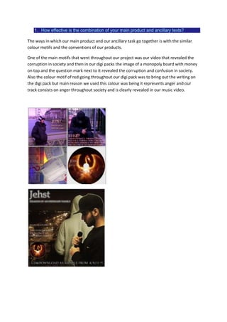
One of the main motifs that went throughout our project was our video that revealed the
corruption in society and then in our digi packs the image of a monopoly board with money
on top and the question mark next to it revealed the corruption and confusion in society.
Also the colour motif of red going throughout our digi pack was to bring out the writing on
the digi pack but main reason we used this colour was being it represents anger and our
track consists on anger throughout society and is clearly revealed in our music video.
2. Throughout the whole project the same Font was used for the artist’s name. This was
another way to get the artist recognised as the font gets noticed with its posters and digi
pack and gives the artist a specific image according to his.
Re search throughout other videos revealed that other hip hop videos do not really go with
a specific colour motif. The UK video i analysed revealed that the normal motif for a hip hop
video is just dull colours such as black and grey which were the main colours used
throughout our video . This revealed the typical convention throughout our video and the
digi pack and the poster as they all have the performer dressed in either black or grey.
Therefore the colour motifs of our project were grey and black. Another reason as we chose
to use these colours were because the artist lyrics throughout the track were about the
corruption of society. As these are not positive points for a track using light colours would
have juxtaposed against the typical convention of our video. Therefore the colours used in
our project were very effective for the artist’s image towards creating a target audience.