1. Music AdvertisementAnalysis
Jay-Z– The Blueprint3
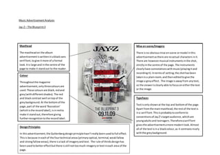
Masthead
The mastheadon the album
advertisementiswritteninablacksans
serif font,togive itmore of a formal
look. Itis large and inthe centre of the
page to make it standout to the reader.
Mise en scene/Imagery
There isno obviousmise enscene ormodel inthis
advertisementasthere are noactual characters init.
There are howevermusical instrumentsinthe shot,
strictlyinthe centre of the page. The instruments
clearlyhave connotationswithmusic(playingitand
recordingit).Intermsof setting,the shothasbeen
takenina plainroom,and theneditedtogive the
image a greyeffect. The image isawayfrom anytext,
so the viewerisclearlyable tofocusoneitherthe text
or the image.
Typefaces
Textisonlyshownat the top and bottomof the page.
Apart fromthe mainmasthead,the restof the textis
ina serif font.Thisisprobablytoconformto
conventionsof JayZ’stargetaudience,whichare
youngadultsand teenagers.Thereforeaserif font
givesthe advertisementamore modernlook.Almost
all of the textisina blackcolour,as it contrastsnicely
withthe greybackground.
Colour
Throughoutthe magazine
advertisement,onlythreecoloursare
used.These coloursare black,redand
grey(withdifferentshades). The red
and blackcontrast well ontopof the
greybackground.At the bottomof the
page,part of the word‘Rocnation’
(whichisthe recordlabel),isinredto
make it standout,therefore giving
furtherrecognitiontothe recordlabel.
DesignPrinciples
In thisadvertisement,the Guttenbergdesignprinciplehasn’treallybeenusedtofull effect.
Thisis because ineachof the fourtechnical areas(primaryoptical,terminal,weakfallow
and strongfallowareas),there isalack of imageryandtext. The rule of thirdsdesignhas
beenusedtobettereffectbutthere isstill nottoomuch imageryortextineach area of the
page.