
Recommended
More Related Content
What's hot
What's hot (20)
Similar to Kerrang all
Similar to Kerrang all (20)
More from Emma Kelly
Recently uploaded
Recently uploaded (20)
Kerrang all
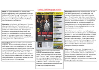
- 1. Kerrang Contents page analysis Banner The bannerat the top of the contentspage is writteninBlacksan serif font.Itstandsout on the yellow background.The logo“Kerrang!”is the same as it ison the frontcover.It looksroughon the edgeswhichportrays the type of music.The logoalsoadvertisesitself letting the readerknowthat thisisKerrang. Main image The mainimage includesthe band“All Time Low” whichtakesupmost of the contentspage. The membersof the bandare all inblack whichlinkstothe genre of musictheyplay-Rock.Rockartiststendto wear dark colours.Theyalsoblendin withthe darkbackground. However,twoof the bandmembersare wearingt-shirts withwhite messageson.The othertwomembersare hiddenbehindandare justwearingplainwhitet-shirts. Thisshowsthat the othertwo bandmembersaren’tas importantas the onesinthe front. Photoshophasbeenusedthere isa greybodyshape in the middle of the band.The bodyshape says “THIS COULD BE YOU!” ina blacksans serif fontwhichstandsoutonthe grey/white backgroundcolour.The fontusedrelatestoa younger( moderngeneration).The writingisincapitals and givesthe impressionthatitisshoutingatthe readers. Directaddressisalso used.Whichmakesthe audience feel aconnection.Itmakesthemfeel asif the bandis saying“thiscouldbe you” too them. Subscription On the bottom righthandcorner. There isa subscriptionadvertisement.Thisisusedtotry and persuade readerstosubscribe.Itisplacedonthe contents page as most readersvisitthispage.The backgroundis blue andtwo yellowbannersare placed ontop.With writinginthe colourblackwhichstandsout above the yellow.The fontIsalsoincapital letters.Thisgivesthe impressionof shoutingatthe readersto subscribe.Thisis usedto getthisstuck inthe readersmind. Colour scheme The coloursusedare typical to kerrang! magazines.The coloursconsistof yellow,black,redand white.White isusedasthe backgroundof the maintext. Thisis the usual backgroundcolourfortextto sit on.Yellow isusedfor the importantbitsof text.For example onthe cateogoriesonthe righthand side.Yellowisusedfor “news”“features”etc.Thiscatchesthe readersattention and makingiteasiertofindwhattheyare lookingfor.The colourred isusedon the sub-heading,because redisonly usedhere we focuson thatstraightaway. Editors note The editorsnote directlyaddressesthe readersas itsays “HELLO READERS.”This makesthemfeel welcome andcomfortable,italsomakesthemfeel like they’re interactingwiththe magazine itself.Thisiswritten inboldsan serif font.Soit catchesthe audience’s attention.The sanserif fontconnotesthatitis addressing the younger/moderngeneration. Language The language used isinformal.For example underneaththe heading“feedback”it states.“You lotseemreallllllllllyexcitedabout 2015”. The word “really”hasbeenexaggerated thisisnot itspropergrammatical spelling.This showsthat kerrang!Isusingslang.Whichshows us that the audience isaimedatthe younger generation.The oldergenerationwouldnottype of readtextswithspellingslike this.
- 2. Kerrang-Front cover analysisMasthead The mastheadisboldand dark whichstands out onthe page.The fontusedlookslike brokenglass whichportraysthe ideaof rebellion.Thislinksintothe genre of musicthismagazine focuseson- Rockmusic.The whole of the mastheadisnotshown.The letter“R” and some of “A” are hiddenbehindthe mainimage.This suggeststhatthe magazine iswell knownanddoesn’t needtobe fullyseen.We stillknowitsaysKerrang! The exclamationmarkatthe endgivesa dramaticfeel and makesitstand out.It makesthe title looklouderwhich linkswiththe type of music- loudrockmusic. Main image The mainimage isa mediumclose up. Meaningthat we focuson the mise-en-scene.The clothes theywearportray a rock vibe.Theywearall blackand one memberwearsa leatherjacket.We wouldassociate people whowearall blacktobe people wholistentothis type of music.Directaddressis alsoused.Theylook straightintothe camera whichmakesthe audience feel like theyhave aconnectionwiththem. Flash/Buzzword The flashinthe middle of the magazine states“Exclusive newinterview”. Thisstandsoutabove the black colourwhichsitsbehindit.The buzzword “exclusive”catchesthe audience’sattentionbecause it makesthemfeel like theyare gettingsomethingoutof the magazine- theyare the firstonestosee the interview.This encouragesthe audience tobuythe product. Colour scheme- The coloursusedconsistof yellow,red blackand white.The coloursredandyelloware primary colours. The backgroundcolouryellowisextremelybright and standsout the most.Redis equallybrightand contrastswiththe colour yellow.Bothcoloursare in your face.Theycatch the viewers’attention.Redandblackare bothknownfor beingcoloursusedforpunk/rock magazines.The connotationsof the colourredare that it symbolisesdanger.Redisastimulantcolourwhichmakes us make quickdecisions-thisiswhyitisusedfor whatis featuredinthe magazine tomake usbuy the magazine. The colour blackisa mysteriouscolourandhasa negative connotation. Whencombinedwithreditgivesand Sub-image The sub image usedadvertiseswhatisincluded inside the magazine.(posters) Itattracts the audience and makesthemwantto purchase thisissue.The sub-image sitson the leftside of the grid.Thisis the firstthingthe audience will seeaswe readfromleftto rightso our eyes will automaticallylooktothe lefthandside. Language The language useddrawsinthe readers.Words such as “new”,“need”,“special”,“mega”all make the audience feelasthoughthisissue issomethingspecial.By usingthese words the audience will wanttobuythe magazine subliminally.The language usedpersuadesthem withoutthemnoticing.Questionsare alsousedsuchas “will theysurvive the gnarliestgigever?”The readerwill wantto knowthisanswerso will buythe magazine tofind Footer The footerisplacedat the bottomof the page whichadds informationaboutthe bands includedinside the magazine.Theyare writtenin a boldfontwhichmakesthemstandout above the yellowbackground. Audience The coloursusedare verymasculine,
- 3. Kerrang- double page spread analysis House Style/Colours The coloursused inthisdouble page spreadconsistof red,yellow,white andblack.Thiskeeps to the house style of manykerrang! Articles.The coloursusedare also coloursassociatedwiththe band.The colouryellowisusedforthe important words.Suchas the artistsname “Dave Grohl”. Drop Cap A dropcap is usedat the start of eachsentence.Thisisatypical feature inmanymusicmagazines.The large lettercapturesthe reader’s attention.Especiallybecauseof itssize and the brightcolourused. Images There isone large image which takesup half of the page onthe left handside.The image includesthe band withthe mainman “Dave Grohl” placed at the frontof the restof the band.This suggeststhathe is the most important out of all of them. The background colouris redwhichblendsinwiththe articlescolourtheme.Hissurname is alsoin capitalsusingsanserif fontin brightyellowunderneaththisimage. Thisagain enforcesthe ideathathe is the one to focuson. Smallerimagesare thenplacedrandomlyonotherparts of the pages,There are a numberof them. Thisis importantbecause the images catch the readersattention. The imagesall include Dave Grohl.Theyare all out of studioshotswhichlinksto whatthe article isabout- Dave Grohl performingatmanyvenues.Theyare alsomainlymid-shots. Quote A pull quote isplacedinbetween the maintext.Thisstandsout between the small textfont.The quote is noticeable andthe readerwill most likelysee thisbefore theyreadthe text. Thisgivesthe readerandinsightto whatthe article entails. Language The language usedis persuasive.Forexample the heading “We builtthiscityonrock ‘n’Grohl!” Thisis referencingasong- whichlinksto the fact it isa musicmagazine.Insteadof the word “roll”“Grohl” isusedinstead. Thisis effective becauseeveryoneknows the song.It catches the reader’s attention.The exclamationmarkatthe endbringsa sense of excitementand makesthe readerwantto read on to see whatthe excitementisabout. Mise-en-scene Propsare usedsuchas drumsand guitars.Thisshowsthe band intheirusual place.By adding instrumentswe getamore realisticfeel. The photographsare notset upor photoshoppedtheyare downto earth. The clothestheywearare darker colourswhichblendinandlinkwiththe colourscheme. Layout The numberof columnsondouble page spreadsoftenalternate.There isnot a norm. Onthisdouble page spreadwe have 3 columnsonthe firstpage and 2 on the secondpage. Anchors A sentence isaddedoneach image.Thisdescribeswhatishappeningin the picture to give the audience abetter understandingof the image.
- 4. Kerrang Who isthe target audience? From the magazine Ihave analysedIwouldsuggestthatthe magazine isaimedtowardsmen.Thisisbecause of the coloursused.The coloursusedare black,red,yellowandwhite.Commonlyusedformale audiences. Kerrangsaudience isaimedatmalesages15-34. We can see thisbecause itcoversbandssuchas All time low- whichwouldappeal toayoungeraudience.If it wasfor an olderaudience itwouldcoverbandssuchasACDC. How doesthe magazine appeal tothem? The magazine appealstothembecause of the techniquesused.The colourscheme andthe waylanguage isusedpersuade the audience to getthe magazine.Forexample onthe magazine Ianalysed.Wordssuchas“exclusive”and“new”and“need”were usedthese are all persuasive andmake them feel asif theyhave to buythe issue.The coloursare brightandstand outwhichmake the magazine lookappealing,the colourcatchestheirattention.The mediumclose upusedalsotakesupa fair bitof the magazine.If theyare interestedinthatband“all time low”thentheywill see the image straightaway and will be drawntoit. How doesthe magazine pitchitself?(missionstatement) The magazine pitchesitselfasa well-known magazine,whichattractsmanyreaders.They give statisticstoprove howmany readers/viewers theyget.
- 5. Readership/circulation The total circulationof kerrang!Magazine was24,207 fromJune-December2015. The readershipisthe graphat the top.We can see that readersare in the C/D social grouping.The magazine isa special buyforthem.
- 6. Readerprofile/Demographics We can see thatthe readerprofile isbasically60%menand 40% women. SoKerrang!Have more male readers.Thisfitswiththeiraimedaudience whichismalesbetweenthe ages15- 34. Kerrangsdemographicfall intosocial classC/Danda mainlywhite British.