3. Question 1a
• Digital technology – is a form of electronic media where data are stored in digital, as opposed to
analog, form. It can refer to technical aspects of storage and transmission (e.g. hard disk drives or
computer networking) of information or to the ‘end product’, such as digital video.
• Creativity – The use of the imagination or original ideas, especially in the production of an artistic work.
• Research and Planning – Research, by definition means to study something thoroughly in order to gain a
wider knowledge on it or collect information about it. Planning is the process of making plans for
something.
• Post-production – All of this planning and filming leads up to this. Post production turns individual
scenes, called raw footage, into a finished motion picture. Editors cut footage together, composers add
music and special effects are added all during post-production.
• Using conventions from real media texts – Using typical features of other media products.
4. Digital Technology
1. In order to incorporate digital technology into the production of my magazine, I used a digital camera to take
the images I included. I used a Canon SLR camera. This benefited the overall outcome of my magazine
images because I could use special effects like adjusting the focus of the camera, which I could not have
done if I used for example a polaroid camera.
2. During the production of my magazine, the main tool I used was Adobe Photoshop. I used a card reader to
transport my images from the digital camera to my computer. I then edited the images (e.g. cropped the
images, changed the brightness/contrast). An example of how I used this technology was when I changed
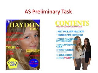
the colour of the image on my contents page to black and white.
3. Another creative decision I made was to make a ‘behind the scenes’ video using Adobe Premiere. In this
video I put together all of the images taken of me while conducting the outdoor photo shoot in order to
show the production of my magazine in a more personal way.
5. Creativity
1. Where and how I used the camera equipment when doing my photo shoots required creativity. I decided to do an
indoor photo shoot and an outdoor photo shoot because I thought this would provide more variety. I had to be creative
when choosing where to shoot when going outside. I used my creativity to decide that I wanted to include nature and
foliage. I also used creativity when taking the images because I adjusted the camera to focus more on my model and
less on the background to give it a more unique look.
2. When using Adobe Photoshop, I had to be creative when thinking about how I wanted the layout of my magazine to
be, and what colours I wanted to include. I also had to be creative when using my Photoshop skills. I also had to be
creative when using different font effects and when using effects on my images, like making the creative decision to
change one of my images to black and white to make it more effective. Another effect I used on a font was to add a
drop shadow. This created a more interesting and eye-catching look to the fonts and made them stand out more.
3. I had to be creative when choosing what my model was going to wear. The colours and designs had to represent the
indie/rock genre therefore I had to choose clothes which I knew could do this well. I found inspiration from other
indie/rock magazines and then asked my model for creative input. I gave her guidelines as to a few specific pieces of
clothing I wanted to see (like the checked shirt and biker boots she wore) but then also gave her some creative control
because she fit the indie/rock genre.
6. Research and Planning
1. In order to research before making my magazine. I spent lots of time looking at other indie/rock magazines
like NME and spent a lot of time on their websites to gain more information about the layout of the
magazine and the overall tone of how I would need to present my magazine. I also looked at the
magazines for inspiration for the outfits indie/rock artists wear.
2. In order to plan for my magazine, I first did a few drafts of my front cover,
double page spreads and contents page. This allowed me to know what colours I wanted to include in my
magazine and also what type of layout I wanted to create. I researched other real music magazines’
layouts to make sure I used typical conventions.
3. I also planned how often my magazine would be published. I decided it would be published
monthly, which meant I had to make sure my contents page reflected how packed full of
information this magazine would be. Since it would be published monthly, realistically it
would be very full of information and have a lot of pages. Therefore, I used this planning
well to determine the number of pages I would have.
7. Post-production
1. For the post-production process, we had to complete an evaluation of our work. This allowed us to
determine our strengths and weaknesses in our magazine. One of the evaluation points was related to
codes and conventions and how we used them when making our magazine. I included information about
how I used the conventions of a clear masthead, barcode and button.
2. Also, I got lots of feedback from my target audience, general magazine readers and others. This allowed
me to understand what I did well and what I didn’t. I spent a lot of time showing audiences my magazine
and filmed their comments and reactions.
3. After receiving feedback, I made the necessary improvements to my magazine
before I submitted my final piece. This allowed me to make good use of my
feedback and to make my magazine the best it could be. I filmed my target
audience while I asked them questions about what they liked/disliked
about my magazine and put it on my blog so I could refer to it constantly.
8. Using conventions from real media
texts
1. There are several typical codes and conventions for real media texts which needed to be incorporated into
my magazine. For example, a convention from a magazine used widely during production is a clear
masthead at the top of the magazine front cover. I did this with my ‘BASS’ masthead.
2. Another typical convention of an indie/rock music magazine is the colour scheme. The colour scheme
usually includes red, black white and grey which I used as my colour scheme throughout my magazine.
Indie/rock magazines tend to have very contrasting colours, some of which are bright to be striking.
3. Another typical code/convention from real music magazines is to have a close-up shot as my front cover
image. I decided to conform to this convention because I think it makes my front cover more eye-catching
and would give it a more professional appearance.