1. Evaluation
Firstly we were asked to choose groups of 3-4 and come up with a name and a slogan for an
advertising company. I decided to join Tom Fearon and Isaac Farmer to make a group of 3, we then
began to try and think of unique ideas for our advertising company but it came apparent that it was
not as simple as it seems. After much discussion we decided to finalise with L.I.T Advertising (lighting
up inspired technology). We chose this name as new technology is being made day in day out and
being an advertising company ‘advertising’ was appropriate to end the name in.
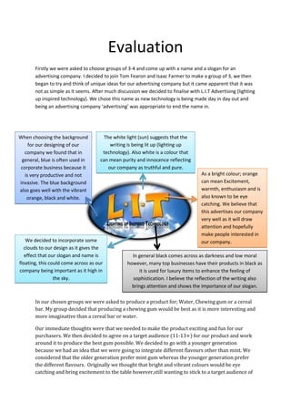
When choosing the background
for our designing of our
company we found that in
general, blue is often used in
corporate business because it
is very productive and not
invasive. The blue background
also goes well with the vibrant
orange, black and white.
The white light (sun) suggests that the
writing is being lit up (lighting up
technology). Also white is a colour that
can mean purity and innocence reflecting
our company as truthful and pure.
We decided to incorporate some
clouds to our design as it gives the
effect that our slogan and name is
floating, this could come across as our
company being important as it high in
the sky.
As a bright colour; orange
can mean Excitement,
warmth, enthusiasm and is
also known to be eye
catching. We believe that
this advertises our company
very well as it will draw
attention and hopefully
make people interested in
our company.
In general black comes across as darkness and low moral
however, many top businesses have their products in black as
it is used for luxury items to enhance the feeling of
sophistication. I believe the reflection of the writing also
brings attention and shows the importance of our slogan.
In our chosen groups we were asked to produce a product for; Water, Chewing gum or a cereal
bar. My group decided that producing a chewing gum would be best as it is more interesting and
more imaginative than a cereal bar or water.
Our immediate thoughts were that we needed to make the product exciting and fun for our
purchasers. We then decided to agree on a target audience (11-13+) for our product and work
around it to produce the best gum possible. We decided to go with a younger generation
because we had an idea that we were going to integrate different flavours other than mint. We
considered that the older generation prefer mint gum whereas the younger generation prefer
the different flavours. Originally we thought that bright and vibrant colours would be eye
catching and bring excitement to the table however,still wanting to stick to a target audience of
2. 11-13+ and a theme of excitement we decided to look into ‘magic’ which would change the
bright and vibrant colours to darker colours. Even in adulthood, magic still produces excitement
however, even more so as a younger adolescent. Therefore we decided that magic could be a
final option for our product; we began to mind map appropriate colours, names, fonts and
slogans for the chewing gum. We individually mind mapped and after discussion came up with
a
final plan of colours, fonts, a name and a
slogan for our production.
My
ideas:
Final
ideas:
3. As you can see we finalised with:
Purple, Black, Pink (dark colours)
The word ‘Magic’ brings up many images; some
may think of card magicians, mind magicians or
other magicians. However generally, magic is
associated with witches, wizards, fairies etc… as
our target audience is mainly aimed at the
younger generation we decided that going with
‘dark’ colours that are associated with witches
and wizards was most appropriate.
‘It’s Magic’ (this is not on the final sheet because we
decided to change it last minute as we believe it was
more appropriate than ‘makes you focus’)
Hocus Pocus
Immediately I and others associate
magic with Hocus Pocus (this may be
because of the film Hocus Pocus). Also
we thought that there were many
imaginative, unique ideas and designs
that we could use for our packaging.
When we individually researched existing chewing gums
we found that the slogans were all simple and ‘stated
the obvious’, therefore we wanted to create the same
effect with ours choosing two simple words, ‘Its Magic’,
These words sum up our chewing gum in one and also
support our T.V advert that we produced later.
Individually we all researched existing chewing gums to help with the making of our product.
I chose to research
Wrigley’s double mint
and found that the
packaging was green;
obviously connecting the
flavour to the colour.
Therefore in our product
we also connected our
flavours with colours,
choosing ‘purple’ related
flavours such as:
Blackberry, Blueberry
and Blackcurrant.
Tom Fearon looked at 5
Gum and found that the
font was simple and easy
to read. We thought that
this may be because it is
easy to read on the shelf
and even though it’s not
flashy it still attracts
attention.
Isaac Farmer looked at
eclipse chewing gum and
found that the design was
very effective. The flashing
light in the background
looked as if it was lighting
up the words. We did not
want to copy the design so
we simply incorporated the
light into our design. You
can see this in our final
design above.
4. To design our product we used Photoshop, it took a while to get started as we kept changing our
ideas however once we got started it was mostly simple to create. We all helped with the design of
our final packaging as we thought that 3 peoples contributions to one design would give us the best
outcome rather than having 3 different designs.
Next I selected the gradient
tool
Lastly I dragged the mouse across the box
to give the effect of the black fading into
the purple
First I chose the
colours; Purple and
Black
Isaac farmer designed the font
for our packaging by selecting
the pen tool then drawing and
curving the lines one by one
until ‘hocus pocus was spelt out.
After we had designed our final packaging we all had to create a bus/train poster, a magazine poster
or a website banner.
In my designing of the magazine poster
I wanted to incorporate the magic
theme as best as I could. I thought that
adding a cauldron would be a good
idea and as I was designing I thought of
the idea that chewing gum pieces
should be bubbling in the cauldron. I
also added our original packaging in the
corner of the poster and added in our
website address to the poster. I used
Photoshop to design the poster.
Isaac decided to create
the website banner. He
decided to simply add
our website address
which incorporates our
slogan in to it. He also
added a small catchy
phrase ‘the new magical
gum coming to stores
near you’
Tom designed the bus/train
poster for our product. He
decided to simply combine our
original packaging with the
website address. He decided
that not over complicating the
design was ideal as people
catching a train or buses don’t
tend to stare at posters and this
simple design will catch their
eye.
5. Over all I am pleased with the print adverts as they all display our product well.
After making our print adverts we were told that we would be producing a short TV advert. We
decided to think of what message we wanted our TV advert to give out to our viewers. We knew
that the theme would have to be magic and our target audience was 11-13; so we decided to think
of what characters, music, props etc… would be appropriate. As a group we produced a mind map of
ideas that we believed would be good for our advert.
Rough ideas
Story
board
Afterdeciding final ideas and producing a
storyboard for the film we began to take
action
behind the camera.Weeach took it in turns to film and direct a section of the advert. When filming
we began to change up some of our ideas as we thought of some better ones.
After filming we edited, using premier pro. We each edited a small section of the film each.
Beneath, are a few screen shots of how I edited my section of our advert.
Final ideas
6. File
Import & chose from files
Drag film into the editing section
Also drag music into the editing section
First, select the music you want to edit
Select audio transitions
Select cross fade
Select exponential fade
To cut footage, select the razor tool
Select video transitions
Select dissolve
Select cross dissolve
Import picture file
Drag onto new layer
Drag onto where you want in sequence
After we had produced our TV advert we were informed that we had to present our tasks to the
class. We could choose how to do this so we decided to make a Prezi including all the tasks I have
evaluated.
7. The black ground and stars that
are slightly blue and purple
stick with the magic theme, I
think this helps create a
suitable and effective display
for our product.
We did not write much on the
Prezi however, we wrote a
script that included everything
that they needed to know.
Our template that we chose is
not complicated so does not
come across as confusing to
our viewers.
We made sure to add in
all tasks including:
We used white,
clear font all the
way through our
prezi to make it
easy for our
viewers to read.
This is simple but
effective.
Advertising company
Print adverts
Our individual researches
Marketing ideas
Advert
In our script we spoke about our; products name
and logo, advertising company, print adverts,
individual research, marketing ideas, TV advert,
target audience, our inspiration and reasons
behind our chosen ideas.
Print screen of our script
Table of strengths and weaknesses of assignment from the
feedback of the class and teachers
Strengths
Weaknesses
imaginative
We had thought of a unique
product and theme
Props
advert
We added effects such as black
and white and exposure to
enhance and make our advert
less plain
we had met our target
audience and it was
appropriate
Prezi
Filming of advert
The filming of our advert was
smooth and professional
Individual research
Marketing campaign
We had kept a good theme
throughout our marketing
campaign
Print adverts
Different flavours of
products
Our range of flavours was
Final product packaging
Target audience
good
Target audience
There could have been
more use of props in our TV
advert
Our Prezi could have been
more exciting with images
and exciting colours
Although we spoke about
our target audience we
could have gone into more
depth
could have spoken more
about how our individual
research helped us with the
designing of the our product
Individually we could have
spoken more about our
designing of our print
adverts
We could have spoken more
about the colours and fonts
we used in our final
packaging
8. Teacher comments
Overall I believe that the class was happy and thought that we had presented our product well. I
think that the part they enjoyed the most was the advert because the comments are all good and
the ratings are 9 and 10 out of 10.
All in all I believe that our pitch was good however, we lacked some research and detail in some
areas. Therefore to improve we can add more detail into our pitch to make sure we get the best
possible mark. Personally I think that we managed to meet our target audience with our product as
we used a unique idea that will be appealing to those of the age we chose.
If I were to do this project again I think that I would change how we came about our final product. I
believe that choosing the target audience first was good however choosing a different target
audience may be easier. Also I think that I would evaluate all my work as I went along because trying
to remember all the detail at the end of the project has come about very hard. I would also set
deadlines for myself for each piece of work I did to ensure that everything was done in decent time
and to the best of my ability, finally would proof read all of my written work thoroughly to ensure
everything includes as much detail as possible.
As a whole I am pleased with the work that not only I have produced but the work that my group
have produced as well. I believe that I contributed ideas that went forward to be in our final product
as well as listening to the ideas of my team.