HARNESSING AI FOR ENHANCED MEDIA ANALYSIS A CASE STUDY ON CHATGPT AT DRONE EM...
Newspaper billboards analysis
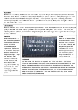
1. Description
the billboard is advertising The Times, it does not advertise any specific story as this is a daily newspaper and the stories
change too often. The text is positioned in the centre of the billboard to make it stand out although no images have been
used. The overall theme of this billboard appears to look like a newspaper front page which is extremely clever. The
Guttenberg principle has been used here as the text is spread out in all the primary strong areas, making the audience
look at the billboard as a whole.
Colour scheme
the black and white colour scheme represents a newspaper theme. It makes the advertisement very clear and easy to read
quickly as the white font stands out well against the black background. Although this colour scheme is very simple, it is
extremely effective as it looks professional and straight to the point. The lack of bright colour suggests that the newspaper
is serious and formal.
Masthead
this masthead design is a
very traditional style which
combined with the colour
scheme creates an
effective newspaper
appearance. The Times is
an established newspaper;
therefore the masthead
design appearing in a large
font at the top of the
billboard automatically
attracts attention and
makes it clear what is
being advertised. The logo
is commonly seen in the
newspaper, so will be
easily recognised by the
readers.
Images
there are no images used in
this billboard which makes
it appear formal, targeting
an educated audience. The
design is very plain and
simple however because
the newspaper is already
well known and popular,
the plain text creates an
effective billboard.
Typography
the classical text is all central to the billboard, serif font is used which is also another
convention of a newspaper. This reinforces the idea that the billboard is meant to be styled
like one. It appears dated and traditional, aiming the billboard an older generation. The
short amount of text makes the billboard quick and simple to read, almost like a newspaper
headline. The large bold text is highlighted against the dark background, which makes it
powerful and sends out the message. There does not need a lot of text as The Times is
already a highly respected newspaper.
2. Description
this billboard is advertising the metro newspaper. The masthead has been placed to the left of the billboard and
is in a very large text, the audience will immediately recognize this as the metro is an established newspaper,
advertising its ’18.3 million daily readers’ will encourage people to read the newspaper as they will assume it is a
popular and respected newspaper. The newspaper masthead/logo has been displayed in the primary optical area
which means the audience will see this first and recognize the newspaper.
Images
there are no images used in this billboard advertisement. The reason for this is
probably because the newspaper is aimed at an older age group. It makes the
newspaper seem formal, serious and remain straight to the point.
Masthead
the masthead is
large and bold
which makes it the
first thing you see
on the billboard.
The use of the
colour white
makes it very eyecatching above the
green background.
Using a globe as
the ‘O’ relates to
the green colour
scheme as it
symbolises the
earth. The metro is
‘The world’s
largest newspaper’
and provides world
news; therefore
the clever use of
this represents
that.
Colour scheme
the green and white colour scheme is bright and interesting. The
newspaper is advertised as being the world’s largest newspaper;
the colour scheme could be used to represent this as the colour
green connotes the earth. This shows that the newspaper
provides world news and that it is the world’s largest
newspaper. The white font appears very clear above the green
background making it look bright and stand out. This is very
effective as it appears simple and easy to read.
Typography
the white serif font
stands out amongst
the green
background. It uses a
similar font style as
would be found when
reading one of the
newspaper articles,
this suggests
formality. The use of
capital letters and
lower case in a
correct manner also
suggests that the
newspaper is formal
and represents the
target audience which
is mainly adults.
3. Description
unlike the previous two billboards this newspaper targets a much younger audience as it appears much more modern
through the use of technology. The slogan advertising the newspaper is clever and witty – like a newspaper headline.
This catches attention and reaches out to a younger audience as it makes the newspaper appear successful and
encourages readers to buy it.
Masthead
this masthead design appears to be much more modern than a traditional newspaper. The
turquoise newspaper title and logo is quite unconventional as it is bright whereas
newspapers usually look quite dull. The logo says ‘M LIVE’ which could represent a news
show or radio broadcast which are both features of modern media, suggesting the
newspaper targets a younger audience. The text used on the masthead is a serif font,
showing it is still following some typical newspaper conventions.
Images
the images on this
billboard show the
newspaper, a laptop, a
tablet and a smart phone
displaying the website or
app. This represents the
modern aspect to this
newspaper and the
different ways of
accessing the news. This
looks informal, it reaches
out to a young audience
as they are much more
likely to use a phone or
laptop to access news
rather than read from an
actual newspaper.
Colour scheme
the billboards colour scheme is mainly yellow. This is a bright
and pleasant colour which is extremely eye-catching. The
images showing the newspaper and website have the same
colour theme showing it’s consistent throughout all the
newspaper products. This is why the billboard is keeping to
the same colour scheme through their advertisements. This
will help brand the newspaper and make it easily recognisable
to readers. The use of colour creates a modern look also,
attracting the attention of the young audience it targets.
Typography
the dark serif font glows
above the yellow
background making the
billboard bright and
interesting as it differs
from other newspaper
advertisements. This will
appeal to younger
people as it makes the
news which could be
considered boring, look
more stylish and fun.
The bold text used for
the slogan resembles a
newspaper headline
although it does not look
completely formal; it still
uses a similar font as
would be seen in
traditional newspapers.
This allows it to still be
taken seriously and
shows it is an important
newspaper.