1. HOW EFFECTIVE IS THE COMBINATION OF YOUR MAIN
PRODUCT AND ANCILLARY TEXTS?
Conventions of media in the music industry allow a band or an artist to create a visual brand identity which is recognisable to
their fans and the general public. We aimed to create this for the band we used by keeping a theme throughout the products
created. The theme mainly relies on the colour scheme as this is the thing which is consistent throughout the digipak, advert and
music video. This enhances the continuity between all three products.
The colour scheme that we chose to use includes a vibrant mix of colours. The colours exhibited are mostly primary colours (red,
yellow and blue); the indie style of music that we are portraying does not usually use these types of colours in their artwork,
however we decided to challenge this convention as I mentioned in the previous question. This different way of approaching the
style of an indie band’s image makes our video and ancillary products different to any others.
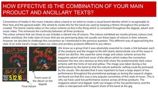
Final Advert
Front cover of
the album on the
digipak
We knew as a group that it was absolutely essential to create a link between each
of the products and the images to the left clearly demonstrate one of the ways in
which we did this. We used the same image and colour scheme across the
magazine advert and front cover of the album which makes the connection
between the two very obvious as they both share the predominantly dark colour
scheme with the hints of red and yellow. The image was taken during a live
performance by the band so that the natural authentic setting could be portrayed
by the visuals. We decided that it was important to have a large aspect of live
performance throughout the promotional package as during the research stages,
we found out that this was a very popular convention of this style of music. This is
why we have used live performance scenes across all three products. The
magazine advert and digipak both use images of the live performance and the
video is interspersed with frequent shots of the band at the gig.
2. To the left a screenshot from the live performance element of the video is displayed; this
clearly shows the direct link between the video and the ancillary products as they all
indicate a combination of the same colour scheme and setting of live performance. The
mise en scene here was very important as the lighting in the actual performance by the
band had an influence on our decision of arrangement of colours throughout all 3
products. This particular shot is very distinguishable within the project because it matches
the image on the front cover of the album and it also pairs with the images on the digipak
as they are essentially the same through the use of the vibrant red colour. I think that
having thesethese shots in the video creates a very clear sense
of continuity and makes it obvious that the products
are all promoting the same album and band. We
could have chosen to take images in the studio for
the digipak and give it a more professional edge,
however, we felt that not using images taken at the
gig would have limited the ways in which the
audience linked the three products. By making them
all look very visually similar, the audience is able to
create an immediate association between them and see that there is a close relationship among the
products. The narrative element of the video does not appear anywhere else throughout the promotional
package as we thought it would be best to keep this separate as it only applies to one song, rather than the
whole album. This means that the three products are not entirely cohesive, however, if we had decided not
to include the narrative aspect, there was a possibility of limiting our audience as it may not have appealed
to some people with purely live performance.
Having the same setting for the live performance and the self captured images for the digipak and magazine
ad makes a deliberate and very effective link between the three products making them immediately
recognisable as a promotional package.
3. Another way in which we have created a relationship between the products is through the use of
fonts; the fonts themselves are ones which the band actually use and because of this, we wanted
to include them to create an authentic feel and relate our own products to the actual band’s.
Although the font itself is the same, we changed the colours to make it original for our work and
also to ensure that it would fit in with our colour schemes. The font which is featured as the
masthead on the magazine advert is also used on the digipak on the top half of the discs to
create a direct link between the two. The font used for the name of the album on the magazine
ad is also used on the front cover of the album and it is additionally featured on the bottom half
of both discs. The font used for the band’s name on the cover is different to the font used for this
on the masthead of the magazine ad; this was done so that the front cover of the album could
look more cohesive with only one font rather than two.
As well as this, with all the fonts we have kept the same colours throughout. The red colour with
a yellow stroke was used for the majority of the text within the promotional package however we
did want a little bit of variety and we did not want to make it too repetitive; consequently, we
used a contrast of the red font and switched to yellow with a red stroke. This is seen on the back
cover for the DVD content. We decided that it would be a good idea to keep the same colours to
remain with the same themes, however, make it look slightly different to add another element of
variety and this also makes it more clear to the audience that the content for both discs is
different. The images used on the digipak and magazine advert also contributed to the effectiveness of the products together as
they feature the same images; the digipak cover and the magazine advert display the same image while the other images on the
digipak are very similar. The use of these repetitive images helps link the products as they make the product more memorable and
create more of a brand identity.
Overall I believe that the combination of the three products we created is extremely effective as they are all clearly very similar in
their themes, colours and content. As the band we chose is unsigned, we had a lot of freedom when creating the promotional
package as we were not restricted by any of their previous work. This freedom allowed us to be creative and original across all
three products whilst still staying true to the band and their genre. We have been successful in creating effective links between the
4. as I believe that a consumer would be able to immediately recognise that they are promoting the same thing. This is something that
was noted in our audience feedback, proving that all 3 clearly link together very well. We tried to create variety within our products,
however, at the same time keep them consistent and in my opinion we have achieved this to a high standard.