1. EV.2. HOW EFFECTIVE IS THE COMBINATION OF YOUR MAIN
PRODUCT AND ANCILLARY TEXTS?
Throughout the whole planning and production process, we had to consider how all of
our products would link together to form a brand identity for the band. This was
particularly important for us, as our band is individual and not signed to a record label,
therefore they are not massively well known or out there, so we had to try and make
that happen and we wanted to do this through creating something that will identify
them and make them stand out from other bands in the form of an identity.
LINKS BETWEEN THE TEXTS
As we were trying to create a brand identity, we all agreed as a group that there should
be a clear connection between all three of the products and something should appear in
all three that clearly represents them as a band. In the end, we decided to do this
through the use of live performance. As they are an indie-rock band, one of the common
conventions of this genre is live performance, which we discovered from our audience
research, the fans of the genre expect to see in some capacity within the music video
particularly. Therefore, we made live performance a valuable part of our music video, as
there were frequent crosscuts between the performance and the storyline to conform to
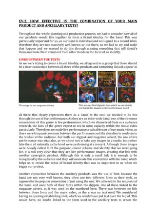
the wishes of the audience. For both our digipak and magazine advert, the use of live
performance was vital also, as we chose not to take any images in a studio, but rather
take them all naturally as the band were performing at a concert. Although these images
were heavily edited to fit the purpose, colour scheme and identity that we were going
for, it is still very clear that they are live performance images, creating that link with
another synergistic product. Although this is only a small link, it is enough to be
recognised by the audience and they will associate this convention with the band, which
helps us to create the sense of brand identity that was so important to us when we
began our project.
Another connection between the ancillary products was the use of font. Because the
band are not very well known, they often use two different fonts as their style, as
opposed to the popular convention of just using the one. We adhered to the requests of
the band and used both of their fonts within the digipak. One of these linked to the
magazine advert, as it was used as the masthead here. There was however no link
between these fonts and the music video, as there was no text used. We considered
having an opening establishing shot, which we would have put text over the top of. This
would have, no doubt, linked to the fonts used in the ancillary texts to create the
The image on our magazine advert This was our final digipak, from which we can clearly
see that all the images are live performance based
2. identity. One could argue that the fact we didn’t do this affects the impact that our
products have on our audience, however for me it is not a big enough issue to affect
anyone in a big way, as the use of text in the music video is not very high up in the
priorities for a music video audience.
We made one key connection between the ancillary texts, as we were aiming to follow
the regular codes and conventions of the products. On both images, the cover image was
the same. This is very significant, because it means that even if there is nothing else the
same between the two texts, this is a link, which the audience can recognise, understand
and relate to. Thus, the combination of our ancillary texts is very good, as the most
important link is there. This consistency will help to make it memorable for the
audience, which would help to enhance album sales. Another advantage is that it helps
to make the brand and the products seem more professional, as there is a consistency
there which would not have been present if we had chosen not to follow this
convention. This is an important example of synergy and entry points within our
products, as the two link together through the brand identity with the image, yet they
are different ways of accessing the band.
Furthermore, the two ancillary texts were also connected by a colour scheme. From
looking at the magazine advert, we can see clearly that there is a red, black and yellow
colour scheme. We also decided to carry this on within the digipak, to add to the link
that was already there between these two products. However, to make the digipak
stand out as bit more on the shelf, we changed the brightness and contrast a lot and also
added blue on one or two of the pages, so that the colour scheme was still there, but it
was not followed to a strict capacity.
When planning our products, we formed lots of possible links that we could have
between them, and most of these were carried
out within the magazine advert and the
digipak, hence why they are very similar in
terms of the style and type of images used.
However, we decided to mix it up a bit when it
came to the main product. We didn’t want to
limit our potential audience by just having one
constant main theme running throughout all
three products. For instance, we considered, in
the planning stage, to just have all live
performance clips in our music video,
which would form a clear link to the
ancillary texts, as they both contain large
amounts of this theme through the
images. However, if we had chosen to do
this in our music video, it would close off
the brand to people that do not like live
performance, which we did not want to
do. Therefore, we mixed it up by having a
fairly bright and vibrant colour scheme
and a storyline through our music video, which helps to create a different entry point to
the brand and opens it up to a whole new target audience. I knew this from my audience
A live performance shot in our music video
A shot of the storyline in our video
3. research, when we asked people what was important to them in a music video. A
number of people said live performance on our survey; however a high amount of
people also said a cohesive storyline was important. Therefore, I believe that the
combination of my main product and ancillary texts works very well, because there is so
much variety, opening up the brand to a wide audience range.
Overall, the combination of our main product and ancillary texts worked very well. In
the pre-production stage, there was a bit of debate within our group whether to go for
variety or consistency within our products, therefore we decided to mix up them both
as the consistency give the whole brand a more professional feel, while the variety side
opened up the brand to a whole new audience. As mentioned in various points
throughout my evaluation, the most important thing for us in pre-production was that
we create a brand for the band, since they are unsigned and still not very well known
and through our use of synergistic entry points, we definitely managed to do this.