
Recommended
More Related Content
What's hot
What's hot (20)
Similar to Website research ancillery
Similar to Website research ancillery (20)
More from lmorl
Recently uploaded
Recently uploaded (20)
Website research ancillery
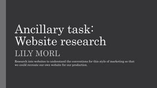
- 1. Ancillary task: Website research LILY MORL Research into websites to understand the conventions for this style of marketing so that we could recreate our own website for our production.
- 2. Man of Steel Website Main Image Man of Steel’s website takes a simplistic, yet effective home page using the poster design for the film too for its basis theme. The main image is the core feature, where the protagonist - ‘Superman’ is flying with a chiascuro lighting around his body to demonstrate the speed in which he is travelling while also portraying how he is represented as a God with the white connoting how he is something glorious, pure and ultimately positive. Secondary Image Located to the left of the main image the title of the film, ‘Man of Steel’ established the name of the film utilising the same colour used for the other marketing medias of metallic grey to symbolise by the links of metal to strength and power. Also, behind the title has a layer of the iconic ‘S’ logo for the Superhero, therefore this informs audience that even if they had made not made the connection of it being this film being based on Superman they would be able to make the link due to his iconic ‘S’ symbol. Release Date Underneath the title in clear and direct view is the release date, as the primary goal here is to achieve as many sales at the box office. Social Feed links Their social media icons directly link to their pages, meaning they are cross media converging from their website to these social networks. It is a necessity to have some form of social networks when people are living in a global village. Digital natives that would be the audience for this film will be mainly consumers of these forms of communication so there will be a much greater awareness giving fans the opportunity to even share this website link maximising the amount of exposure for the upcoming release of the film. Consequently, this allows niche audiences and freedom for people to choose how they want to view the advertisement for the film – therefore no potential consumer is isolated. Billing Block More than likely websites for films now always have the billing block at the end of the home page. It briefly gives the viewers the glance to look over the contributors of the film. Menu The main consistent convention for websites is they must have a menu, this allows the consumers to go to pages which information about the film to go directly to what they like to be informed about. As a consequence of this, it means that greater audience is being engaged as the niche audiences who consume marketing differently are being appeased and met. Music Each page for this website plays a score from the film, which is unique as not many institutions employ this method. Utilising music creates this website to be more cinematic and appeases music lovers whilst also it is noticeable to fans of Hans Zimmer the composer for this soundtrack is his works. Ultimately, we are given clues to the tone and mood of the film as audiences know that the music matches the style / atmosphere of the film. The atmosphere being dark, ominous, eerie and reflective of the protagonists embodiment of sheer power as this undefeatable God. This is in fact the first time this protagonist is being introduced to the DC world in these modern comic book adaptations so fans are eccentric over knowing they are being given a complete different take than past superman movies. Presentation Initially the home page reveals a memory moment of a child playing outside – contrasting the dark theme of the rest of the website in which it reflects with hope of this young Clarke boy (protagonist).
- 3. Man of Steel Website This website takes the format of displaying on the navigation bar the chances to gain insights into the upcoming film (at the time) in the tabs ‘Gallery’ and ‘Videos’. Gallery is a feature that gives a range of photos from the film. Man of Steel was renown for its releases of photos as one of its basis for marketing the film – particularly evident in its official Man of Steel teaser poster that depicted a long shot of Superman being arrested. This generates a positive response and much speculation for the content of the movies story. They display their gallery in a carousel / slideshow. A range of movie websites often utilise a sole page devoted to explaining the actual movie itself – providing a blurb so to speak. This provides a brief outline of the film to viewers who may or may not have seen the trailer. Dependent on the editors, they can choose whether to have brief videos of the movie to ensnare audiences by having pre-release footage of the movie to perhaps hone in on CGI / dramatic acting which they know is a selling point. The audience if seen previous footage can associate the movie with being a ‘must see’ at the cinema, therefore boosting revenue at box office.
- 4. Mocking Jay Website Social Feed links Unlike Man of Steel this website does not use icons of the logos of the social media networks to link to the media platforms, instead it has in a faded font colour in text ‘share,’ ‘follow’ and ‘download’ which viewers can immediately identify these as the links to navigate them to Facebook and Instagram etc. Furthermore, text “#UniteRevolution” in capitalised lettering in a scratched font style presents it as being written in blood of the fallen for the fight. This website specifically attempts to make the audience interact with their production in allowing them to join in with the revolution on Twitter and consequently allows them to bridge an understanding with the rebels and not the Capitol. Layout The website is extremely postmodern, produced in the narrative of the ‘Capital’ the antagonist organisation of the franchise. Although, the glitch from the start of Snow with two victors on either side of him is edited with a glitch effect to perceive the Captiatol website being hacked. However, a misplaced Diamond shaped black filled shape glitches on the home page linking directly with this idea of revolution – the power shift in the movie of districts and the capital. Also, it has a direct connection to the film and how the revolution district’s interference of TV connection was used to publicise Katniss as a figure head as the Mocking Jay. This idea of interference is amplified in the transition wave at the bottom of the diamond– this is evident in the text ‘The Capital must fall so we may be free.’ Tagline On their home page they link with their other mediums of advertising in using the same tagline which is a famous quote from the franchise “Panem today, Panem Tommorrow, Panem Forever” which instills this idea of the repression of the capital long lasting hold over minorities in this case Districts captives. Menu Here in the menu sees tabs that allows the consumer of the website choose what path they want to take. http://www.thecapitol.pn/ The Main Image The base image of the home page compliments this theme of resistance and an interference due to the protagonist all clothed in red suit and mise-en-scene of props of red arrows contradict the grey background and white throne. This colouring of red reflects this rebellious nature of the protagonist, the disruptive nature of how she is a catalyst for what equilibrium there was in this fictional world – has been disrupted. The red colour against the white throne is symbolic to highlight the violence and bloodshed in this battle between the Capital and the Districts. There is foreshadowing of the death of the authority system and most importantly President Snow (which the white symbolises his character) – there is a strong hint at his blood running in the snow by Katniss’s hand of an arrow.
- 5. Menu Here in the menu sees tabs that allows the consumer of the website choose what path they want to take. Each of these options; - ‘District heroes’ - ‘One Panem’ - ‘Capitol Concerns’ - ‘Capitol TV’ Allows them to engage in information of what the Capitol citizens actually in the fictional world are receiving. Essentially propaganda of the Capitol which submerges the audience into the world of Panem. Widget On one of the website pages there can be found a widget which is a slide show presentation of all the weather forecasts in each district. It adds a comical effect where the editors have strategically taken this convention to be an intriguing detail that captures the eye of these viewers in this deliberate attempt of editors to create verisimilitude. Having this weather forecast concludes in making the fictional world realistic – a trait of postmodernism, to challenge ‘the truth.’ Side Panel Menu In this side panel menu some additional pages lead to allow consumers join in this hacking progress where they can join in with participating in the revolution on either mobile phone or computer. Such a narrative created in their website allows audiences to become a character themselves, contributing to much anticipation as they learn more about the upcoming film and such eagerness is rewarded too in some of theses features they provide on their website.