Annotation of magazine articles
•
1 like•842 views

In order for me to understand how to structure my double page spread for the Creative Review I annotated and fully deconstructed 4 double page spreads from an issue of their magazine.

Recommended
More Related Content
What's hot
What's hot (18)
Viewers also liked
Viewers also liked (13)
Similar to Annotation of magazine articles
Similar to Annotation of magazine articles (20)
Recently uploaded
Recently uploaded (20)
Annotation of magazine articles
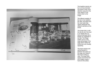
- 1. The headline stands out but is not too dramatic and doesn't draw much attention away form the main feature in the article which is the image. The different weights of the text in the headline, the deck, the byline and the main body help clearly distinguish the different elements of the article. The Image links in with the title as all of the food is on display like it is being showcased like a theatre as suggested in the title. The image makes up for a very large percentage of the page which makes the article look very visually appealing. The large margins and defined gutters in between text opens up the page and makes it feel more inviting to read. The large white spaces around the text and images create a frame for the article.
- 2. The images are at the top where you'd expect the title to be. This allows you to look at the images first before reading the article. The credit is in a different type face and weight so you can clearly see it is unrelated to the body. The images are linked well to the title as the artwork has many striking colours. The art has a Mediterranean feel and is designed to look quite old. The drop cap looks good on the page and signifies the begging of the body of text. It stands out because of the different Sans Serif typeface and larger weight. This is useful when the articles begin in different places on different pages.
- 3. The bold and large pull quotes are useful for showing main/ interesting parts of the body text which makes the audience what to read it properly and in context. The dotted lines in the gutters of the body text make the reading easy and comfortable as the body text is spit into small bitesize chunks. The images are quite unusual and make up for a large amount of the page space, this makes the reader then want to find out more about the pictures by reading the article which explains them. The enlarged bullet point takes on the same role as the drop cap by indication the start of the article which is useful if flicking through the magazine, the reader may not realise the page they're on is where the article begins.
- 4. The indents are used well in this article. To avoid having many empty lines in between each paragraph which would break up the article and disrupt the flow, the indents can indicate breaks in the text while retaining the aesthetics and flow of the article. The strap lines are useful as they give basic information about the article like the author and the topic. This text sits nicely out the way in the top margin so it's not to be re-read every turn of a page. The images in this magazine all have white space around them which frames them on the pages. They are never overlapped with other images or text which shows the reader they are the main features of the article.