1. A company's brand identity is how that business wants to be perceived by consumers. The
components of the brand (name, logo, tone, tagline, typeface) are created by the business to
reflect the value the company is trying to bring to the market and to appeal to its customers.
The business has a good brand identity as their name 'Shutter Island' sounds mysterious and
gives the audience an idea of the genre as it doesn't sound like a name of a teen drama for
example. In other posters the films tagline is 'someone is missing' which attracts audiences
that like crime and mystery. We decided to take this on board and find a magazine company
that promoted psychological thrillers and found Fangoria.
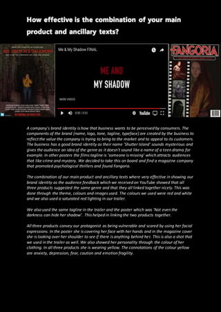
The combination of our main product and ancillary texts where very effective in showing our
brand identity as the audience feedback which we received on YouTube showed that all
three products suggested the same genre and that they all linked together nicely. This was
done through the theme, colours and images used. The colours we used were red and white
and we also used a saturated red lighting in our trailer.
We also used the same tagline in the trailer and the poster which was ‘Not even the
darkness can hide her shadow’. This helped in linking the two products together.
All three products convey our protagonist as being vulnerable and scared by using her facial
expressions. In the poster she is covering her face with her hands and in the magazine cover
she is looking over her shoulder to see if there is anything behind her. This is also a shot that
we used in the trailer as well. We also showed her personality through the colour of her
clothing. In all three products she is wearing yellow. The connotations of the colour yellow
are anxiety, depression, fear, caution and emotion fragility.