
Recommended
More Related Content
What's hot
What's hot (18)
Viewers also liked
Viewers also liked (10)
Similar to AS Media Magazine Research
Similar to AS Media Magazine Research (20)
Recently uploaded
Recently uploaded (20)
AS Media Magazine Research
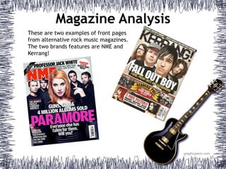
- 1. Magazine Analysis These are two examples of front pages from alternative rock music magazines. The two brands features are NME and Kerrang!
- 2. Magazine Analysis Masthead – The masthead is positioned at the top of the page. It is big and bold, making it eye-catching. The NME logo is also very identifiable, particularly for regular readers of the magazine. This means that it can be slightly obstructed by the cover band. Headline – The headline, usually about a featured band, will often be in the middle of the page, just below the cover star/s. It is central and will draw the reader’s attention, by making it sound interesting. For example, a rhetorical question is used to intrigue the target audience. Cover Star/s – Always shown on the front cover is a cover star or band. They will always be linked with a particular genre. The mode of address is very direct, as the band is looking straight forward. Barcode – The barcode is always displayed in the bottom right corner, so to not obstruct the main image. The general feel of the front page is quite serious. This is conveyed by the dark colours and simple layout, attracting a more mature audience. Feature – The magazine will often have a list of featured bands, interesting the reader if there is a particular band. It also tells newer readers the genre of music covered.
- 3. Magazine Analysis Main feature– The headline, is about the featured cover band. Both the headline and the picture are in the middle of the page, making it centre of attention for the target audience. For example, a rhetorical question is used to intrigue the target audience. This particular headline uses alliteration; Fame, Freak- Outs and Fatherhood. The mode of address is again direct. The general feel of the front page is more action-packed and exciting. There is a lot going on, with a bit more colour than that of NME. This is to attract a younger teenage audience. Freebies – This magazine offers freebies, for example posters of particular artists. This attracts people to the magazine, specifically younger people. Masthead – The masthead is positioned at the top of the page, and is very central. It is big and bold, making it eye-catching. Part of the masthead is also blocked from view by the cover star, however The Kerrang! logo is also very familiar to a mass audience. Barcode – The barcode is always displayed in the bottom right corner, so to not obstruct the main image.
- 4. Magazine Analysis The overall style of this page is that of a newspaper, which is quite organised and also old-fashioned, appealing to an older readership. Masthead – The masthead is also displayed on the contents page, again at the top of the page. Band Index - This is a feature that displays all of the bands that appear in the magazine, giving readers a sneak preview of what to expect in the issue. Offers – The contents page will usually feature some form of advertising or offers. In this instance, there is a subscription offer. This encourages readers to regularly purchase the magazine. Contents – A contents page will always have the contents of the magazine, highlighting articles and pages of interest. This allows the reader to better navigate to the part they want to look at. Article – A small article will sometimes feature on a contents page, and will be continued later on, enticing the reader to look further into the magazine.
- 5. Magazine Analysis The overall style of this page is quite contemporary and modern, as to attract its younger target audience. Feature – On the contents page there is frequently a featured band or singer, interesting fans of that artist. Offers – The contents page commonly features a subscription-based offer, enticing readers to buy the magazine cheaper and on a regular basis. Contents – A contents page will always have the contents of the magazine, highlighting articles and pages of interest. This allows the reader to better navigate to the part they want to look at. Masthead – The masthead is shown on the contents page, around the middle of the page.
- 6. Magazine Analysis Article – The double page spread will always have a big article that specially features in the issue of the magazine. It will be about the featured celebrity. Title – The title of the article will always be in a big font, and will often be a quote from the celebrity that features in the article. Celebrity – A very large picture of a celebrity will be on the page next to the story. Overview – A short overview will often be underneath the title, giving a brief overview of the article or story.
- 7. Magazine Analysis Celebrity – A very large picture of a celebrity will be on the page next to the story. Title – The title of the article will always be in a big font, and will often be a quote from the celebrity that features in the article. Overview – A short overview will often be underneath the title, giving a brief overview of the interview. Article – The double page spread will always have a big article that specially features in the issue of the magazine. It will be about the featured celebrity.
- 8. Magazine Analysis Mode of Address: For most alternative rock magazines, they adopt a mode of address that is quite dark and aggressive. The cover stars and artists featured are often posing in quite a serious manner. Although the mode of address is often direct, with the person looking at the reader, it is rarely a very friendly expression. Even for those that smile, the smile is perhaps cocky, suggesting that they are superior to you. This makes these kinds of magazines not so suitable for younger readers, because it is more mature and stern in style.