![[object Object],[object Object],[object Object],[object Object],[object Object]](data:image/gif;base64,R0lGODlhAQABAIAAAAAAAP///yH5BAEAAAAALAAAAAABAAEAAAIBRAA7)
Recommended
More Related Content
What's hot
What's hot (20)
Viewers also liked
Viewers also liked (20)
Similar to Media presentation
Similar to Media presentation (20)
Recently uploaded
Recently uploaded (20)
Media presentation
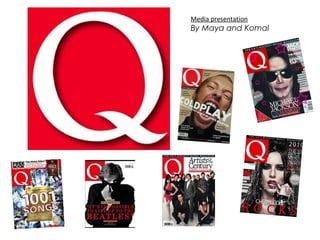
- 1. Media presentation By Maya and Komal
- 4. Content The logo of the magazine is one the top left handed corner. One of the major reason for this is because when people read, immediately they start from the top left handed corner. When people flick through a magazine, the first thing that would catch the readers eye is the “Q”. This then gets stored into the brain by people as its automatically stored. This can lead to making the magazine famous and aware people. The order is not sequential in page order, but it is ordered under headings – makes it easier for the reader to navigate what it wants to read. Continuous theme of red black and white. Reinforces that these colours represent Q magazine. Icons are used for artists in the magazine and also features included. Two different type of type faces are used. Bold, capitals for headings and less obvious fonts for the descriptions. Jay Z is a famous artist/entrepreneur. The fact that his face is enlarged attracts the audiences attention, This magazines portrays through the sizes of images which artist is the most important. How accessible are audience?
- 5. Double Page Spread One page of the spread is used for copy, while the other is used for images. This makes it easier for the reader to absorb each piece of information, and makes it clearer to read. The background and language used represent the rock culture. The colours used again, follow the theme for Q magazine. Also reminds readers of a piano – since the band is called The Black keys A variety of formal and slang register is used. Written in capitals, which appeals towards the eye. This man is making eye contact with the audience. The artist portray a long shot. “ THE BLACK KEYS” written in capitals to attract customers .
- 8. Key factors 162 number of pages. 39 number of full pages with adverts. 123 total pages of editorial. 50 editorial copy