1. Evaluation for photographs
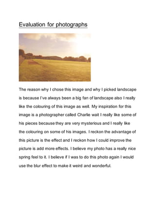
The reason why I chose this image and why I picked landscape
is because I’ve always been a big fan of landscape also I really
like the colouring of this image as well. My inspiration for this
image is a photographer called Charlie wait I really like some of
his pieces because they are very mysterious and I really like
the colouring on some of his images. I reckon the advantage of
this picture is the effect and I reckon how I could improve the
picture is add more effects. I believe my photo has a really nice
spring feel to it. I believe if I was to do this photo again I would
use the blur effect to make it weird and wonderful.
2. I love this picture because I think the colours of the flower are
very un-natural and the tools I used on this picture were the
hue saturated tool to bring out the colour. I am very pleased
with this photo and I believe it has gone to plan because I was
researching other landscape and tried to copy the images but
edit them so they look different. I believe what went well is that I
love the colour effect looks very cool also I reckon the effect of
the colour of the leave is very detailed, I reckon what I could
improve on is to focus it more. I believe I have learnt new skills
by copying the images onto one image.
3. The feedback that I got was very positive and the only
improvements I have to do are add less effect on the image of
Karne. All together I am very proud of my images and my
feedback because it was very positive. I believe my strengths
of this topic were that I have improved my skills on Photoshop
such as I have changed the colour for image 2.
Portrait:
In this picture I have used my photography skills to produce this
basically what I have done is that I used the blur effect to
produce this really weird and wonderful colour and effect which
4. makes the image look really cool. I also used the opacity tool to
put the other picture of karne so it makes it look like one
picture. I believe the advantage of this picture is that it looks
like an abstract photo but there is still that sense that it is a
portrait. I believe the disadvantage of this picture is that I may
have overdone the effects next time I will use the blur effect on
a lower percentage for an example I will use only 5%.
Landscape:
I really like this image because the colours represent that weird
sense but also very creative feel to it. What I did to produce this
image is that I used Photoshop to make all these colours
possibly. I used the brightness and contrast tool and also I
selected the bin and turned it purple. I believe the only
disadvantage of this picture is that it was very simple if I was to
5. do this picture again is that I would add more effects as I feel
like it is to simple and I would love to add a blur effect and
possibly add another image into one so it seems like it is in the
same picture.