
Recommended
More Related Content
What's hot
What's hot (18)
Viewers also liked
Viewers also liked (20)
Similar to Chosen Pictures
Similar to Chosen Pictures (20)
Recently uploaded
Recently uploaded (20)
Chosen Pictures
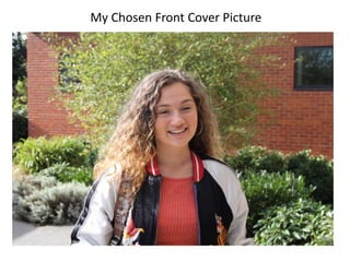
- 1. My Chosen Front Cover Picture
- 2. Why did I choose this picture? I chose this image because I feel like it suits the magazine I am creating. In the image I have a student who is smiling, looking at the camera with some parts of the school behind her. It is a good image because it is easy to tell that she is a sixth former as she is wearing her own clothes and there is good lighting to the image. I like the how the backdrop would look like once I have cropped the image to magazine size. The greenery behind the model gives the impression that the photograph was one of high quality as the background blurred once the model was in focus. The fact that it blurred out was another factor in deciding to choose the image as it gives me a nice canvas to work on once I start putting the front cover together. I can place white text over the green leaves without it getting lost or not being read clearly. Even though I didn't have a shot like this on my shot list, I think it was the best to have her not holding any books or have any props as it would take out the simplicity from the image and make it appear less formal which is not what I wanted. If I was to improve one thing about this image it would be to have her standing further away to have more of her in shot. Image once it’s cropped
- 3. My Chosen Content Page Picture Why did I choose this as my contents page image? I chose this pictures as I liked how it had both models completely in shot. I was looking to take one main image for my contents page that was landscape and I felt like this one was the best compared to the others. Both models seem happy and are having a good time. It is a good image as it represents school and learning which is good as my magazine is a college one and therefore it links to my brief. The fact that the front cover model has been used again links the image to the front cover as well as the green at the top which links to the green in the magazine cover’s background. Overall I like the look of the image and felt that it was suitable and a welcoming image.