1. Here can you
see the
magazine with
the CD.
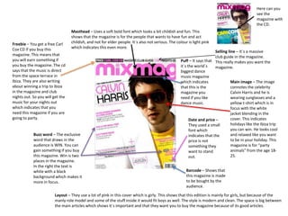
Masthead – Uses a soft bold font which looks a bit childish and fun. This
shows that the magazine is for the people that wants to have fun and act
Freebie – You get a free Carl childish, and not for elder people. It`s also not serious. The colour is light pink
Cox CD if you buy this which indicates this even more.
Selling line – It`s a massive
magazine. This means that club guide in the magazine.
you will earn something if Puff – It says that This really makes you want the
you buy the magazine. The cd it`s the world`s magazine.
says that the music is direct biggest dance
from the space terrace in music magazine
Ibiza. They are also writing which indicates Main image – The image
about winning a trip to Ibiza that this is the connotes the celebrity
in the magazine and club magazine you Calvin Harris and he is
nights out. So you will get the need if you like wearing sunglasses and a
music for your nights out dance music. yellow t-shirt which is in
which indicates that you focus with the white
need this magazine if you are jacket blending in the
going to party. Date and price – cover. This indicates
They used a small holidays like the Ibiza trip
font which you can win. He looks cool
Buzz word – The exclusive indicates that the and relaxed like you want
word that draws in the price is not to be in your holiday. This
audience is WIN. You can something they magazine is for “party
gain something if you buy want to stand animals” from the age 18-
this magazine. Win is two out. 25.
places in the magazine.
In the right the text is
white with a black Barcode – Shows that
background which makes it this magazine is made
more in focus. to be bought by the
audience.
Layout – They use a lot of pink in this cover which is girly. This shows that this edition is mainly for girls, but because of the
manly role model and some of the stuff inside it would fit boys as well. The style is modern and clean. The space is big between
the main articles which shows it`s important and that they want you to buy the magazine because of its good articles.
2. Masthead – The font is bold Freebie – You get a free euro festival
and masculine which indicates guide if you buy this magazine. This
that the magazine is mostly makes the audience feel like they gain
for men. It`s also in red, black something if they buy it.
and white which is the main
punk colours.
Date and price – The date Main image – The image is of
and price is hidden under the vocalist in Green Day. He
the big masthead and it can looks cool when he hold up
be hard to find, because it is his guitar. The guitar is yellow
not the normal place to and highlighted while his
write it either. So it is very of clothes is black and
focus. mysterious. He is a role
Sub image – This shows more of model for everybody that
what is inside the magazine. And likes rock, and he looks like a
the background behind the photo proper rock star that do what
and the text below is yellow to ever he wants. He is making a
highlight the photo. face like he is screaming
which shows that he owns
the stage whit a lot of
Buzz word – You have the word confident.
exclusive, plus and win in this
magazine. The main story gets
special because not only is it
exclusive, but it`s secret as well. Barcode – This shows that
This makes you want this the intension for this
magazine, because you feel special magazine is to be bought by
when you read it. You also feel like its audience.
you get something extra because
it is standing plus in front of it. The
plus is in white with a red
background to get focus and the Layout – The layout indicates that the target audience is men. The masthead is a bold and
text behind plus is white on black masculine like all the other fonts used in the front cover. The cover is a little bit messy
for the same effect. And Eminem which is also typical for the rock genre. The colour scheme have a lot of highlighted colours
and Tank Girl is in yellow to get in it which all takes a lot of focus and makes it look like it is a very important magazine and
highlighted. that it contains a lot more than it does.
3. Masthead – The magazine is so
known that they don`t need to show
the whole masthead. The font is bold Main image – The main image
and masculine which shows that it`s a is of Trey Songz. He is a R&B
manly magazine. artist and a role model for
men. They made him like a
Layout – The layout is very manly with the dangerous, masculine tattooed
main image and colour scheme. The man here. They show that this
magazine has a article about 4 ways to is how you should be and look.
rock a suit which also indicates that the Young people that listens to
target audience is men. The colours hip hop and R&B like his music
red, black and white is really strong wants to look like this very
colours which draws a lot of attention and often. His eyes is looking
shows how dangerous and confident the intense and straight into the
main image is. It is all very strong. camera and the red and black
layout also makes him more
dangerous.
Barcode – This shows that the Buzz word – The buzz word is
intension for this magazine is to be EXCLUSIVE. You need to buy this
bought by its audience. magazine if you want to hear this
story.
Date and price – It`s hard to see the date and price so this
is nothing they want to put the focus on. It is probably
very expensive.
They also write their website address big over the
barcode so everyone sees it when they are looking at the
price and maybe buy the magazine or just visits the
website instead.
4. Headline – You have the NME logo at the right in red so it
is in focus. And contents is also bold in the same font, but
in white and big so it gets focus as well.
Index – This is a band index which
shows you which bands that are in the
magazine. It stands which pages you
can find it on. And the bands is in red
as the NME logo and the gig guide. So Date – You can see the date
this is what NME focus the most on. that it was published here.
The font is the same as the logo to
show the similarity and the
awareness.
Sidelines – You have the titles for
the different themes highlighted
Main image – the main image is of in white text with a black
arctic monkeys on stage. Before you background so you can see it
read the text you can see that you can easier. The page number is in red
read more about their live here too and the text in black
performance inside the magazine. It is under the titles. You can see
also the main article. They are in big everything that is in the magazine
focus in the picture with the black here.
background.
Main title – The main title is in the same
bold font as the logo and “p45” is in red
which is similar to the logo again. It gives it
a focus and it’s big so it’s highlighted. Plug – It is a gig guide inside. This was put in
focus with the red background and the
white text. And it says that it is the UK`S No
Anchor – This draws you into buy more. 1 gig guide, which makes you want to read
You will save money if you subscribe to it and it makes it exclusive.
NME.
5. Masthead – The masthead is
in the same colour scheme as
the contents page to make it Heading – The heading is very
simple and clearly. clearly because Contents is
written so big with capital
letters in black on white
Banner – The banner is very background for the contrast.
clear with the layout and very
simple so it is easy to find the
articles you want to read by
looking under the sub-titles. Sub-images – The sub images
By using grey background in draws your attention for only a
the banner it gets its on little while before you look at
focus, but it still doesn’t draw everything else, but it gets its
attention away from the rest focus by having all the images
of the page. beside each other under the big
The colour scheme is used well heading.
on this banner by separating
the different themes.
Events – they catch your attention early
by putting all the events at the end and
the sub-titles are bold for you to find
what interests you best. This draws you
attention early in the magazine.
Main image – the main image is a studio picture of a famous
artist. She looks confident, and the photo is taken with a low
angle to show how powerful and important she is. She is also
glamorous with the silver hanging around her, even though
she is dressed casual too make her even more powerful.
6. Heading – The month and year is written
over the heading to get some attention.
While the heading is getting more attention
Main image – the main image because Contents is written in yellow on a
is a studio photo of The black background to get some contrast. The
Martinez Brothers. They gets a layout is also simple here as the whole
lot of attention because they content page.
covers a lot of the page. The
brothers are role models for Sub-image – The sub image doesn’t draw
the manly magazine’s target so much attention because it is a very
audience. They are dressed simple image. But the page number is in
casual like everyone should be the same font as the main image which
dressed and look everyday. indicates that the article is important. The
Even the side you can find the article is about Burning Man Festival which
article about them is drawing is written at the bottom of the image.
attention because it is big with
a special font.
Features – It is simple to find the articles
you want to read when you look at
features. It get’s it’s focus because it is
beside the main image. The titles are bold
so it gets simple and easy to find.
Website – The website for
this magazine is written very
little underneath the freebie
text for you too see it, but it
is not in focus.
Freebie – MixMag lets information about your freebie for the magazine
draw your attention by having a yellow background behind the black title.
This shows how much the magazine plays on the freebie they give away.
It is a very important part of the magazine and a lot of people probably buy
this magazine just because of the freebie.
7. News – There is a little
banner with Kerrang’s Heading– The main title is a question following with Davey’s answer to the
website and some question. This gives you an idea of which types of questions to expect in the
information here and it interview below. It is highlighted with white and pink text and a black background.
shows that it is not a His answer is more highlighted because it is bigger like his big image. It shows that
part of the article his answers is the most important in the interview. Underneath the title you get
because it has other more information of what to expect to read about.
colours like red. But it
gets enough focus for
you to read it.
Layout – The layout is
kept simple but still
Main image – Davey Havok fresh for young adults
looks very cool and relaxed with the colours. The
in this picture. They have colour scheme is manly
made him casual as the but still a bit girly
quote they use in the because of the pink
headline. He is a role model colour they used in the
for how men from 18-30 headline. It is kept
wants to look in a casual simple because they
day. only use 3 colours and
pink is the only colours
that draws special
attention.
Article – The article starts with a big D, which is Davey Havok’s letter. Then the
questions is written with a white background instead of grey for it to get simple and
clean. It is easy to read only some of the article if you want to just by looking at this.
And it is also “cooler” for the young adults and it gets interesting instead of
boring, even though it is simple.
8. Banner – The black
Main image and headline
banner draws a lot of
– This is a DPS for DJmag.
attention because it is
Ferry Corsten looks cool
white text on black
and relaxed in this photo.
background instead. And
The tie is not tight for the
it got a picture of one of
style to be a casual. He
Ferry Corsten CD’s.
draws a lot of attention
They have a title over it
because the photo is so
which doesn’t draw any
big, and because of the
attentions.
text on the photo. They
The white text is telling
have even used
you something about
“Ferry”, his name, instead
every track on the CD.
of “Very” in a expression
So this must be the main
for the headline. After
article in this
that they write about him
magazine, because it is
as a mastermind, which
so important and he get’s
indicates him as someone
a lot of attention in the
who have all the answers.
magazine.
And someone to look up
to.
Main article – The main article is kept very simple without drawing any attention. Layout – The layout is kept simple
The questions is in bold text while the answers is normal. This makes the page very with the main image and the
simple and not messy because of the big picture and the black banner. banner in extra focus. The fonts are
simple as well.
9. Headline – The headline is highlighted in the black box with a white
line and the pink number 3. They use another font here to make it a
bit more serious than the rest of the titles because this is the
headline. “The best parties of the last month” is written in yellow on
the bottom of the page to let you know what you are about to read.
Main image – This image is a
club image of some young
Need to know –
adults drinking and having
They have their
fun. They gives a big
own little box
impression of what you are
under the
going to read about along
different
with the titles. They shows
reviews to tell
you how you should be in a
you everything
nightclub.
you need to
know before
Sub-images – They also
you go to the
shows you how you should
different
act in a nightclub. And they
parties. They
also gives you an impression
are highlighted
from each party you are
with the pink
going to read about. They
background and
are all of young adults having
gives you more
fun which will be the target
important
audience for the magazine
information.
MixMag.
Main text – The main text is kept in a simple font underneath the titles with a more playful font.
This font is used for their young target audience. They want to keep the article cool and a bit
childish with all of the fun colours like yellow and pink. This is for you to get a need for acting
childish and go out to these parties yourself.