
Recommended
More Related Content
Viewers also liked
Viewers also liked (19)
Similar to 'Line photo' analyses
Similar to 'Line photo' analyses (20)
Recently uploaded
Recently uploaded (20)
'Line photo' analyses
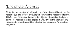
- 1. ‘Line photo’ Analyses Firstly, I experimented with lines in my photos. Doing this catches the reader's eye and creates a visual path in which the reader can follow. This focuses their attention onto the object at the end of the line. In doing so, I realised that this approach wouldn't fit the theme of my magazine because it would have looked too structured for a college magazine.
- 2. In the two photos above I decided to focus the camera on the background and not the banister in the foreground as I feel that the model(s) at the bottom are the main point of the image this way and all attention is on them. These also have a very relaxed feel to them and would fit my magazine genre of a college magazine because of the location clearly being a school environment.
- 3. I think that the photo above is very effective due to the low angled shot used. It shows the model to be unaware of both the camera and the line she is stood upon which gives a sense of everyday life again as situations such as this are usually un-staged in an environment alike this school.
- 4. I don't think the photo above works at all because the camera isn't focused on the line which caused it to not be as evident to the viewer. The model also looks un-sharp, as if the shot has been taken with no precision whatsoever and that is not the vibe a sixth form college magazine should have to it. The lack of focus also defeats the object of the line being in place as it doesn't achieve the goal which is to allow the viewer's eyes to follow it.
- 5. The final photo from my 'line-shoot' is above. I think that using the path as a natural line was very effective in the location I chose because the grey path is in deep contrast to the greenery surrounding. This forces the path to stand out which means that the viewer's eye would be directly drawn to it instantly.