1. Analyses of Front
Covers – College
Magazine
As a class we have just been introduced to college
magazines to create a mock task of our preliminary task.
To help me understand the key features of a college
magazine, which I will have to recreate, I decided to
analyse a few samples from previous years.
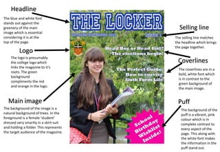
2. Headline
Selling line
Main image
Logo
Puff
Coverlines
The blue and white
font stands out against
the greenery of the
main image which is
essential considering it
is at the top of the
page.
The logo is
presumably the
college logo which
links the magazine to
it’s roots. The green
background
compliments the red
and orange in the
logo.
The selling line matches
the headline which
brings the page together.
The coverlines are in
a bold, white font
which is in contrast
to the green
background of the
main image.
The background of the
puff is a vibrant, pink
colour which is in
complete contrast to
every aspect of the
page. This along with
the white font makes
the information in the
puff stand out.
The background of the image is a
natural background of trees. In
the foreground is a female
‘student’ dressed very smartly in a
skirt-suit and holding a folder.
This represents the target
audience of the magazine.
3. Headline
Selling line
Main imageCoverlines
The white font is in
contrast with the navy
blue background of the
colour blocked placed
above the main image
which would catch the
eye of the reader.
The selling line matches
the font and colour of the
headline which brings
the page together.
The coverlines are in
a bold, white font
which is in contrast
to the green
background of the
main image.
The main image is in a
sepia tone and involves a
teenage boy wearing a
shirt and tie. He is looking
and pointing directly into
the camera lens and
smiling which is a form of
direct address by forcing
the reader to feel included.
The coverlines are
dotted around the
page without much
thought. This makes
the page look messy
and suggests that the
editor has no skill in
composition.
The background of the
headline disrupts the
page making it seem
as though it is split into
two.
The selling line only
involves the issue
number and therefore
leaves out key details.
There is a lot of dead
space behind the
model in which a
reflection of a messy
wall can be seen. This
distracts the reader.
4. Selling line
Puff
Coverlines
The selling line provides
information for the target
audience to ensure they
are fully satisfied with the
magazine.
The coverlines are in
a bold, white font
which is in contrast
to the green
background of the
main image.
The background of
the puff is a bright
blue colour. This
makes the puff stand
out against the
brickwork of the
background.
Headline
Main image
The bold, black font
catches the attention of
the reader’s eye as it
stands out against the
orange toned
background.
The background of the image is
a red brick wall. In the centre is
a female ‘student’ dressed in
chinos and a checked shirt with
glasses on. This suggests that
the target market of this
magazine is an intelligent
student.
This coverline is
placed across the
page on a blue
background similar to
that of the puff. It is
accompanied by a
picture of the model
and the text is a
different font to that of
the rest of the
magazine.
Main story