
Recommended
More Related Content
What's hot
What's hot (20)
Viewers also liked
Viewers also liked (20)
Similar to Shots
Similar to Shots (20)
More from sarahrodgerson
Recently uploaded
Recently uploaded (20)
Shots
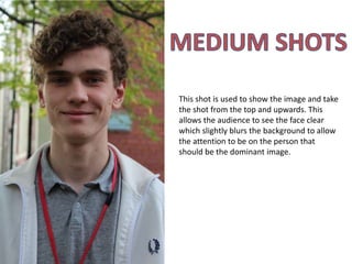
- 1. This shot is used to show the image and take the shot from the top and upwards. This allows the audience to see the face clear which slightly blurs the background to allow the attention to be on the person that should be the dominant image.
- 2. This shot is close up and allows the persons face to dominate the image. This allows the person to engage the readers attention and keep their focus and this is the likely shot that I will use for my magazine as it will suit my genre well and allow the person and my magazine to be widely recognised.
- 3. A big close up shows the face only and a slight background and this shows the person in a direct mode of address. This would be a possibility for my magazine as it’s a head shot and it doesn’t include much background which allows the attention to be on the persons face.
- 4. This is an extreme close up of the persons face which allows the reader to feel connected to the image. However this type of shot doesn’t allow the person to be easily recognised so it won’t be suitable for my magazine.
- 5. This is a mid shot of the person and it’s taken from the waist upwards. This is one of the most common uses of shots in magazines and I am planning on using this kind of shot for the images on my double page spread so that I have a variety of shots.
- 6. The medium long shot shows the person from the knees up. These kinds of images aren’t commonly used on front covers as they don’t normally dominate the image as the background can be seen.
- 7. The long shot shows the entire body. These type of shots aren’t commonly used in magazines and if they are they are mainly used for sub images. This is because you can’t really see the face and it isn’t dominating the image therefore it won’t grab the readers attention as much as a close up shot would.
- 8. This is a very long shot that shows the entire body and allows the person to dominate the image wile allowing a small amount of background.
- 9. This is an extreme long shot which makes the person appear small and barely visible. It makes it hard to notice the person as the background dominates the image which is why it’s unsuitable for my magazine.