2. How old are you?
0
1
2
3
4
5
6
16 17 18
I asked people of these ages as this is the age group of which my magazine will be targeted to.
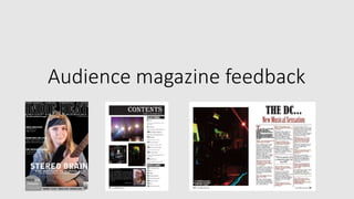
3. Would you buy a magazine with this front
cover on?
100%
0%
Column1
Yes No
Everyone I asked said that they would consider buying a magazine had it had my front cover on.
4. Do you think my three products look
professional, if not why?
0 1 2 3 4 5 6 7 8 9 10
Yes
No
Only one person said no and there reason was that they appeared too simplistic, however the other 9 I
interviewed believed they were professional, therefore they don’t need much more improvement.
5. Do you think the artist on the front cover
looks like an Indie-rock artist?
90%
10%
Sales
Yes No
Only one person believed they didn’t look like an Indie-rock artist, whereas the other 9
did, thus they must follow the conventions more than not.
6. Do the feature articles artists in the contents
page appeal to you?
0%
10%
20%
30%
40%
50%
60%
70%
80%
90%
100%
Yes No
Everyone I asked said the feature article artists appeal to them, this suggests I have
chosen the right artists for my chosen age group.
7. Do the feature articles on the front cover of my
magazine appeal to you and make you want to
read it?
90%
10%
Yes
No
One person said no this suggests they have a different taste of music to Indie-rock as the
other 9 said they appealed to them.
8. Why?
0
0.5
1
1.5
2
2.5
3
3.5
They sound good Artists are well known I like them I am a fan Don’t appeal to me
Series 1
When asked why they liked or disliked the front cover features, most people said that they appealed to
them as the artists are well known, whereas the only negative comment was that they didn’t appeal to
them, thus this magazine wouldn’t be popular for that one person because of there music taste.
9. What do you dislike about my contents page?
0 1 2 3 4 5 6 7
Editor's letter
Layout
Nothing
Six people said that they disliked the layout, which tells me I could have made it better to
appeal to the audience.
10. What do you like about my contents page?
Layout, 3
Editor's letter, 2
Images, 5
Website, 1
0 0.5 1 1.5 2 2.5 3 3.5 4 4.5
Five people said they like the images used on my contents page and three said they liked the
layout, which suggests the layout isn’t actually that bad
11. Do you think my colour scheme fits well with
the Indie-rock genre?
100% 0%
Yes No
All the people I interviewed believed that the colour scheme fits with the
genre, suggesting no improvements need to be made to the colour.
12. What do you like best about my front cover?
0
1
2
3
4
5
6
7
8
Masthead The puff Main image
Most people I asked chose the puff, this suggests it makes the magazine more professional.
13. What do you like least about my front cover?
0
0.5
1
1.5
2
2.5
3
3.5
4
Cover lines Nothing Masthead Main image
The most popular answer was cover lines and how they were layout, inferring
they are too close together possibly.
14. What do you like most about my double page
spread?
0 0.5 1 1.5 2 2.5 3
Layout
Quotes
Drop cap
Fonts
Image
Interview
The most popular answer was the quotes and layout, which shows they are the strongest part of
my double page spread.
15. What do you like least about my double page
spread?
0 0.5 1 1.5 2 2.5 3 3.5 4
The image
Nothing
Fonts
Most popular was the fonts and image, whereby four people said that they least liked them, thus
needing improvement.
16. What are your thoughts on my interview with
the DC?
Detailed, 3
Interesting , 5
Good, 2
Needs more detail, 1
Most said the interview was interesting and had lots of detail, showing the interview is good.
17. Overall, do you think my magazine follows the
Indie-rock genre?
0
2
4
6
8
10
12
Yes No
Column2 Column1
Everyone I asked said that the believed the magazine followed the Indie-rock genre.