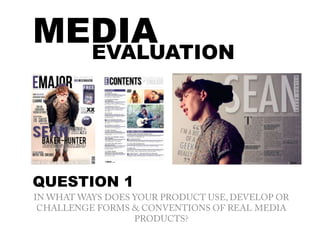
2. FRONT COVERWhen creating my music magazine, I looked at a selection of other real music magazines to
help and inspire me. I made sure that my magazine front cover used…
•Masthead– I used a bold san-serif font that immediately stands out, I made the ‘E’ or
‘Emajor’ the signature purple colour that runs through the front cover in order to create
contrast. I also made sure it ran behind my main image.
•Headline – I made sure my headline was bold and in one of the biggest fonts on the page. I
centralised it two-thirds of the way down the front cover to grab attention and be easy to
see without spoiling the design ‘feel’ of the product
•Strap-line – I made sure that my strap-line – ‘The UK’s Major Indie Music Magazine’ was
eye-catching, self explanatory and also used a pun to do with the title ‘major’, however
didn’t reveal too much. I used a mixture of different fonts and colours to draw the reader in.
•Puffs/plugs – I used two puffs/plugs on my front cover in order to gain instant ‘what’s in it
for me?’ attention from the reader. They immediately stand out although they’re still subtle
enough to fit in with the overall design ethos of my front cover without detracting from the
main stories.
•Coverlines – My coverlines refer to items and articles that my target audience will identify
with and find interesting. I tried to keep them as varied as possibly within the confines of a
music publication. I deliberately kept the colour in them subtle but I considered a wide
variety of shades, outlines, shadowing, glow and tones to make them visible against the
background.
•Fonts – I have used a variety of fonts purely for the style effect and to keep the reader
interested. They combine to create diversity and makes each one stand out whilst still
keeping within the design theme. I used a mixture of serif and san serif fonts to further
enhance this.
•Information points – I also added a barcode, price and dates to make my product look
more professional. The reader has everything they need to entice them further on the
cover without searching or ‘working’ hard .
CONVENTIONS
USED
3.
4. CONTENTS PAGECONVENTIONS
USED
When creating my music magazine, I looked at a selection of other real music
magazines to help and inspire me. I made sure that my magazine contents page
used…
•Masthead – I made sure that my masthead used the same font and style as on the
front cover, however, I slightly changed it by adding the word ‘contents’ instead of
‘major’ and also added a box around the letter ‘E’ in order for it to stand out
•Strap line – I decided to make my strap line - ‘This months issue of Emajor’ quite
subtle in order to not detract attention away from the masthead. I did this my
making it a light grey, I also used a variety of different fonts and sizes to make it
visually interesting
•Images – my images relate to the stories on the page, I have added slight
shadowing to my images in order to make them stand out from the page, I have
also put them into a square shape formation for a structured feel. I have put a page
number on the corner of each image in order for the reader to easily be able to tell
what page the story connected to the picture is on.
•Page numbers – I have made my page numbers clear and also added a box around
each page description that is featured as an image on the page.
•Headings – Bold and easy to read in a serif font with lines that separate them from
the captions below
•Sections – I have separated my page numbers into ‘What’s on the cover’ and ‘this
months highlights’ this is easily visible due to the purple box that I have written the
two headlines in.
5.
6. DOUBLE PAGE SPREAD CONVENTIONS
USED
•Masthead – My masthead is in a very big and bold san-serif
font. I tried to use a graphic design effect by adding shadowing
and a ‘cut out’ effect with the artists second name – ‘Baker-
hunter’ by writing in vertically down the letter ‘N’ and making
it the same colour as the right hand side of the picture
background.
•Subheading – My sub heading is in the same colour as my
title. I used a serif font to contrast and compliment the title
and lined it up with the width of the columns below.
•Pull Quote – My pull quote is bold and slightly abstract. I
wanted to do this so that it would be instantly visible. I used
two large speech marks above and below my quote to draw
attention to the content. I slightly rotated each line for a
starburst effect positioned down the model's chest. I outlined
the word 'geek' in the same colour as the title in order for it to
have a greater impact as it is the key word of the quote.
•Drop capital – I created my drop capital manually to create
impact and to add a conventional effect.
•Columns – I added 3 columns manually for a neat and easy to
read effect.
•By line – I added a by line to the top left hand corner and used
italic and bold fonts to add impact. I made my by line big
enough to see but not too big that it detracts from other text
on the page.
7.
8. DEVELOPMENTS
& CHALLENGES
I wanted to make sure I gave my magazine a slightly unconventional, stylised and
fashion-infused feel. I did this by making sure I didn’t overpower the pages with
too many bold and bright colours. Instead I kept to a more neutral, urban theme
of graphite, stone, dove grey and a little purple.
I also made sure I kept the design simple and classy, sticking to a colour scheme
on each page. Some magazines, for example Kerrang, are very overbearing in
their design, and somewhat ‘loud’ but I wanted to make sure that mine was quite
understated and not at all ‘cheesy’.
I also used a mixture of different fonts which I felt contrasted with what is usually
found in a more regular magazine as a lot of publications don’t tend to use too
many fonts together on a page. I wanted the reader to appreciate the pages for
their visual merits as well as their content as it would suit the target audience and
its dual interests in fashion and music.