SlideShare a Scribd company logo
1 of 3
Download to read offline
Front Cover Analysis
Title: The contrasting black and white
colour scheme utilized on the title has
been selected as it is reflective of the
music genres (punk, metal and emo)
covered by the magazine as well as being
bold, eye-catching instantly recognizable.
The photo purposely overlaps the title in
order to foreground the band; this
ensures that the magazine title does not
detract from the main article, as it is
likely that people who do not usually
read Kerrang! will buy the magazine due
to an interest in Biffy Clyro.
Colour Scheme: The black and white
colour scheme present on this
magazine cover has been selected as it
is synonymous with the style of music
that it covers, as well as its target
audience (14/15 year olds). In
choosing this colour scheme the
magazine is conforming to the
conventions of the genre, meeting the
readers’ expectations and making them
feel comfortable whilst reading it as
they know it was made for them.
Photography: In terms of photography
a medium shot of the band posing has
been used. This shot has been chosen
as it creates a sense creates intimacy
with the group, making the article seem
more appealing to the reader. As the
band is posing for a photo shoot it is
pragmatically implied that the group
has a good relationship with the
magazine as they are willing to pose
for them. The smaller photos located at
the bottom of the page are also all
medium shots or medium close ups.
Text/picture ratio: As this is a front
cover it relies heavily on pictures to
catch the readers’ attention and to
entice them to by the magazine. The
text present consists of bold, snappy
miner sentences, these aid the reader
in gaining an understanding of the
contents of the magazine quickly,
thus making them want to by it. A
short pull quote ‘unfold the puzzle of
life…’ ahs been utilized to give the
reader an insight as to the contents
of the magazine; influencing their
decision to buy a copy.
Fonts: The same bold, white text has
been used for all of the band names;
unlike the mast head they are not
distressed in any way, this is in order
to maintain clarity. In terms of font
size the main heading has the largest
font, as it is the most important idea
presented on the front cover. The pull
quote to go along with it is the same
font only smaller, this way it does not
detract from the main heading. The
distressed font style of the mast head
is a convention of the genre of music
of which the magazine covers.
Overall: The stark contrast of the
black and white colours to the
aggressive red help follow the
conventions of the broad genre of
rock and create an eye-catching
design. The photography makes the
magazine seem more appealing to
the reader, particularly to the target
market (14 year olds). The fonts
work in collaboration with the
images; overlapping them and
adding extra information without
taking away emphases. The whole
cover has been designed to parallel
the genres that it covers.
Double Page Spread Analysis
Colour Scheme: similar to
the front cover this double
page spread exemplifies a
colour scheme consisting of
black, white and red; colours
that appeal to the target
market of Kerrang!, that also
parallel the style of music of
the band the article is talking
about. In recognizing the stark
contrast between white and
black, the editor has made the
text in the main article stand
out against the dark
background, making it easy to
read and continuing the bold
style of which the magazine
tends to adopt.
Photography: A medium
close up of the band
performing live has been used
to cover both pages of the
double page spread, giving
the entire design a lively
appearance. In using a live
photo the magazine moves
away from clichéd poses,
often prevalent in more
mainstream pop magazines
and instead adopts a more
natural, photojournalistic
approach that readers will
appreciate. As well as this the
choice of a live photo makes
the article feel more intimate
for the reader.
Writing style: The article focuses on a
gig played by the band, and is written
in a fairly informal style that the
magazines typical reader (14 year olds)
would find engaging. Quotes from the
band work well in collaboration with
the intimate style of the DPS created
by the large mid-shot of the band.
Colloquial language such as ‘fizzles’
and ‘gig’ help to maintain an informal
register that would be entertaining for
the reader, as well as reflecting the
demographic of the band.
Fonts: The font for the main body of the article is a
plain, clear sans serif style which is easy to read and
reduces the reading time necessary; something
which 14 year olds will appreciate as, stereotypically
they will not want to spent large amounts of time
reading. The main heading uses a powerful, bold
font that has been chosen in order to catch the
readers’ eye while they are skimming through the
magazine looking for an article that interests them.
The broken style used on the heading ‘Rated: Lives’
conforms to the manic style of music of which the
article is discussing as well as maintaining
conventions of the genre.
Text/picture ratio: Because
the editor has chosen to
include an article which in
itself is fairly short as this
accommodates the demands
of the reader, a large photo
which covers both pages of
the DPS has been
implemented. This works in
accordance with the lively
style which the magazine
tends to include. A large
heading, overlapping the
image has been used so that
the reader can quickly gain an
insight as to the subject of the
article.
Overall: The colour
scheme of dark black, bold
white and aggressive red
works in well accordance
with the demographic of the
magazine and the music
genres that it covers. The
photography creates a
lively, vivid aura in order to
engage the reader, and the
informal style of image
used helps to create
intimacy. This informality
is continued through the
phatic writing style that
mirrors the band being
covered. The font used in
the main article is fairly
plain in order to maintain
some level of sophistication
and coherence as well as
being easy to read.
However the main
emphasis of the DPS is
placed on the large photo
that dominates both pages.
Contents page analysis
Text/picture ratio: this contents page
has a very busy layout where the
pictures occupy far more space than the
text. Emphases has been placed on the
image of ‘you me at six’ as this is the
main article and as such has a much
larger photo than the other stories. Each
image has pull quote that gives the
reader a vague idea as to what to expect
from the article, this entices the reader
towards them. The heading ‘contents’
has been enlarged and as such, fore
grounded this is so that the reader
instantly knows what they are looking
at. The idea behind this page is that the
reader can quickly find the article they
are interested in which is why it consists
predominantly of photos.
Writing style: This page mostly consists
of quotations and pull quotes that give
the reader an idea of what to expect from
each article. Despite mainly consisting of
miner sentences this contents page
manages to establish an informal register
that is likely to appeal to the teenagers
this magazine targets as well as reducing
the time necessary to choose an article to
read.
Font: For the most part a fairly plain
sans serif font has been used as it is
easy to read and establishes a sense of
sophistication. Emboldened headings
have been used so that the reader can
quickly decipher the pictures. The
heading ‘contents’ uses a yellow font to
make it stand out above the other text
present, an idea that is continued with
the sub-headings. The quote in the top
right hand corner uses a slightly larger
font size than most of the text of the
page so that it is instantly noticeable.
Colour Scheme: The colour scheme
used in this contents page differs from
the black, white and red that readers
can come to expect from Kerrang!.
Instead a colour scheme of gray and
yellow has been used, gray as the
background colour almost as if it is
creating a blank canvas for the bold
yellow to highlight the important
headings.
Photography: This contents page
contains a mixture of medium to close
up shot of live performances and
poses, giving the page an interesting
varied look. The live photos are in
keeping with the energetic style of the
magazine and the posed photo of ‘you
me at six’ injects an element of humor
into the layout. Both of these factors
make the reader want to read the article
that goes with the image.
Overall: Because the pictures take
up more space than the text the page
has a busy appearance, however it
manages to maintain understandable
through the use of a multitude of
headings that complement the
images. The writing style consists
mainly of short snappy sentences
and quotations that make the reader
want to read the article from which
they are talking about. The use of a
san serif style font ensures that the
text is clear and easy to understand
so that the reader can quickly find
out the page of the article they are
interested in. The colour scheme of
gray and yellow is slightly more
formal than the black, white and red
prevalent in Kerrang!. The mix of
live and posed shots has been used
to make the reader want to read the
article of which they concern.

More Related Content

What's hot

Market research and analysis
Market research and analysisMarket research and analysis
Market research and analysisMattyHorne00
 
Evaluation question 5
Evaluation question 5Evaluation question 5
Evaluation question 5Tom
 
Analysis of Magazines.
Analysis of Magazines.Analysis of Magazines.
Analysis of Magazines.beckyyoungs
 
Question 1 - Tom's response
Question 1 - Tom's response Question 1 - Tom's response
Question 1 - Tom's response lunn99
 
Magazine Analysis
Magazine AnalysisMagazine Analysis
Magazine Analysislallen92
 
Main task magazine analysis
Main task   magazine analysis Main task   magazine analysis
Main task magazine analysis JordanLiddell
 
Media evaluation question 1
Media evaluation question 1Media evaluation question 1
Media evaluation question 1Brandon Nolan
 
Magazine Analysis
Magazine AnalysisMagazine Analysis
Magazine AnalysisJessDruett
 
Magazine Analysis
Magazine AnalysisMagazine Analysis
Magazine Analysisasmediae13
 
Music Analysis by Ayesha Patel
Music Analysis by Ayesha PatelMusic Analysis by Ayesha Patel
Music Analysis by Ayesha Patelayeshapatel97
 
Contents page analysis
Contents page analysisContents page analysis
Contents page analysisAmy Lea
 
Music Magazines - Research
Music Magazines - ResearchMusic Magazines - Research
Music Magazines - ResearchVanessa S
 

What's hot (20)

Market research and analysis
Market research and analysisMarket research and analysis
Market research and analysis
 
Cover research
Cover researchCover research
Cover research
 
Evaluation question 5
Evaluation question 5Evaluation question 5
Evaluation question 5
 
Analysis of Magazines.
Analysis of Magazines.Analysis of Magazines.
Analysis of Magazines.
 
Question 1 - Tom's response
Question 1 - Tom's response Question 1 - Tom's response
Question 1 - Tom's response
 
Research Task 2
Research Task 2Research Task 2
Research Task 2
 
Magazine Analysis
Magazine AnalysisMagazine Analysis
Magazine Analysis
 
Magazine analysis
Magazine analysisMagazine analysis
Magazine analysis
 
Main task magazine analysis
Main task   magazine analysis Main task   magazine analysis
Main task magazine analysis
 
Media evaluation question 1
Media evaluation question 1Media evaluation question 1
Media evaluation question 1
 
Magazine Analysis
Magazine AnalysisMagazine Analysis
Magazine Analysis
 
Magazine Analysis
Magazine AnalysisMagazine Analysis
Magazine Analysis
 
Music Analysis by Ayesha Patel
Music Analysis by Ayesha PatelMusic Analysis by Ayesha Patel
Music Analysis by Ayesha Patel
 
Magazine analysis
Magazine analysisMagazine analysis
Magazine analysis
 
Evaluation 1
Evaluation 1Evaluation 1
Evaluation 1
 
Evaluation
EvaluationEvaluation
Evaluation
 
Contents page analysis
Contents page analysisContents page analysis
Contents page analysis
 
Eval 1.1
Eval 1.1Eval 1.1
Eval 1.1
 
Question one
Question oneQuestion one
Question one
 
Music Magazines - Research
Music Magazines - ResearchMusic Magazines - Research
Music Magazines - Research
 

Viewers also liked

Estructures
EstructuresEstructures
Estructuresjisorna
 
WordPress on Auzre Websites
WordPress on Auzre WebsitesWordPress on Auzre Websites
WordPress on Auzre Websitessnicker_jp
 
Enhancement of cultural and linguistic variety through OER
Enhancement of cultural and linguistic variety through OEREnhancement of cultural and linguistic variety through OER
Enhancement of cultural and linguistic variety through OERicdeslides
 
東京ブロガーミートアップLT
東京ブロガーミートアップLT東京ブロガーミートアップLT
東京ブロガーミートアップLTsnicker_jp
 
Windows Azure CloudService で Java 使ってみたアレコレ
Windows Azure CloudService で Java 使ってみたアレコレWindows Azure CloudService で Java 使ってみたアレコレ
Windows Azure CloudService で Java 使ってみたアレコレsnicker_jp
 
Access and enhancing the quality of higher education
Access and enhancing the quality of higher educationAccess and enhancing the quality of higher education
Access and enhancing the quality of higher educationicdeslides
 
サバフェスLT(元うなぎ屋)
サバフェスLT(元うなぎ屋)サバフェスLT(元うなぎ屋)
サバフェスLT(元うなぎ屋)snicker_jp
 
ICDE Report: UNESCO Chairs in OER, International Meeting Krakow, Poland April...
ICDE Report: UNESCO Chairs in OER, International Meeting Krakow, Poland April...ICDE Report: UNESCO Chairs in OER, International Meeting Krakow, Poland April...
ICDE Report: UNESCO Chairs in OER, International Meeting Krakow, Poland April...icdeslides
 
「Windows Azure」 の Mobile Services
「Windows Azure」 の Mobile Services「Windows Azure」 の Mobile Services
「Windows Azure」 の Mobile Servicessnicker_jp
 
South East Asia - and ICDE
South East Asia - and ICDESouth East Asia - and ICDE
South East Asia - and ICDEicdeslides
 
レンタルサーバーとVPSそしてクラウド
レンタルサーバーとVPSそしてクラウドレンタルサーバーとVPSそしてクラウド
レンタルサーバーとVPSそしてクラウドsnicker_jp
 
Splunk_NiteX 「ノンテクエンジニアでも、デキる!ログ解析」
Splunk_NiteX 「ノンテクエンジニアでも、デキる!ログ解析」Splunk_NiteX 「ノンテクエンジニアでも、デキる!ログ解析」
Splunk_NiteX 「ノンテクエンジニアでも、デキる!ログ解析」snicker_jp
 
Higher education: measurement and quality - ethics
Higher education: measurement and quality - ethicsHigher education: measurement and quality - ethics
Higher education: measurement and quality - ethicsicdeslides
 
情報システム部がSplunk を使うとどうなるか?
情報システム部がSplunk を使うとどうなるか?情報システム部がSplunk を使うとどうなるか?
情報システム部がSplunk を使うとどうなるか?snicker_jp
 

Viewers also liked (17)

13april kp
13april kp13april kp
13april kp
 
Estructures
EstructuresEstructures
Estructures
 
Q
QQ
Q
 
WordPress on Auzre Websites
WordPress on Auzre WebsitesWordPress on Auzre Websites
WordPress on Auzre Websites
 
Enhancement of cultural and linguistic variety through OER
Enhancement of cultural and linguistic variety through OEREnhancement of cultural and linguistic variety through OER
Enhancement of cultural and linguistic variety through OER
 
東京ブロガーミートアップLT
東京ブロガーミートアップLT東京ブロガーミートアップLT
東京ブロガーミートアップLT
 
Windows Azure CloudService で Java 使ってみたアレコレ
Windows Azure CloudService で Java 使ってみたアレコレWindows Azure CloudService で Java 使ってみたアレコレ
Windows Azure CloudService で Java 使ってみたアレコレ
 
Access and enhancing the quality of higher education
Access and enhancing the quality of higher educationAccess and enhancing the quality of higher education
Access and enhancing the quality of higher education
 
サバフェスLT(元うなぎ屋)
サバフェスLT(元うなぎ屋)サバフェスLT(元うなぎ屋)
サバフェスLT(元うなぎ屋)
 
ICDE Report: UNESCO Chairs in OER, International Meeting Krakow, Poland April...
ICDE Report: UNESCO Chairs in OER, International Meeting Krakow, Poland April...ICDE Report: UNESCO Chairs in OER, International Meeting Krakow, Poland April...
ICDE Report: UNESCO Chairs in OER, International Meeting Krakow, Poland April...
 
「Windows Azure」 の Mobile Services
「Windows Azure」 の Mobile Services「Windows Azure」 の Mobile Services
「Windows Azure」 の Mobile Services
 
South East Asia - and ICDE
South East Asia - and ICDESouth East Asia - and ICDE
South East Asia - and ICDE
 
レンタルサーバーとVPSそしてクラウド
レンタルサーバーとVPSそしてクラウドレンタルサーバーとVPSそしてクラウド
レンタルサーバーとVPSそしてクラウド
 
Splunk_NiteX 「ノンテクエンジニアでも、デキる!ログ解析」
Splunk_NiteX 「ノンテクエンジニアでも、デキる!ログ解析」Splunk_NiteX 「ノンテクエンジニアでも、デキる!ログ解析」
Splunk_NiteX 「ノンテクエンジニアでも、デキる!ログ解析」
 
Higher education: measurement and quality - ethics
Higher education: measurement and quality - ethicsHigher education: measurement and quality - ethics
Higher education: measurement and quality - ethics
 
情報システム部がSplunk を使うとどうなるか?
情報システム部がSplunk を使うとどうなるか?情報システム部がSplunk を使うとどうなるか?
情報システム部がSplunk を使うとどうなるか?
 
Identifying your influencers
Identifying your influencersIdentifying your influencers
Identifying your influencers
 

Similar to Kerrang!

Tasks 1 4 and hwk 2
Tasks 1 4 and hwk 2Tasks 1 4 and hwk 2
Tasks 1 4 and hwk 2charlie__97
 
Tasks 1 4 and hwk 1
Tasks 1 4 and hwk 1Tasks 1 4 and hwk 1
Tasks 1 4 and hwk 1charlie__1
 
Market research on the pop and rock music genre
Market research on the pop and rock music genreMarket research on the pop and rock music genre
Market research on the pop and rock music genreivelinaemilova
 
Media research 2
Media research 2Media research 2
Media research 2abbiestone
 
Media research 2
Media research 2Media research 2
Media research 2abbiestone
 
Media research 2
Media research 2Media research 2
Media research 2abbiestone
 
Magazine analysis q, kerrang, nme
Magazine analysis   q, kerrang, nmeMagazine analysis   q, kerrang, nme
Magazine analysis q, kerrang, nmeAlex Wilman
 
Evaluation slideshow
Evaluation slideshowEvaluation slideshow
Evaluation slideshowRmunden2008
 
Written Evaluation First Draft
Written Evaluation First DraftWritten Evaluation First Draft
Written Evaluation First DraftRyanDenner
 
Written evaluation
Written evaluationWritten evaluation
Written evaluationRyanDenner
 
In what ways does your media product use, develop or challenge forms and conv...
In what ways does your media product use, develop or challenge forms and conv...In what ways does your media product use, develop or challenge forms and conv...
In what ways does your media product use, develop or challenge forms and conv...RyanDenner
 
Contents page analysis
Contents page analysisContents page analysis
Contents page analysisKirsty Allen
 
Magazine Analysis
Magazine AnalysisMagazine Analysis
Magazine AnalysisAlex Wilman
 

Similar to Kerrang! (20)

Tasks 1 4 and hwk 2
Tasks 1 4 and hwk 2Tasks 1 4 and hwk 2
Tasks 1 4 and hwk 2
 
Tasks 1 4 and hwk 1
Tasks 1 4 and hwk 1Tasks 1 4 and hwk 1
Tasks 1 4 and hwk 1
 
Audience appeal
Audience appealAudience appeal
Audience appeal
 
Market research
Market researchMarket research
Market research
 
Market research on the pop and rock music genre
Market research on the pop and rock music genreMarket research on the pop and rock music genre
Market research on the pop and rock music genre
 
Market Research
Market ResearchMarket Research
Market Research
 
Contents pages
Contents pagesContents pages
Contents pages
 
Media research 2
Media research 2Media research 2
Media research 2
 
Media research 2
Media research 2Media research 2
Media research 2
 
Media research 2
Media research 2Media research 2
Media research 2
 
Magazine analysis q, kerrang, nme
Magazine analysis   q, kerrang, nmeMagazine analysis   q, kerrang, nme
Magazine analysis q, kerrang, nme
 
Evaluation slideshow
Evaluation slideshowEvaluation slideshow
Evaluation slideshow
 
Task 5
Task 5Task 5
Task 5
 
Written Evaluation First Draft
Written Evaluation First DraftWritten Evaluation First Draft
Written Evaluation First Draft
 
Written evaluation
Written evaluationWritten evaluation
Written evaluation
 
In what ways does your media product use, develop or challenge forms and conv...
In what ways does your media product use, develop or challenge forms and conv...In what ways does your media product use, develop or challenge forms and conv...
In what ways does your media product use, develop or challenge forms and conv...
 
Task 2
Task 2Task 2
Task 2
 
Contents page analysis
Contents page analysisContents page analysis
Contents page analysis
 
Q
QQ
Q
 
Magazine Analysis
Magazine AnalysisMagazine Analysis
Magazine Analysis
 

Recently uploaded

The First Date by Daniel Johnson (Inspired By True Events)
The First Date by Daniel Johnson (Inspired By True Events)The First Date by Daniel Johnson (Inspired By True Events)
The First Date by Daniel Johnson (Inspired By True Events)thephillipta
 
RAK Call Girls Service # 971559085003 # Call Girl Service In RAK
RAK Call Girls Service # 971559085003 # Call Girl Service In RAKRAK Call Girls Service # 971559085003 # Call Girl Service In RAK
RAK Call Girls Service # 971559085003 # Call Girl Service In RAKedwardsara83
 
(NEHA) Call Girls Ahmedabad Booking Open 8617697112 Ahmedabad Escorts
(NEHA) Call Girls Ahmedabad Booking Open 8617697112 Ahmedabad Escorts(NEHA) Call Girls Ahmedabad Booking Open 8617697112 Ahmedabad Escorts
(NEHA) Call Girls Ahmedabad Booking Open 8617697112 Ahmedabad EscortsCall girls in Ahmedabad High profile
 
Akola Call Girls #9907093804 Contact Number Escorts Service Akola
Akola Call Girls #9907093804 Contact Number Escorts Service AkolaAkola Call Girls #9907093804 Contact Number Escorts Service Akola
Akola Call Girls #9907093804 Contact Number Escorts Service Akolasrsj9000
 
Aminabad @ Book Call Girls in Lucknow - 450+ Call Girl Cash Payment 🍵 8923113...
Aminabad @ Book Call Girls in Lucknow - 450+ Call Girl Cash Payment 🍵 8923113...Aminabad @ Book Call Girls in Lucknow - 450+ Call Girl Cash Payment 🍵 8923113...
Aminabad @ Book Call Girls in Lucknow - 450+ Call Girl Cash Payment 🍵 8923113...akbard9823
 
FULL ENJOY - 9953040155 Call Girls in Gtb Nagar | Delhi
FULL ENJOY - 9953040155 Call Girls in Gtb Nagar | DelhiFULL ENJOY - 9953040155 Call Girls in Gtb Nagar | Delhi
FULL ENJOY - 9953040155 Call Girls in Gtb Nagar | DelhiMalviyaNagarCallGirl
 
Alex and Chloe by Daniel Johnson Storyboard
Alex and Chloe by Daniel Johnson StoryboardAlex and Chloe by Daniel Johnson Storyboard
Alex and Chloe by Daniel Johnson Storyboardthephillipta
 
FULL ENJOY - 9953040155 Call Girls in Moti Nagar | Delhi
FULL ENJOY - 9953040155 Call Girls in Moti Nagar | DelhiFULL ENJOY - 9953040155 Call Girls in Moti Nagar | Delhi
FULL ENJOY - 9953040155 Call Girls in Moti Nagar | DelhiMalviyaNagarCallGirl
 
FULL ENJOY - 9953040155 Call Girls in Noida | Delhi
FULL ENJOY - 9953040155 Call Girls in Noida | DelhiFULL ENJOY - 9953040155 Call Girls in Noida | Delhi
FULL ENJOY - 9953040155 Call Girls in Noida | DelhiMalviyaNagarCallGirl
 
FULL ENJOY - 9953040155 Call Girls in Shahdara | Delhi
FULL ENJOY - 9953040155 Call Girls in Shahdara | DelhiFULL ENJOY - 9953040155 Call Girls in Shahdara | Delhi
FULL ENJOY - 9953040155 Call Girls in Shahdara | DelhiMalviyaNagarCallGirl
 
Charbagh / best call girls in Lucknow - Book 🥤 8923113531 🪗 Call Girls Availa...
Charbagh / best call girls in Lucknow - Book 🥤 8923113531 🪗 Call Girls Availa...Charbagh / best call girls in Lucknow - Book 🥤 8923113531 🪗 Call Girls Availa...
Charbagh / best call girls in Lucknow - Book 🥤 8923113531 🪗 Call Girls Availa...gurkirankumar98700
 
FULL ENJOY - 9953040155 Call Girls in Uttam Nagar | Delhi
FULL ENJOY - 9953040155 Call Girls in Uttam Nagar | DelhiFULL ENJOY - 9953040155 Call Girls in Uttam Nagar | Delhi
FULL ENJOY - 9953040155 Call Girls in Uttam Nagar | DelhiMalviyaNagarCallGirl
 
Call Girl Service In Dubai #$# O56521286O #$# Dubai Call Girls
Call Girl Service In Dubai #$# O56521286O #$# Dubai Call GirlsCall Girl Service In Dubai #$# O56521286O #$# Dubai Call Girls
Call Girl Service In Dubai #$# O56521286O #$# Dubai Call Girlsparisharma5056
 
FULL ENJOY - 9953040155 Call Girls in Mahipalpur | Delhi
FULL ENJOY - 9953040155 Call Girls in Mahipalpur | DelhiFULL ENJOY - 9953040155 Call Girls in Mahipalpur | Delhi
FULL ENJOY - 9953040155 Call Girls in Mahipalpur | DelhiMalviyaNagarCallGirl
 
SHIVNA SAHITYIKI APRIL JUNE 2024 Magazine
SHIVNA SAHITYIKI APRIL JUNE 2024 MagazineSHIVNA SAHITYIKI APRIL JUNE 2024 Magazine
SHIVNA SAHITYIKI APRIL JUNE 2024 MagazineShivna Prakashan
 
Turn Lock Take Key Storyboard Daniel Johnson
Turn Lock Take Key Storyboard Daniel JohnsonTurn Lock Take Key Storyboard Daniel Johnson
Turn Lock Take Key Storyboard Daniel Johnsonthephillipta
 
FULL ENJOY - 9953040155 Call Girls in Indirapuram | Delhi
FULL ENJOY - 9953040155 Call Girls in Indirapuram | DelhiFULL ENJOY - 9953040155 Call Girls in Indirapuram | Delhi
FULL ENJOY - 9953040155 Call Girls in Indirapuram | DelhiMalviyaNagarCallGirl
 
exhuma plot and synopsis from the exhuma movie.pptx
exhuma plot and synopsis from the exhuma movie.pptxexhuma plot and synopsis from the exhuma movie.pptx
exhuma plot and synopsis from the exhuma movie.pptxKurikulumPenilaian
 
FULL ENJOY - 9953040155 Call Girls in Paschim Vihar | Delhi
FULL ENJOY - 9953040155 Call Girls in Paschim Vihar | DelhiFULL ENJOY - 9953040155 Call Girls in Paschim Vihar | Delhi
FULL ENJOY - 9953040155 Call Girls in Paschim Vihar | DelhiMalviyaNagarCallGirl
 
San Jon Motel, Motel/Residence, San Jon NM
San Jon Motel, Motel/Residence, San Jon NMSan Jon Motel, Motel/Residence, San Jon NM
San Jon Motel, Motel/Residence, San Jon NMroute66connected
 

Recently uploaded (20)

The First Date by Daniel Johnson (Inspired By True Events)
The First Date by Daniel Johnson (Inspired By True Events)The First Date by Daniel Johnson (Inspired By True Events)
The First Date by Daniel Johnson (Inspired By True Events)
 
RAK Call Girls Service # 971559085003 # Call Girl Service In RAK
RAK Call Girls Service # 971559085003 # Call Girl Service In RAKRAK Call Girls Service # 971559085003 # Call Girl Service In RAK
RAK Call Girls Service # 971559085003 # Call Girl Service In RAK
 
(NEHA) Call Girls Ahmedabad Booking Open 8617697112 Ahmedabad Escorts
(NEHA) Call Girls Ahmedabad Booking Open 8617697112 Ahmedabad Escorts(NEHA) Call Girls Ahmedabad Booking Open 8617697112 Ahmedabad Escorts
(NEHA) Call Girls Ahmedabad Booking Open 8617697112 Ahmedabad Escorts
 
Akola Call Girls #9907093804 Contact Number Escorts Service Akola
Akola Call Girls #9907093804 Contact Number Escorts Service AkolaAkola Call Girls #9907093804 Contact Number Escorts Service Akola
Akola Call Girls #9907093804 Contact Number Escorts Service Akola
 
Aminabad @ Book Call Girls in Lucknow - 450+ Call Girl Cash Payment 🍵 8923113...
Aminabad @ Book Call Girls in Lucknow - 450+ Call Girl Cash Payment 🍵 8923113...Aminabad @ Book Call Girls in Lucknow - 450+ Call Girl Cash Payment 🍵 8923113...
Aminabad @ Book Call Girls in Lucknow - 450+ Call Girl Cash Payment 🍵 8923113...
 
FULL ENJOY - 9953040155 Call Girls in Gtb Nagar | Delhi
FULL ENJOY - 9953040155 Call Girls in Gtb Nagar | DelhiFULL ENJOY - 9953040155 Call Girls in Gtb Nagar | Delhi
FULL ENJOY - 9953040155 Call Girls in Gtb Nagar | Delhi
 
Alex and Chloe by Daniel Johnson Storyboard
Alex and Chloe by Daniel Johnson StoryboardAlex and Chloe by Daniel Johnson Storyboard
Alex and Chloe by Daniel Johnson Storyboard
 
FULL ENJOY - 9953040155 Call Girls in Moti Nagar | Delhi
FULL ENJOY - 9953040155 Call Girls in Moti Nagar | DelhiFULL ENJOY - 9953040155 Call Girls in Moti Nagar | Delhi
FULL ENJOY - 9953040155 Call Girls in Moti Nagar | Delhi
 
FULL ENJOY - 9953040155 Call Girls in Noida | Delhi
FULL ENJOY - 9953040155 Call Girls in Noida | DelhiFULL ENJOY - 9953040155 Call Girls in Noida | Delhi
FULL ENJOY - 9953040155 Call Girls in Noida | Delhi
 
FULL ENJOY - 9953040155 Call Girls in Shahdara | Delhi
FULL ENJOY - 9953040155 Call Girls in Shahdara | DelhiFULL ENJOY - 9953040155 Call Girls in Shahdara | Delhi
FULL ENJOY - 9953040155 Call Girls in Shahdara | Delhi
 
Charbagh / best call girls in Lucknow - Book 🥤 8923113531 🪗 Call Girls Availa...
Charbagh / best call girls in Lucknow - Book 🥤 8923113531 🪗 Call Girls Availa...Charbagh / best call girls in Lucknow - Book 🥤 8923113531 🪗 Call Girls Availa...
Charbagh / best call girls in Lucknow - Book 🥤 8923113531 🪗 Call Girls Availa...
 
FULL ENJOY - 9953040155 Call Girls in Uttam Nagar | Delhi
FULL ENJOY - 9953040155 Call Girls in Uttam Nagar | DelhiFULL ENJOY - 9953040155 Call Girls in Uttam Nagar | Delhi
FULL ENJOY - 9953040155 Call Girls in Uttam Nagar | Delhi
 
Call Girl Service In Dubai #$# O56521286O #$# Dubai Call Girls
Call Girl Service In Dubai #$# O56521286O #$# Dubai Call GirlsCall Girl Service In Dubai #$# O56521286O #$# Dubai Call Girls
Call Girl Service In Dubai #$# O56521286O #$# Dubai Call Girls
 
FULL ENJOY - 9953040155 Call Girls in Mahipalpur | Delhi
FULL ENJOY - 9953040155 Call Girls in Mahipalpur | DelhiFULL ENJOY - 9953040155 Call Girls in Mahipalpur | Delhi
FULL ENJOY - 9953040155 Call Girls in Mahipalpur | Delhi
 
SHIVNA SAHITYIKI APRIL JUNE 2024 Magazine
SHIVNA SAHITYIKI APRIL JUNE 2024 MagazineSHIVNA SAHITYIKI APRIL JUNE 2024 Magazine
SHIVNA SAHITYIKI APRIL JUNE 2024 Magazine
 
Turn Lock Take Key Storyboard Daniel Johnson
Turn Lock Take Key Storyboard Daniel JohnsonTurn Lock Take Key Storyboard Daniel Johnson
Turn Lock Take Key Storyboard Daniel Johnson
 
FULL ENJOY - 9953040155 Call Girls in Indirapuram | Delhi
FULL ENJOY - 9953040155 Call Girls in Indirapuram | DelhiFULL ENJOY - 9953040155 Call Girls in Indirapuram | Delhi
FULL ENJOY - 9953040155 Call Girls in Indirapuram | Delhi
 
exhuma plot and synopsis from the exhuma movie.pptx
exhuma plot and synopsis from the exhuma movie.pptxexhuma plot and synopsis from the exhuma movie.pptx
exhuma plot and synopsis from the exhuma movie.pptx
 
FULL ENJOY - 9953040155 Call Girls in Paschim Vihar | Delhi
FULL ENJOY - 9953040155 Call Girls in Paschim Vihar | DelhiFULL ENJOY - 9953040155 Call Girls in Paschim Vihar | Delhi
FULL ENJOY - 9953040155 Call Girls in Paschim Vihar | Delhi
 
San Jon Motel, Motel/Residence, San Jon NM
San Jon Motel, Motel/Residence, San Jon NMSan Jon Motel, Motel/Residence, San Jon NM
San Jon Motel, Motel/Residence, San Jon NM
 

Kerrang!

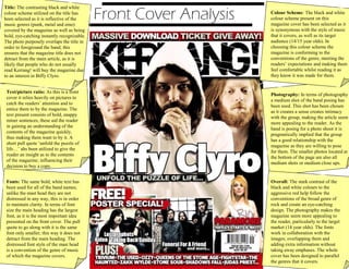
  • 1. Front Cover Analysis Title: The contrasting black and white colour scheme utilized on the title has been selected as it is reflective of the music genres (punk, metal and emo) covered by the magazine as well as being bold, eye-catching instantly recognizable. The photo purposely overlaps the title in order to foreground the band; this ensures that the magazine title does not detract from the main article, as it is likely that people who do not usually read Kerrang! will buy the magazine due to an interest in Biffy Clyro. Colour Scheme: The black and white colour scheme present on this magazine cover has been selected as it is synonymous with the style of music that it covers, as well as its target audience (14/15 year olds). In choosing this colour scheme the magazine is conforming to the conventions of the genre, meeting the readers’ expectations and making them feel comfortable whilst reading it as they know it was made for them. Photography: In terms of photography a medium shot of the band posing has been used. This shot has been chosen as it creates a sense creates intimacy with the group, making the article seem more appealing to the reader. As the band is posing for a photo shoot it is pragmatically implied that the group has a good relationship with the magazine as they are willing to pose for them. The smaller photos located at the bottom of the page are also all medium shots or medium close ups. Text/picture ratio: As this is a front cover it relies heavily on pictures to catch the readers’ attention and to entice them to by the magazine. The text present consists of bold, snappy miner sentences, these aid the reader in gaining an understanding of the contents of the magazine quickly, thus making them want to by it. A short pull quote ‘unfold the puzzle of life…’ ahs been utilized to give the reader an insight as to the contents of the magazine; influencing their decision to buy a copy. Fonts: The same bold, white text has been used for all of the band names; unlike the mast head they are not distressed in any way, this is in order to maintain clarity. In terms of font size the main heading has the largest font, as it is the most important idea presented on the front cover. The pull quote to go along with it is the same font only smaller, this way it does not detract from the main heading. The distressed font style of the mast head is a convention of the genre of music of which the magazine covers. Overall: The stark contrast of the black and white colours to the aggressive red help follow the conventions of the broad genre of rock and create an eye-catching design. The photography makes the magazine seem more appealing to the reader, particularly to the target market (14 year olds). The fonts work in collaboration with the images; overlapping them and adding extra information without taking away emphases. The whole cover has been designed to parallel the genres that it covers.
  • 2. Double Page Spread Analysis Colour Scheme: similar to the front cover this double page spread exemplifies a colour scheme consisting of black, white and red; colours that appeal to the target market of Kerrang!, that also parallel the style of music of the band the article is talking about. In recognizing the stark contrast between white and black, the editor has made the text in the main article stand out against the dark background, making it easy to read and continuing the bold style of which the magazine tends to adopt. Photography: A medium close up of the band performing live has been used to cover both pages of the double page spread, giving the entire design a lively appearance. In using a live photo the magazine moves away from clichéd poses, often prevalent in more mainstream pop magazines and instead adopts a more natural, photojournalistic approach that readers will appreciate. As well as this the choice of a live photo makes the article feel more intimate for the reader. Writing style: The article focuses on a gig played by the band, and is written in a fairly informal style that the magazines typical reader (14 year olds) would find engaging. Quotes from the band work well in collaboration with the intimate style of the DPS created by the large mid-shot of the band. Colloquial language such as ‘fizzles’ and ‘gig’ help to maintain an informal register that would be entertaining for the reader, as well as reflecting the demographic of the band. Fonts: The font for the main body of the article is a plain, clear sans serif style which is easy to read and reduces the reading time necessary; something which 14 year olds will appreciate as, stereotypically they will not want to spent large amounts of time reading. The main heading uses a powerful, bold font that has been chosen in order to catch the readers’ eye while they are skimming through the magazine looking for an article that interests them. The broken style used on the heading ‘Rated: Lives’ conforms to the manic style of music of which the article is discussing as well as maintaining conventions of the genre. Text/picture ratio: Because the editor has chosen to include an article which in itself is fairly short as this accommodates the demands of the reader, a large photo which covers both pages of the DPS has been implemented. This works in accordance with the lively style which the magazine tends to include. A large heading, overlapping the image has been used so that the reader can quickly gain an insight as to the subject of the article. Overall: The colour scheme of dark black, bold white and aggressive red works in well accordance with the demographic of the magazine and the music genres that it covers. The photography creates a lively, vivid aura in order to engage the reader, and the informal style of image used helps to create intimacy. This informality is continued through the phatic writing style that mirrors the band being covered. The font used in the main article is fairly plain in order to maintain some level of sophistication and coherence as well as being easy to read. However the main emphasis of the DPS is placed on the large photo that dominates both pages.
  • 3. Contents page analysis Text/picture ratio: this contents page has a very busy layout where the pictures occupy far more space than the text. Emphases has been placed on the image of ‘you me at six’ as this is the main article and as such has a much larger photo than the other stories. Each image has pull quote that gives the reader a vague idea as to what to expect from the article, this entices the reader towards them. The heading ‘contents’ has been enlarged and as such, fore grounded this is so that the reader instantly knows what they are looking at. The idea behind this page is that the reader can quickly find the article they are interested in which is why it consists predominantly of photos. Writing style: This page mostly consists of quotations and pull quotes that give the reader an idea of what to expect from each article. Despite mainly consisting of miner sentences this contents page manages to establish an informal register that is likely to appeal to the teenagers this magazine targets as well as reducing the time necessary to choose an article to read. Font: For the most part a fairly plain sans serif font has been used as it is easy to read and establishes a sense of sophistication. Emboldened headings have been used so that the reader can quickly decipher the pictures. The heading ‘contents’ uses a yellow font to make it stand out above the other text present, an idea that is continued with the sub-headings. The quote in the top right hand corner uses a slightly larger font size than most of the text of the page so that it is instantly noticeable. Colour Scheme: The colour scheme used in this contents page differs from the black, white and red that readers can come to expect from Kerrang!. Instead a colour scheme of gray and yellow has been used, gray as the background colour almost as if it is creating a blank canvas for the bold yellow to highlight the important headings. Photography: This contents page contains a mixture of medium to close up shot of live performances and poses, giving the page an interesting varied look. The live photos are in keeping with the energetic style of the magazine and the posed photo of ‘you me at six’ injects an element of humor into the layout. Both of these factors make the reader want to read the article that goes with the image. Overall: Because the pictures take up more space than the text the page has a busy appearance, however it manages to maintain understandable through the use of a multitude of headings that complement the images. The writing style consists mainly of short snappy sentences and quotations that make the reader want to read the article from which they are talking about. The use of a san serif style font ensures that the text is clear and easy to understand so that the reader can quickly find out the page of the article they are interested in. The colour scheme of gray and yellow is slightly more formal than the black, white and red prevalent in Kerrang!. The mix of live and posed shots has been used to make the reader want to read the article of which they concern.