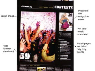
1. Large image Picture of the magazine cover Not very music orientated Page number stands out Not all pages are listed only, key events
2. Refers back to the magazine cover Lots of images are used to get readers attention, to make them go to that page Pictures indicating a mixed magazine
3. Not all pages are listed Basic colours, white, yellow and black are used
4. The page number is clear, also, also explains a little about the article
5. It gives you a free CD, but explains what It is about so you can decide if you want it or not All the song names Play on the words, as the CD is free and it is crazy.
6. Headings are used, to give the reader a guide, as it is a mixed magazine “ your”, as if they are directly talking to you. Playing with his name, as if they know him
7. Again a large image is used, but from this image you could automatically tell that it is music based Similar font is used as the masthead, so you could tell its from Kerrang Colours that are used clashes with the background, primary colours are used, indicating a male based magazine Used the masthead on the contents page too
9. Sub headings are used to indicate draw the reader to what they want to read A free poster, using a danger colour, so it gets your attention Not using a a paragraph to explain what is in the magazine, just briefly informing you
10. The colour scheme is continued from the front page The issue number is bold and big so readers don’t get confused Logo is on the contents page too Lots of images are used, to show the reader the variety in the magazine
11. Sub headings are different to the other magazines, as the Q magazine uses artists names to categorise As all the other magazines, the page number is enlarged